Florine Stettheimer, the Department Store, and the Spaces of Display, New York 1916–1926
Florine Stettheimer’s work circulated in the nineteen-teens and twenties around a wide variety of forgotten exhibition spaces in which fine art intermingled with commercial culture and domestic interiors were brought into public view. Stettheimer, a modernist painter, exhibited her work to her circle of well-known artists, writers, and critics in her carefully decorated, cellophane-and-lace-filled home and studio. Scholars have focused on this private form of display, yet archival records demonstrate that in this period Stettheimer also participated in a diverse array of public group exhibitions. These ranged from the landmark modernist museum show, the Exhibition of Paintings and Drawings Showing the Later Tendencies in Art at the Pennsylvania Academy of the Fine Arts, to the highly commercial Suggestions for the Decoration of the Fireplace at the Arts Guild Galleries.1 She also exhibited many times at a contemporary art gallery set within the two-story model house, Belmaison, in which Wanamaker’s New York department store displayed its most luxurious home furnishings.2 This gallery showed the work of many other well-known modernists, including Stuart Davis, Marsden Hartley, Charles Sheeler, Marguerite Zorach, and William Zorach.
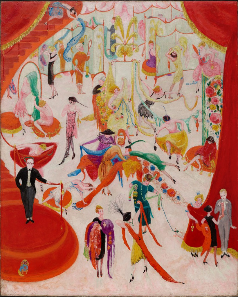
Stettheimer not only brought modern art into the department store; she brought the department store into modern art. Her 1921 work, Spring Sale at Bendel’s (Philadelphia Museum of Art), pulls back the curtain on a whirl of bargain-hunting women who have temporarily transformed the first floor of this exclusive boutique into a joyful scramble (fig. 1). The wealthy Stettheimer, who regularly purchased couture garments, depicts this indecorous display of upper-middle-class consumer desire in a humorous style influenced by published and unpublished commercial illustrations. The following year, Spring Sale at Bendel’s itself circulated through another space of class-based negotiation. Stettheimer exhibited it among the so-called “freak creations” of both modernists and amateurs in the annual “no jury—no prizes” exhibition of the Society of Independent Artists at the Waldorf Astoria.3 There, it hung before what was perhaps the largest, most varied, and most potentially antagonistic audience of any show in New York City.
Stettheimer’s career offers a uniquely productive case study through which to understand both the variable and overlapping spaces of modernism at this moment, and the distinctions that emerged within them. Tracing the movement of her works brings into view a variety of previously unexamined venues in which art and commerce converged. It also demonstrates that while the places and audiences Stettheimer encountered were interconnected, they were not interchangeable. Scholars often invoke the word “fluid” to describe the lack of rigid boundaries in the art world of this moment, with some positing a dynamic relationship between so-called high and low culture, and others drawing attention to a more inclusive modernism.4 Moving through these many individual locations, however, it becomes evident that while different classes of objects and people flowed through them, the resulting juxtapositions often served to expose subtle hierarchies inside. This essay reveals the previously overlooked diversity of Stettheimer’s exhibition practices, and argues that the period’s lack of rigid boundaries between art and commercial culture resulted in nuanced class and gender-based mingling and sorting, not democratic equivalence, within the spaces of early twentieth-century American modernism.
Stettheimer’s Domestic Display Environments
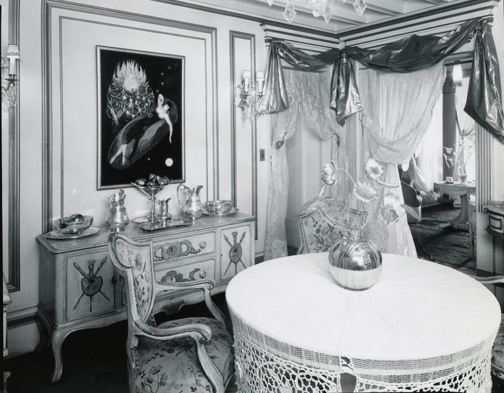
Stettheimer’s careful decoration of her home and studio has been the subject of significant research. The artist lived for much of her life with her mother Rosetta and two unmarried sisters, Ettie and Carrie. Born into a wealthy German-Jewish family, these three sisters together had the freedom to create a home and a social circle of their liking. Their household arrangements set them outside gender norms. They emphasized the freedom this offered, saying, “Being unmarried women . . . we didn’t have to fit into any categories.”5 In this context, Stettheimer created almost hyperfeminine white and gold interiors festooned with cellophane and lace and filled with her own works of art. She painted some of the furniture as well, including the credenza visible in a photograph of her studio (fig. 2). The rooms became both avenues for self-expression and total installation environments, where fine art and decoration were all but indistinguishable.6 Cécile Whiting has convincingly argued that these domestic interiors were part of a sustained artistic conversation with men in her circle, many of whom were gay, about the representation of androgyny, gender, and the self.7
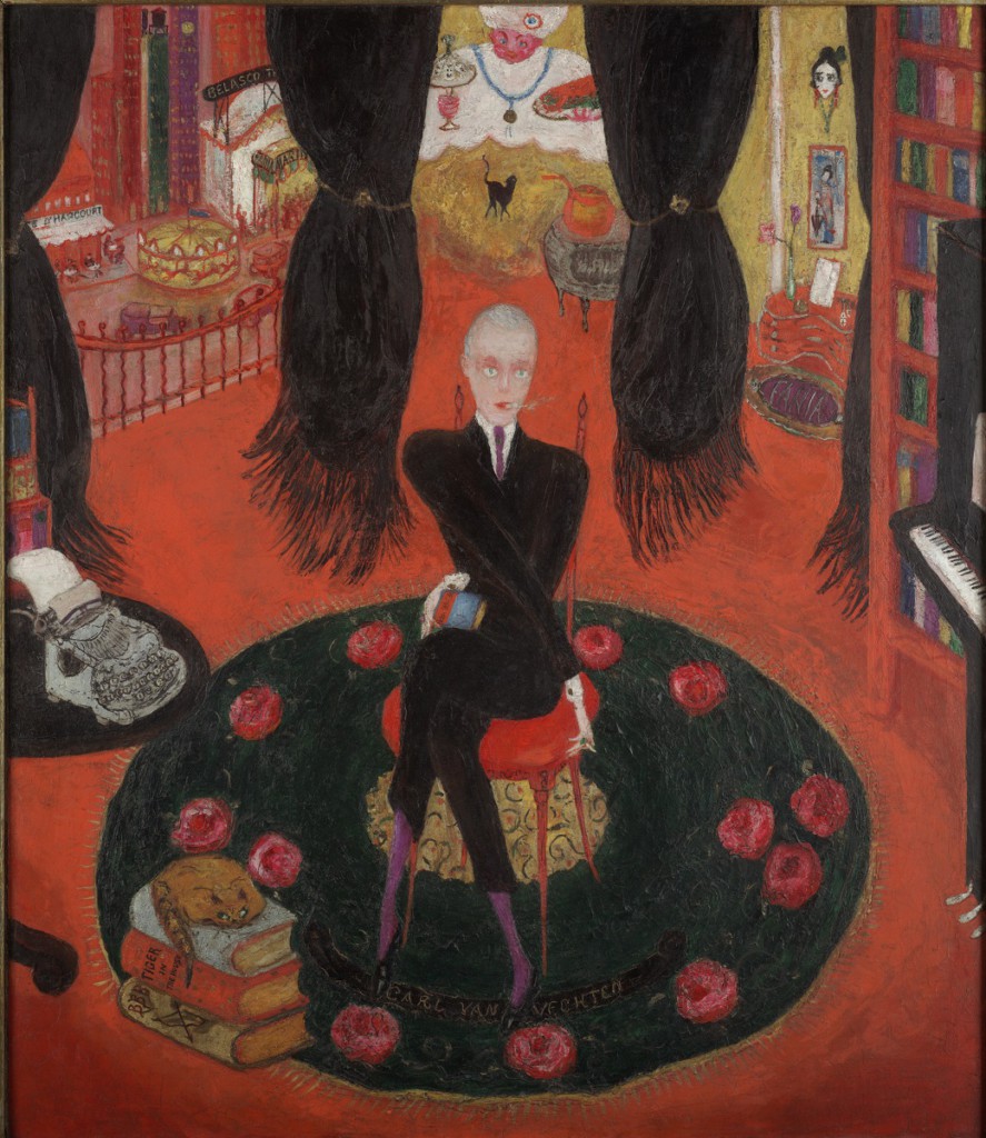
In these unique and remarkable settings, Stettheimer privately showed her work to the select group of artists, writers, critics, and other members of the art world that constituted what has come to be known as the Stettheimer salon. These included artists such as Marcel Duchamp, Marsden Hartley, and Gaston Lachaise; writers like Leo Stein and Avery Hopwood; and “magazine men” such as Vanity Fair editor Frank Crowninshield.8 Stettheimer produced individual portraits of many of these people and carefully controlled their display within her home. For example, in December of 1922 she unveiled her portrait of a close friend, the critic and photographer Carl Van Vechten, at an elaborately choreographed tea (fig. 3).9 As David Tatham has shown, Stettheimer depicted this complex array of friends and acquaintances in her work, while also capturing the broader social structures and prejudices that shaped them.10
In contrast to the robust scholarship on her domestic display, Stettheimer’s public exhibition history has never been the subject of sustained study. Examining this history reveals that, just as the spaces in which Stettheimer exhibited were more complex than previous scholarship acknowledges, so too were Stettheimer’s practices themselves. Until now, scholars have effectively sequestered Stettheimer at home by focusing almost exclusively on her private displays of her work and her circle of intimate friends.11 This is at least in part because she had only one solo show, early in her career, which resulted in no sales and mixed reviews. Thereafter, she presented her work in group exhibitions. The standard narrative is that she was so troubled by that early negative experience that she essentially withdrew her art from view.12 Yet the historical record tells a different story; between 1916 and 1926 Stettheimer frequently showed her work in public.
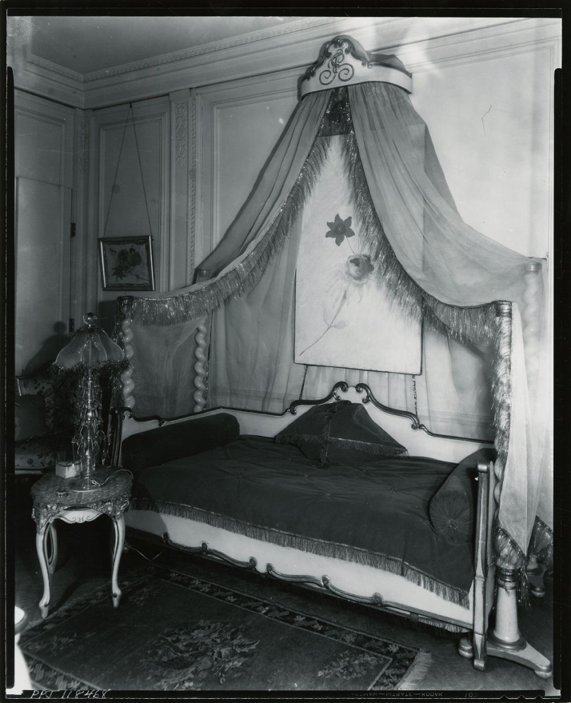
Stettheimer’s one-person show took place in 1916 at the important New York gallery Knoedler & Company. It demonstrates that from the beginning, Stettheimer’s exhibition practices troubled the boundaries between private and public space, and between domesticity and commerce. In an upper room, Stettheimer displayed her paintings in a replica of the most private spaces of her own home. She covered the walls with white muslin and installed a canopy modeled on one she had designed for her own bedroom (fig. 4). Selling art in simulated private and semiprivate interiors was a well-established gallery practice in this period, and artists’ studios had long functioned as sites of display and purchase.13 Knoedler itself had privately shown art to its wealthy patrons in ostensibly domestic spaces without price tags, labels, or any other indication of commerce since the later nineteenth century.14 Stettheimer’s exhibition, however, transgressed even this highly fluid set of boundaries. Recreating the most private areas of an artist’s own home, particularly a woman artist’s own bedroom, was far outside the norm.
Following her one-person show, Stettheimer participated in between one and six exhibitions a year until 1926, when her mother became ill.15 The spaces in which she exhibited were extraordinarily diverse, ranging from museums to the annual exhibition of the Society of Independent Artists to department stores, including Wanamaker’s and, in one case, Marshall Field’s in Chicago. Following Stettheimer’s work through these varied locations allows us to map the ongoing circulation of objects and people in this moment.
A Commercial Setting for Modern Art: Wanamaker’s New York Department Store
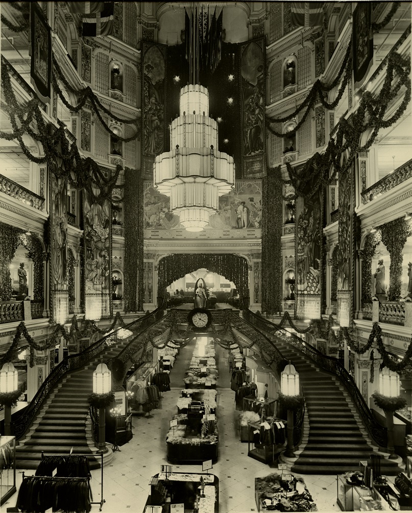
Stettheimer showed at least five times at a modern art gallery set within Belmaison, the luxurious home decoration department inside Wanamaker’s New York department store. An analysis of the store, the department, and the gallery reveals a complex enterprise in which distinctions between salesrooms, domestic interiors, and art exhibitions shifted and blurred. Customers of all kinds mingled in the impressive interiors of Wanamaker’s, but the store was also subdivided into distinct shops that explicitly catered to different classes (fig. 5). The two stories of Belmaison, inside Wanamaker’s, mimicked the arrangement of a private home, with shoppers moving through simulated historic and contemporary dining rooms, sitting rooms, bathrooms, and bedrooms. One could only access the Belmaison Gallery, which from 1921 to 1925 showed some of the most ambitious modernist art on view anywhere in New York, by entering Belmaison and passing through its showrooms.16
The Belmaison Gallery opened at a time of significant, ongoing interchange between department stores, museums, and art galleries.17 Department stores in the United States came into being after the end of the Civil War as an increasingly business-oriented and secular culture of individual self-fulfillment took root. As William Leach has demonstrated, they became “lands of desire” that made real the “dream life of capitalism.”18 Department stores and museums soon formed close alliances. Museums increasingly borrowed from department store display strategies and sought to boost the appearance of social relevance by placing their objects, expertise, and resources at stores’ disposal.19 For example, between 1917 and 1940, The Metropolitan Museum of Art held annual exhibitions of American industrial arts, selected from both commercial manufacturers and department stores, that were installed explicitly to elevate public taste and inspire improved American design.20 In turn, department store owners took it upon themselves to become “missionaries” of aesthetics to those shoppers who never entered museums.21 Many stores regularly presented a range of free educational programs, art exhibitions, and displays intended both to edify the public and to cultivate consumer desire for their merchandise. These included Macy’s 1927 “Exposition of Art in Trade,” organized with the help of The Metropolitan Museum as part of a continuing relationship between the museum and the store’s furniture department.22 The installation presented modern decorative arts in a variety of contemporary model interiors that included avant-garde artwork such as Kazimir Malevich’s Knife Grinder or Principle of Glittering (1912–13; Yale University Art Gallery).23 These ongoing partnerships would persist into the 1930s with, for example, the Museum of Modern Art’s collaborations with stores like Marshall Field’s.24
If a number of museums cultivated relationships with department stores, individuals who ran small, exclusive modern art galleries, including Charles Daniel, Edith Halpert, and Alfred Stieglitz, distanced themselves instead. Even as the work of artists they represented circulated around a wide spectrum of spaces, these dealers attempted to define and defend boundaries between them. After all, if a collector could, for example, buy a work by Sheeler at the Daniel Gallery and at Wanamaker’s at the same time, where did that leave Daniel and others like him?25 Dealers such as these often addressed these kinds of questions by defining themselves as missionaries working to further American modernism at no profit, even though their galleries were by their very nature commercial enterprises. Halpert, who founded the Downtown Gallery in 1926, took great pains to separate her work and that of her fellow dealers from the taint of department store-style mercantilism, and emphasized the difficulty they had in making money. She wrote, “Is art a business? If you are speaking of the art department of Gimbles, it is . . . But if you are a dealer in contemporary American art, I wonder. We do not buy at all, and find it extremely hard to sell.”26 These individuals also differentiated their galleries from what they characterized as pedestrian, profit-oriented spaces like the Belmaison Gallery by claiming a moral and aesthetic high ground. Stieglitz consistently asserted that his gallery was “not a business, and I am not a dealer . . . no game is being played, I want nothing of anyone.”27 He cultivated an altruistic persona, circulating, for example, a story in which a nameless young woman came to his gallery with little money but a deep, visible love for the work of John Marin. Stieglitz, moved by her genuine emotion, gave her a Marin watercolor. He concluded the story by asserting that his practices were governed by a higher law than economics, saying “That’s what’s called a sale here . . . As for keeping books in this place, only a poet could do it.”28
In order to understand the Belmaison Gallery, it is also necessary to understand the specific department store in which it stood. In the latter half of the nineteenth century, John Wanamaker was one of the first men to create the department store as we know it today. In keeping with his evangelical Christian faith, he envisioned his stores as more than profit-making ventures. He saw them as venues in which to uplift the public through education, art, and culture, while also attracting and entertaining customers.29 As a consequence, although the Belmaison Gallery was atypical in that it exhibited modernist work, Wanamaker’s had been displaying fine art in both Philadelphia and New York for many years before the space opened.
Wanamaker’s was in this period the largest store in New York, and the crowds that visited represented a broad spectrum of the people of that city.30 It consisted of two enormous buildings, each occupying a full city block, and stretched all the way from Broadway to Fourth Avenue and from Eighth to Tenth Streets. By 1916, the store saw hundreds of thousands of people each year in its home furnishing departments alone; its telephone exchange handled fourteen thousand calls a day; and it employed between five thousand and almost eight thousand people, depending on the season.31 The experience of entering this world of desire was calculated to be visually enticing and even overwhelming. The store was divided into many little shops, creating a densely layered architecture of social stratification.32 Department store merchants spoke openly among themselves about creating spaces for “the masses” and “the classes,” but the layout of Wanamaker’s suggests an even more complex structure.33 Separate boutiques strategically placed around the store specialized in specific commodities such as clothing, toys, and hardware, with different departments offering the same category of merchandise at various price points. For example, Wanamaker’s sold women’s hats in several different places. The most exclusive shop, Marcelle Demay, presented custom-made hats in an explicitly French interior with an entirely French staff. One could only access the moderately priced store, the French Millinery Salons, by walking through Marcelle Demay’s more expensive, tantalizing installation calculated to stir desire in the midrange shopper. Inexpensive hats were to be found elsewhere at the Moderate Price Millinery Salons, whose name and placement signaled exclusion from the world of luxury. If a shopper was lucky, they might find even cheaper hats in the “Down-Stairs Store,” or bargain basement.34
Belmaison stood at the top of this price-based hierarchy and made use of French to signal its exclusivity. The furniture and decorative objects in Belmaison were the most expensive sold at Wanamaker’s, and they were displayed in luxurious, simulated domestic spaces. Departments such as Belmaison were not new at Wanamaker’s; as early as 1888, the Philadelphia store displayed furniture in the so-called House Beautiful, which contained salesrooms decorated to look like private homes, and in 1908 Wanamaker’s New York store opened House Palatial, a “real” two-story, twenty-four–room model home later replaced by Belmaison.35 The name Belmaison itself was an altered form of the French “belle maison,” or beautiful house. To many Wanamaker’s shoppers, this faux-French word, like the names of the more expensive hat shops, would have evoked the allure of the European center of couture fashion and high culture. Wanamaker’s use of French or French-sounding names for its more exclusive spaces and objects was not unique; it was a common promotional strategy in this period. As one writer in a contemporary advertising periodical put it, to use French words was to “borrow from Paris itself, a note of distinction.”36
Much of what we know about Belmaison comes from a single document: a fifty-five page illustrated descriptive booklet published by Wanamaker’s shortly after its opening in 1919. This booklet makes it clear that Belmaison was explicitly designed by and for women.37 The department was the creation of Ruby Ross Goodnow (also known as Ruby Ross Wood), who had a long and illustrious career as a decorator and writer on the subject of interior design. Unlike its predecessor, House Palatial, Belmaison also included a staff of decorators offering custom interior design services. It was intended to stir the desire of housewives not only for luxury but also for self-improvement and self-actualization through consumption. The booklet explains that, by design, Belmaison “awakens in home-makers an idea of self-expression, a passion to make one’s home as beautiful as possible—realizing that in making our homes beautiful we go far toward making ourselves and our lives beautiful.”38 For most shoppers, the idea of living in the luxurious rooms of Belmaison would have been far out of reach, and strolling through them would have been an exercise in dreaming about a different life.
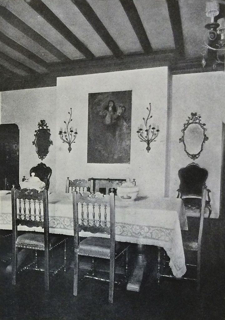
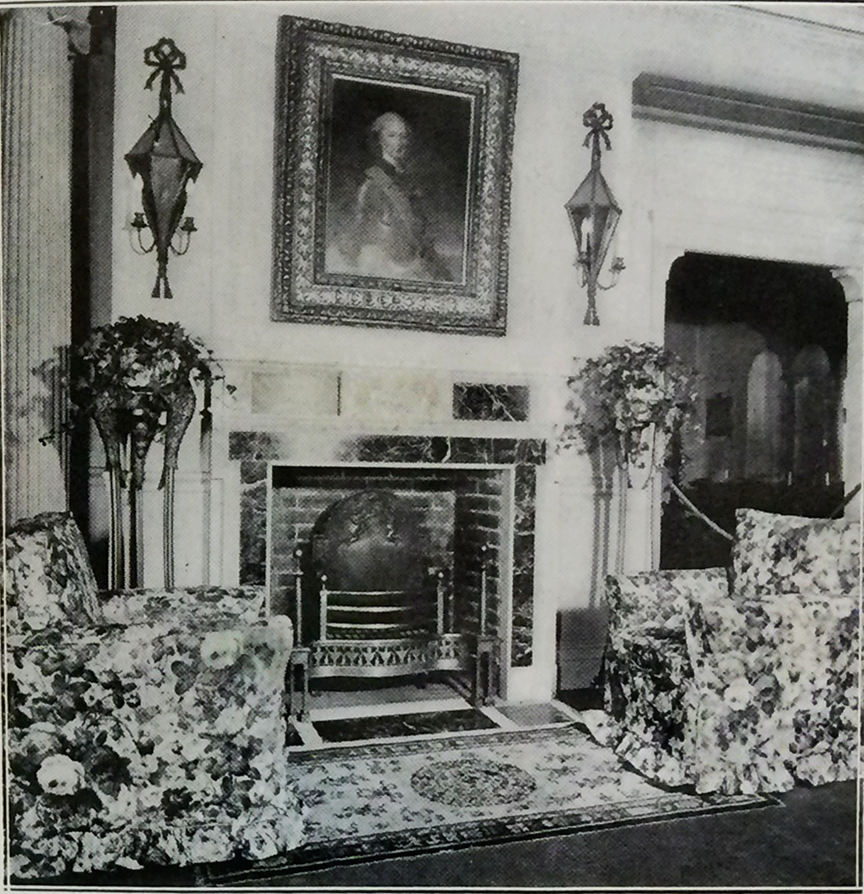
Belmaison consisted of twelve simulated private interiors, sometimes subdivided into smaller spaces, that were spread across two floors and decorated according to various themes. These included the Louis XVI Salon, the Italian Room, and the Gaily Papered Hall (fig. 6). Although their names were often highly specific, many rooms in reality consisted of an eclectic, historically inaccurate fantasy of a place and time that never existed. Antiques and reproductions were freely mixed. One entered Belmaison, and the Belmaison Gallery, by passing through the English Hall (fig. 7). Despite its name, that room was described in the explanatory brochure as “typical of an American or English country house,” mixing Queen Anne, William and Mary, and “older English” styles. The author emphasized the homey and welcoming, rather than imposing, nature of this introductory room, stating that the “great, chintz-covered arm-chairs drawn up to the fire-place suggest chats and afternoon tea.”39
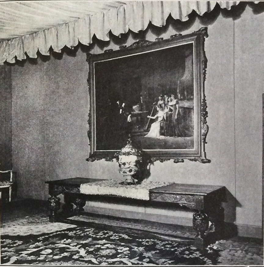
Belmaison initially showed no sign of modernist influence and displayed no contemporary art. Its traditional style extended to the so-called Blue Galleries, a group of three rooms painted sea-blue and designated for the display of historical paintings alongside antique tapestries, carpets, screens, wallpapers, and furniture (fig. 8).40 With the opening of the Belmaison Gallery, however, modern art entered Belmaison.
Belmaison Gallery: Modernism in the Department Store
In the spring of 1921, the Belmaison Gallery opened in the rooms where the Blue Galleries had been.41 Nested within the feminized space of interior design, the gallery mounted a diverse array of exhibitions. These included everything from ambitious shows of postwar European modernism; to presentations of American modernist artworks with contemporary furniture, rugs, and ceramics; to exhibitions related to current events and containing no modern art at all. Previously unpublished archival material, including a collection of the gallery’s exhibition brochures now housed at The Metropolitan Museum of Art, demonstrates that these shows were categorized, promoted, arranged, and documented differently.42 Even within individual exhibitions, modern and decorative or popular objects were at times segregated into separate rooms. A detailed examination of the Belmaison Gallery reveals a multifaceted space of exchange and cross-pollination in which fine art, domestic décor, and popular culture intermingled.43 It also reveals, however, that the intermingling in this location resulted in the formation of intricate, implicit hierarchies.
The Belmaison Gallery’s department store location insured that an extraordinarily diverse array of people, not just objects, mingled in its rooms. These included everyone from housewives who wandered in while shopping to members of the art world who visited to see modern works. Only scraps of evidence about the reception of the gallery remain, and they come entirely from male writers. Nevertheless, they suggest these distinctions were significant and often gendered. On the one hand, a newspaper critic quoted a shocked, if polite, female shopper who had stumbled into an exhibition as saying, “this certainly gives you a feeling.”44 Well-known artists, critics, and collectors, including John Quinn, also regularly traversed the showrooms of Belmaison to see the objects on view.45 The reception of the gallery by those figures was complex. The Belmaison Gallery’s exhibitions were the subject of regular, largely positive reviews in arts publications.46 However, even as he showed his work there, Marsden Hartley used the phrase “shades of John Wanamaker” to criticize exhibitions he found too commercial.47
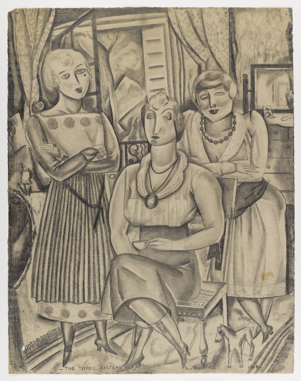
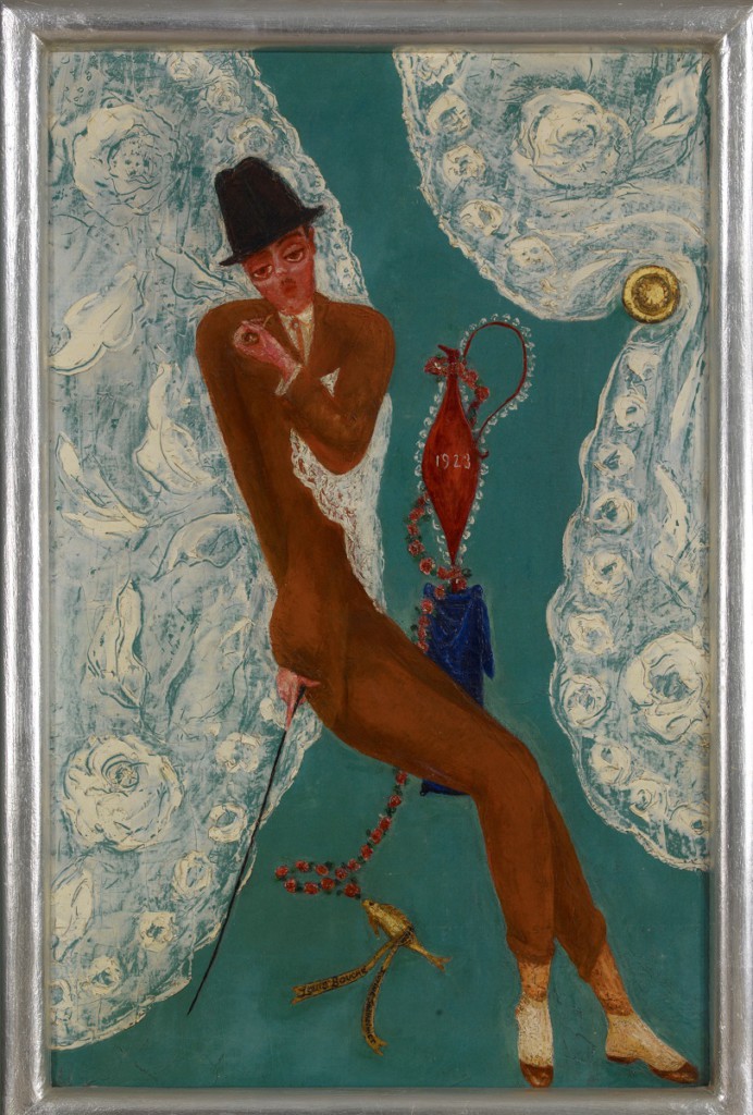
Louis Bouché, who became the inaugural gallery director in the fall of 1921, was a well-connected modernist painter, muralist, and writer whose primary interest was contemporary fine art. American by birth, Bouché grew up in France and the United States and as an adult spent considerable time in Europe. He showed regularly at major exhibitions in which Stettheimer also took part, including the 1921 Pennsylvania Academy of the Fine Arts show. He was a member of Stettheimer’s group, and though they were not particularly close, he had drawn a portrait of her with her sisters a few years earlier (fig. 9). She in turn painted Bouché’s portrait in 1923 (fig. 10), characteristically filling it with inside references. Among other elements, these include lace curtains, which appear often in both his and Stettheimer’s work and echo those in Stettheimer’s home.48 The curtains perhaps also nodded to the Belmaison Gallery itself; the gallery’s custom stationary included curtains framing the page.
Bouché’s first act as director was to introduce European modernism into the gallery with the Exhibition of Paintings by French Cubists and Post Impressionists. This November 1921 show was an ambitious grouping of postwar work by, among others, Georges Braque, Giorgio de Chirico, Juan Gris, Fernand Léger, Marie Laurencin, Henri Matisse, Jean Metzinger, Amedeo Modigliani, Pablo Picasso, and Maurice de Vlaminck.49 Bouché’s goal in this first show was to provoke the New York art world. In the exhibition brochure, he decried the infrequent showing of postwar European modernism in the United States, writing:
Whereas interesting loan exhibitions of the Impressionists and their followers have been held in galleries, and in the last few years even in museums, there have been no attempts to show the work of the younger moderns. . . . On account of the amazing developments in the modern idea during the past few years, this present exhibition must be ranked as one of the most important since the 1913 Armory Show.50
Despite Bouché’s ambition to rival the Armory Show, reviewers largely perceived the exhibition through the lens of commercialism and interior decoration. For example, a reviewer for Arts and Decoration (a periodical itself devoted to the idea of art as decoration) praised the showing of avant-garde European modernism, but framed the paintings as domestic ornaments. He recommended this kind of art for purchase as a status symbol and a solid financial investment, writing: “these pictures are of the kind that one sees hanging in sumptuous houses all over continental Europe.”51
Following his opening salvo devoted to European modernism, Bouché’s shows fell into what he later described as two distinct categories: displays of cutting-edge modern art, with and without accompanying decorative works, and what he called “scene shows” based on current events. In his fine art exhibitions, Bouché displayed American artists including George Bellows, Andrew Dasburg, Arthur B. Davies, Stuart Davis, Charles Demuth, Preston Dickinson, Marsden Hartley, Edward Hopper, Rockwell Kent, Yasuo Kuniyoshi, Gaston Lachaise, Reginald Marsh, Walter Pach, Jules Pascin, Man Ray, Charles Sheeler, John Sloan, Niles Spencer, Joseph Stella, Maurice Sterne, Marguerite Zorach, and William Zorach. He occasionally added the work of contemporary European and Latin American artists to the mix. Bouché’s “scene shows,” which included no modernist pieces, drew instead on popular culture. For example, when the Prince of Wales visited New York for the International Polo Match, Bouché mounted an exhibition of art related to polo alongside mass-market saddles and bridles.52 Because the gallery consisted of multiple rooms, such displays could appear simultaneously. While these two kinds of exhibitions occupied the same spaces, the gallery only produced brochures for those that included fine art. The brochures themselves also demonstrate a different attitude toward what were clearly perceived as distinct classes of objects within those exhibitions. They commonly included detailed checklists of fine art organized by artist, but no documentation of other pieces.
The layout of the gallery’s art exhibitions themselves also reflected this hierarchical approach. In 1923, Stettheimer participated in Bouché’s Exhibition of Paintings, Watercolors, Drawings, Etchings, Lithographs, Photographs and Old Prints of New York City, an unusually well-documented example of a show that included, but also separated, fine and popular artworks.53 The exhibition contained both modernist paintings by artists including Bellows, Hopper, Sheeler, and Sloan, and popular “old prints” of the kind traditionally used to adorn middle-class homes. Most of these prints, including several by the firm N. Currier (which would become Currier and Ives), date from the nineteenth century, but a few, such as a 1656 Dutch map with an inset showing “Nieuw Amsterdam,” were much older.54 Contemporary reviews describe five distinct areas segregated by medium and date, with three for modern paintings, one for modern works on paper, and one for the prints. The largest room displayed the most abstract depictions of the city, including the five sizeable panels of Joseph Stella’s Voice of the City of New York Interpreted (1920–22; Newark Museum).55 Bouché reproduced a modernist work by Bertram Hartman called City Blocks (c. 1920; Samuel P. Harn Museum of Art, University of Florida) on the cover of the exhibition brochure and, emphasizing the relative importance of the fine art pieces, listed the far more plentiful modern works first in a detailed list organized by artist. In contrast, the prints appeared in a crowded and heavily abbreviated chronological list in a second, smaller section of the brochure. The large number of objects—one hundred and thirty-five modern artworks and thirty-one prints—must have filled the rooms of the Belmaison Gallery to capacity, suggesting a crowded, salon-style arrangement with no room for object labels.
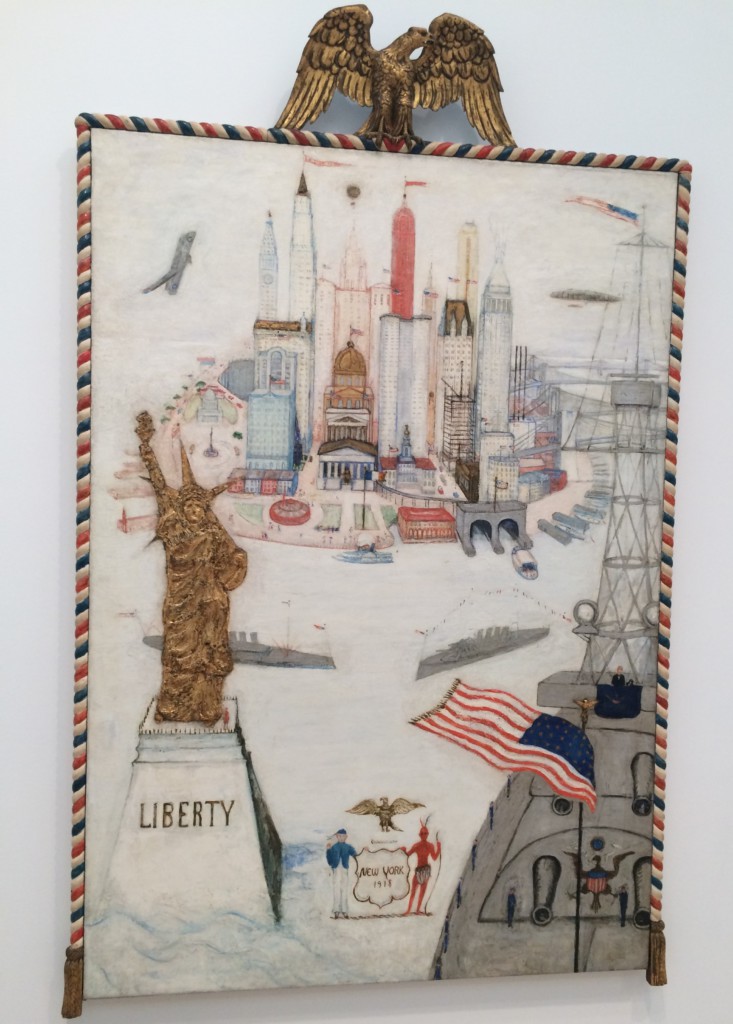
Stettheimer contributed her New York/Liberty, illustrated here with an angled photograph that shows its sculptural components (fig. 11), to this diverse exhibition. Stettheimer’s work itself draws on a wide range of sources, mingling commercial, decorative, and modernist elements. These include a custom-made, carved wooden frame topped by an American eagle that quoted the contemporary fashion for folk art (a taste shared by members of her circle), and a three-dimensional Statue of Liberty adhered to the canvas. The subject of the painting is a specific and pivotal moment in the peace process at the end of World War I. In the foreground, President Woodrow Wilson stands aboard a Navy ship, likely the USS George Washington, on which he departed from New York Harbor for the Paris Peace Conference in December of 1918.56 Reflecting this time at which the nation stood at the tipping point between war and peace, the composition is split down the middle, with war and industry on the right and civilian life on the left. On the right, the Navy ship aims its cannons toward the viewer, with skyscrapers under construction rising behind it. In contrast, the welcoming Statue of Liberty is on the left, in front of the more residential West Side, where Stettheimer lived. This iconographical split is underscored by an equally well-defined binary color scheme in which blue and silver predominate on the right, and red and gold predominate on the left. This opposition of sparkling gold and silver on the two halves of the canvas is especially striking in person, because the pigments are far more metallic than they appear in reproduction.
The painting is also a complex, repetitive amalgam of symbols representing the City of New York. In the upper portion of the painting, Stettheimer presents a compressed depiction of the island of Manhattan as seen from New York Harbor. Various city landmarks are both visually recognizable and repetitively identified with text. For example, the tallest skyscrapers, the Woolworth Building and the Singer Building (demolished in 1967–68), are topped with identifying flags reading “5 & 10 CENTS” and “SINGER,” respectively. Other well-known landmarks in the painting include Columbus Circle, Grant’s Tomb, and the neoclassical Federal Hall, complete with a tiny statue of George Washington. In the bottom center is a stylized rendering of the seal of the City of New York, with a colonist on the left, a Native American on the right, and a bald eagle crest above. The almost obsessively repeated symbols and landmarks fix the scene as inarguably New York, yet are also so prolific they begin to lose all meaning. For example, in addition to the overall red, white, and blue color scheme, the painting contains at least twenty-five American flags, with more suggested but not clearly defined (many are tiny and adorn various buildings and boats).
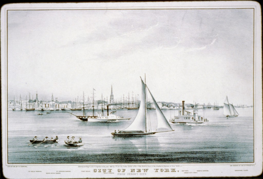
Bouché’s juxtaposition of New York/Liberty with nineteenth-century prints representing the same subject matter, New York Harbor, underlines Stettheimer’s category-defying artistic practices by emphasizing the extent to which her painting both draws upon and transforms the visual conventions of older commercial illustration. For example, the exhibition included the 1849 print The City of New York: From Jersey City, published by N. Currier (fig. 12). This commercial print shares important components with New York/Liberty. It too depicts travel by boat in the harbor, and presents the city as an amalgam of recognizable landmarks insistently labeled with text. The names of significant buildings or places in the image, including the post office, Trinity Church, and the Battery, are printed directly below them in the lower margin. While both the print and New York/Liberty seek to map and label the city as seen from the harbor, Stettheimer’s composition uses a new, aerial mode of vision to create a more synoptic, modern vision of New York.57 In this way, the painting exemplifies the mixing of sources that characterizes both her work and the Belmaison Gallery as a whole.
The Belmaison Gallery provides an important, unique, and previously unexamined example of a diverse yet differentiated display space in New York at this moment. It closed sometime in late 1925 and sold off its remaining inventory in early 1926. This was likely due in part to Bouché’s decision to leave Wanamaker’s in order to focus on his own artwork.58 However, the gallery’s placement of modern art in the department store continued to influence display in New York. For example, in her large and ambitious 1926 Société Anonyme show, the International Exhibition of Modern Art at the Brooklyn Museum, Katherine Dreier included four smaller rooms partitioned off from the main galleries.59 These were outfitted with traditional furniture purchased from the large, middlebrow Brooklyn department store Abraham & Straus, and decorated with a variety of modern works by artists ranging from Louis Eilshemius to Kurt Schwitters.60 Dreier knew the Belmaison Gallery well, having purchased there a painting by Albert Gleizes.61 In Brooklyn, Dreier adopted the gallery’s commercial display strategy to a different end: advancing her noncommercial goal of bringing modern art into the homes and lives of people of all classes.
When Stettheimer sent her modernist paintings to venues like the Belmaison Gallery, they entered the spaces of commercial culture. Her painting Spring Sale at Bendel’s, the other half of this equation, accomplished the reverse. It brought the complexity of a department store interior, with all its spectacular enticements, into a modern painting.
The Spaces of Spring Sale at Bendel’s
Stettheimer’s 1921 painting Spring Sale at Bendel’s (fig. 1) and its 1922 exhibition at the Society of Independent Artists “no jury—no prizes” show together exemplify both the contemporary flow back and forth between art and commercial culture, and the complex distinctions operating within these overlapping categories. The store had once been the preserve of sophisticated couture customers, but by 1921 it increasingly attracted a wider range of women shopping for discounted or ready-to-wear fashion.62 In her painting, Stettheimer drew on a variety of modernist and commercial styles to map this increasing diversity, organizing the composition into specific spaces defined by class and gender. In 1922, she then placed this piece on view in front of a wide array of art world insiders, outsiders, and antagonists at the Society of Independent Artists annual exhibition.
Bendel’s was an exclusive fashion house, not a large department store like Wanamaker’s catering to the “masses,” the “classes,” and everyone in between. Spring Sale at Bendel’s depicts this store specifically; a contemporary photograph of its first floor shows a similar layout, including a curving staircase and tall mirrors that correspond to elements in Stettheimer’s painting.63 Bendel’s, like many similar stores in the teens and twenties, was in the midst of a transformation. Henri Bendel, the proprietor, had begun his career in the 1890s by opening a stylish hat shop and soon became a tastemaker and couturier to many of the richest women in New York. He traveled regularly to Paris, brought back sketches and patterns of the latest fashions, and made custom dresses from imported fabrics for the elite. Over time, however, Bendel prospered by introducing more and more ready-to-wear fashions into his store and adding perfume and cosmetics to the mix, while continuing to offer couture dressmaking services to the wealthy.64 The inclusion of less expensive merchandise at Bendel’s, and the accompanying tensions depicted in Spring Sale at Bendel’s, reflect far broader postwar cultural shifts in class and gender roles as women increasingly worked outside the home. As scholars including Marie Clifford have described, with new sources of disposable income, a wider variety of women entered exclusive stores like Bendel’s, stirring anxiety among the elite as divisions between upper-class and upper-middle-class spaces became increasingly ill defined.65
The architecture of Bendel’s itself made explicit the increasingly permeable boundaries between the upper and upper-middle classes, and the all but impenetrable boundary separating them from lower-class workers. Bargains, and the shoppers who sought them, were positioned closest to the entrance on the first floor. The more expensive clothing displays and private couture consultation rooms were on the second and third floors, above but not unreachable from the first floor. There, wealthier shoppers like Stettheimer could look down over balcony railings at the bargain hunters below.66 Completely obscured by the painting, and rendered invisible by the store itself, were the dressmaking workshops on the upper floors of the building, as far as possible from the public spaces.67 Like that of the booming American fashion industry as a whole, Bendel’s success was built on the cheap labor of garment workers, most of whom were women who would never earn enough to participate in the culture of consumption churning on the floors below them.68 Bendel’s was in fact, alongside other elite department stores, the subject of several strikes of the Ladies’ Tailors and Dressmakers’ Union in the teens.69
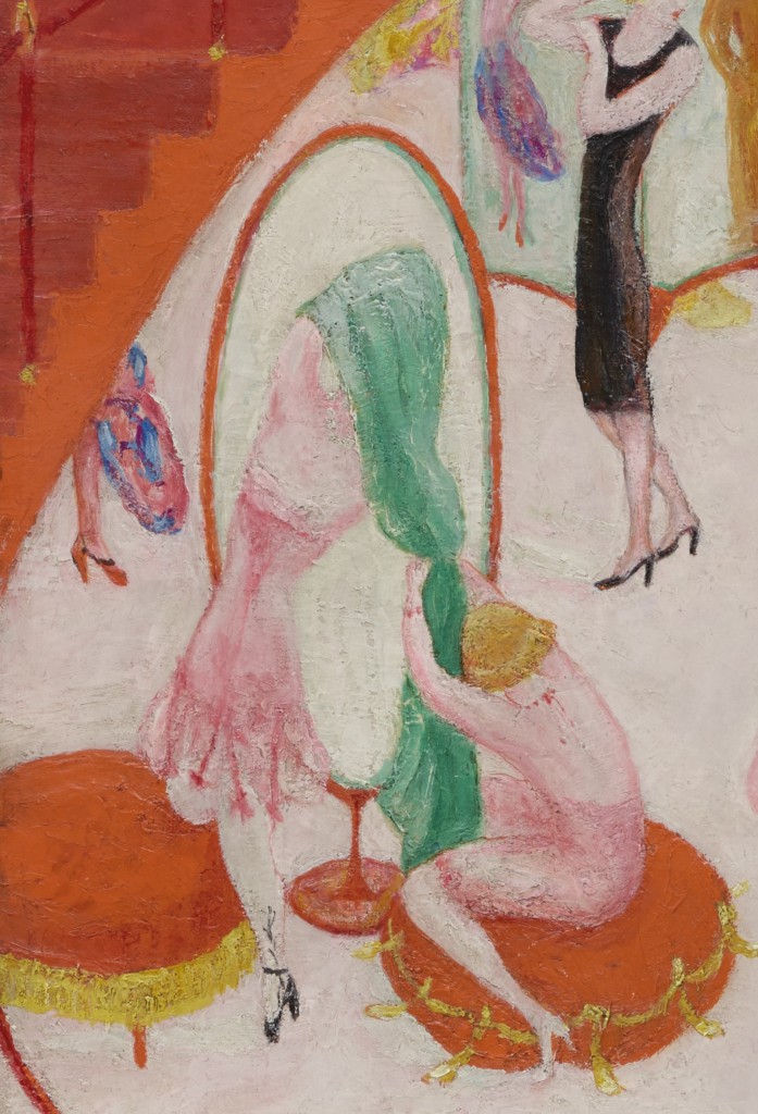
The compositional structure of Spring Sale at Bendel’s mirrors the social and architectural distinctions at the store. The largest and most detailed space of the painting is the central sales floor, framed by the red curtains and staircase. It is filled with budget-conscious shoppers of all ages driven into a competitive frenzy over the prospect of finding the perfect Bendel’s dress at a discount. Men stand outside the gendered boundary marked by the curtain and stairs on either side, occupying a second, liminal type of space. Stettheimer’s position looking down from above also evokes a third location, the upper floors devoted to wealthier customers.
At the center of the painting, inhibitions drop as desire surges. Three women, one leaping through the air in her excitement, search through fashions spread out on a table. Others preen before a series of enormous mirrors, even, like the woman in the yellow dress at upper right, throwing off their clothes as if at home in their hurry to try on garment after garment. Women, like the figure in pink holding black lace at center left, move about half-dressed and showing their garters. The painting’s almost fluorescent colors and array of mirrors create a vivid, funhouse-like atmosphere that underscores the emotion and abandon on the floor. Extraordinarily bright oranges adorn upholstered stools, the edges of the staircase, and various garments. These are jarringly juxtaposed with strong contrasting colors. For example, Stettheimer places a line of pure green against pure orange on the edge of the oval mirror under the staircase (fig. 13). The painting’s composition is structured around and lit by a central mirror. As William Leach has shown, mirrors, already all but ubiquitous in department stores by the turn of the century, could provoke a kind of narcissistic haze in the consumer.70 Indeed, many women around the room seem entranced by them, evaluating their doubled, reflected selves as they construct a public identity through fashion and commercial consumption. Garlands of fabric, some flowered, also extend from the mirror in the center as if from a spring maypole. Women circle it, almost as if performing a joyful May Day dance.
Stettheimer renders gender divisions explicit, as the only two men present stand in shallow, foreground spaces: one on the large red stairs at the left, and the other in front of the curtain on the right. Henri Bendel, guardian and ringmaster, is at the foot of the stairs between the bargain hunters and the more exclusive upper floors. Stettheimer knew him, and his store, well. She referenced Bendel’s both in her 1931 depiction of fashionable consumerism, Cathedrals of Fifth Avenue (The Metropolitan Museum of Art), and in her untitled poem describing a series of pleasures that reads in part: “I like oysters cold / and my garden with mixed flowers/ and the sky full of towers / and traffic in the streets / and Mallard’s sweets/ and Bendel’s clothes.”71 Stettheimer marks Bendel as the owner by placing him in an authoritative position outside the circus-like sale and crowning him with a laurel wreath disguised as a dress embellishment. She also references herself on those stairs. By painting her trademark signature, a lowercase “f” superimposed on an “s,” on the dog’s sweater, she both places a partial surrogate in the transitional space between upstairs and downstairs, and associates it with the instinctive nature of an animal.
The vignette on the other side of the painting shows that, while men are confined to the foreground, Stettheimer presents a more complex depiction of gender than that division might at first suggest. There, an anonymous man offers his opinion on a garment to a saleswoman standing in front of the curtain and a female shopping companion hiding behind it. As others, including Susan Fillin-Yeh, have demonstrated, androgyny and sexuality were central concerns and recurring themes in Stettheimer’s work.72 The man on the right, like many in Stettheimer’s paintings, is clearly coded as a dandy in the visual language of the day. Dandies, commonly depicted with effeminate poses, sylphlike bodies, and tiny feet in contemporary cartoons, were a distinct cultural type in this period. They did not adhere to a common construction of masculinity, in which men were expected to be large, strong, and interested in rugged pursuits.73 Instead, they were understood as elegant, urban, fashionable, and often, to the right viewer, gay.74 The dandy Stettheimer places here represents an androgynous form of sexuality explicitly linked to fashion. The inclusion of Bendel also introduces homosexuality for those in the know; he was gay, and he had a long-time partner named Abraham Bastedo.
Along with the sales floor and the foreground areas, the painting defines another space: the upper floor on which Stettheimer stands. She, and by extension the viewer, look down from the location in which couture fittings would take place and full-price garments would be purchased. Stettheimer’s relationship to the scene below her is complex; from above, Stettheimer depicts the spring sale below with a mixture of humor, superiority, and pleasure.
Spring Sale at Bendel’s, Humor, and Illustration
Spring Sale at Bendel’s presents a humorous depiction of Bendel’s that both pokes fun at and celebrates the vibrant incursion of bargain hunters into this exclusive boutique. Stettheimer often painted in a simultaneously modernist and illustrative style, as her New York/Liberty demonstrates.75 Her portraits also owe much to the conventions of contemporary caricature, and her compositional strategies and sinuous women are indebted at least in part to the work of illustrators like Vanity Fair’s Anne Harriet Fish (fig. 14).76 She was not alone in this; many American modernists, including Demuth and Davis, incorporated aspects of popular illustration and advertisement into their work.77 Stettheimer, however, drew on another important illustrative source: couture presentation sketches seen privately only by wealthy consumers of custom-made fashion like Stettheimer, and unavailable to most artists of the day.
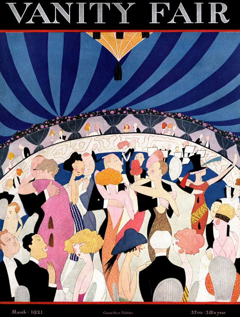
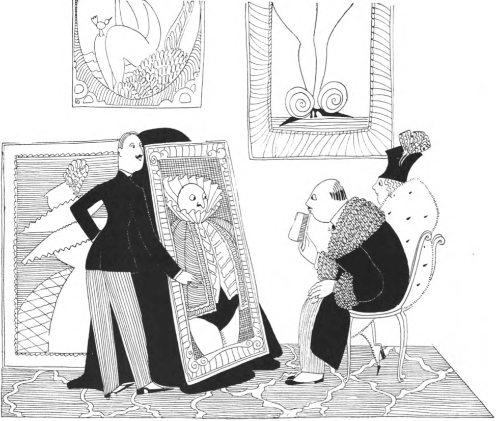
While Whiting and others have explored Stettheimer’s connection to published cartoons, the subject is particularly relevant to this painting. Stettheimer’s comedic depiction of the bargain hunters in the center of this composition references, but also transforms, images from a specific genre of cartoons: those commonly found in upscale periodicals mocking the poor manners of the rising middle class.78 The spectacle of a parvenu violating the code of manners in an upper-class setting was the premise of countless, often ruthlessly scornful illustrations. One such image is Fish’s Old Ancestors for New, published in Vanity Fair in 1921 in a feature called “A Collection of Collectors” (fig. 15).79 The cartoon and its accompanying text are merciless. The caption explains that these “crude people” are new millionaires from Racine, Wisconsin, quite literally trying to purchase the illusion of upper-class breeding by buying historic portraits to pass off as paintings of their own ancestors. In contrast to the art dealer, the husband and wife are pudgy and unfashionably dressed, and the hapless man betrays his poor manners by holding the brim of his hat to his lips.
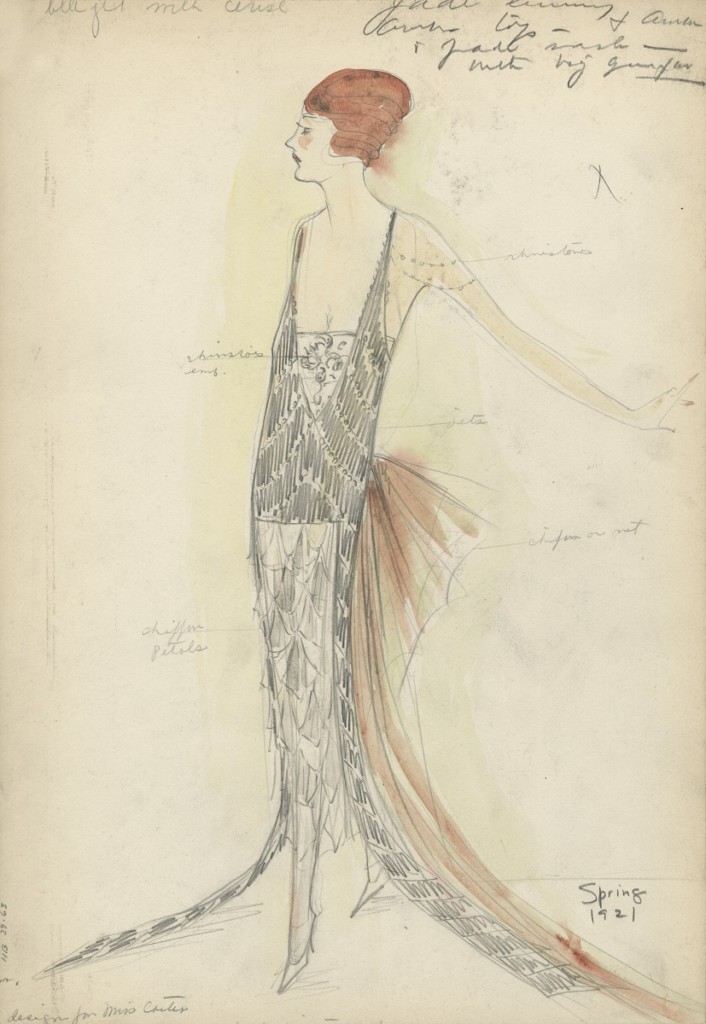
Stettheimer also drew on an entirely different and previously unpublished set of illustrations. Bendel, like other couturiers, brought the high fashion designs he saw in Paris and other European cities back to his American customers in the form of one-of-a-kind, original watercolor and gouache drawings executed by a variety of hired illustrators.80 If a customer chose to purchase a dress, he marked that drawing with her name and personalized notations of her preferred colors, materials, and styles, guaranteeing that it could not then be presented to another client. Bendel’s spring 1921 couture drawing inscribed “design for Miss Carter,” for example, includes handwritten pencil notations such as “rhinestones” at the shoulder and “chiffon petals” at the skirt (fig. 16). Even though it was sold at Bendel’s at the precise moment depicted in Spring Sale at Bendel’s, the spring of 1921, Miss Carter’s made-to-order dress could never appear in the pile of marked-down clothes at the center of the painting.
Couture presentation sketches, in which women unfailingly stand perfectly poised and still, would have represented to Stettheimer, and the limited number of upper-class customers who also knew them, the antithesis of the bargain hunters in Spring Sale at Bendel’s. If Vanity Fair cartoons showed the upper-middle classes behaving badly, couture illustrations presented to fashionable upper-class women an idealized vision of themselves. While the women in Spring Sale at Bendel’s gesture wildly as they rush about, those in the couture sketches are dignified. There are, however, strong similarities between Stettheimer’s figures and those in the illustrations. For example, the woman in green at the very center of the painting, jumping through the air to grab a garment on the table, has the same lean, elongated body and tiny high heels as the woman in the sketch. This visual relationship between the figures in Stettheimer’s painting and those private illustrations, combined with the stark contrast in their decorum and behavior, again humorously posits a lack of manners as a defining characteristic of the upper-middle class.
While Stettheimer’s illustrative sources illuminate the parody in Spring Sale at Bendel’s, the painting itself is no popular print or scornful cartoon. The influence of commercial images on Stettheimer’s art is undeniable, but her work stubbornly resists duplication. Stettheimer’s paintings are not reproducible products, and after her 1916 exhibition she characteristically did not offer them for sale. They are emphatically handmade, incorporating three-dimensional elements, custom frames, thick masses of paint, subtle layers of slightly-tinted whites, and glittering metallic surfaces (like those in New York/Liberty) that are still difficult to photograph. Stettheimer’s representation of bargain shoppers is also a complex, multifaceted modernist image that presents a nuanced depiction of the intermingling of classes, not a straightforward satire like Old Ancestors for New. The luminous scene and joyful, dancing movements of the women offer instead a riotous spectacle at once indecorous and fun. Little vignettes like the two women in pink at the left, one seemingly lifting a green dress off another, are humorous but not disdainful. Although the viewer is placed in a position above, and even superior to, the scene, the entry of these less wealthy, more uninhibited women into this elite boutique is also a source of interest and amusement.
Exhibiting Spring Sale at Bendel’s
When Stettheimer exhibited Spring Sale at Bendel’s in the annual exhibition of the Society of Independent Artists in 1922, she placed this intimate painting before a highly diverse public. The Society of Independent Artists was established and run by many major modernists, including artists such as Marcel Duchamp, Walter Pach, and Sloan, and prominent patrons like Dreier and Walter Arensberg. Stettheimer was a founding member of the society and participated in its annual exhibitions from 1917 until 1926. These shows opened each year to vast, all-but-unmanageable crowds.81 With no jury and no prizes, anyone who paid an entrance fee could participate, and the resulting many hundreds of works submitted were hung alphabetically by artist. As is well known, that first year Marcel Duchamp submitted under a pseudonym a readymade urinal with the title Fountain, which was controversially rejected from the exhibition.82 This drew much attention and many visitors to that show, and even in 1922 the exhibition was still associated in the public mind with what the popular press characterized as bizarre and outrageous modern art.83
Like Spring Sale at Bendel’s, the Society of Independent Artists shows as a whole were filled with internal contradictions, diverse positions, and humor of all kinds. In this seemingly egalitarian space, among a wide spectrum of objects and people, distinctions based in class, gender, and status emerged. The audience included those interested in and knowledgeable about modernism, those left intimidated and bewildered, and those who came just to mock it. The shows were ostensibly designed to welcome people of all classes, including amateurs with no art world connections, yet from 1919 onward they were held on the roof of the Waldorf Astoria, one of the most exclusive hotels in the city.84 They were organized solely by art world insiders, even as the surrounding rhetoric described a radical leveling of cultural hierarchies. The lack of jury and alphabetical display, designed to scramble existing categories and eliminate curatorial value judgments, left many members of the general public confused and alienated. Less sophisticated visitors were identified and judged by their manners, although here it was their excessive formality, not informality, that gave them away. John Sloan, president of the society, expressed his frustration with the habit of some art world neophytes to “take off their hats, talk in whispers, and tiptoe around a gallery,” demonstrating reverence but no enjoyment of the objects on view. In 1924, he attempted to correct this behavior by hanging a placard near the Society of Independent Artists exhibition entrance directing visitors to “keep your hat on.”85 Others were there to make fun of what they saw; a mass-market newspaper review of the 1922 exhibition proclaimed that the show had opened “to the usual salvo of jeers,” but “thrived on ridicule” and was “sure of publicity from laughter.”86
Spring Sale at Bendel’s engaged the laughter, both appreciative and derisive, that characterized the Society of Independent Artists exhibition as a whole. When Stettheimer submitted the painting, she gave up control over the objects with which it was seen. It became part of a motley assortment of 845 amateur and professional works. The painting was praised, with one critic singling it out as “alive with biting humor.”87 Yet who was being bitten? The cartoonish depiction of ill-mannered bargain hunters in the painting would have been recognizable to a broad public. Some audience members (perhaps including those inclined to keep their hats on) might have seen themselves in Stettheimer’s shoppers, conspicuous and out of place in a space where they did not know how to behave. At the same time, upper-class Bendel’s customers, particularly those select few familiar with couture presentation sketches, could have smiled knowingly at the joke.
A focused examination of Stettheimer’s work, and the individual venues through which it circulated, reveals intricate hierarchies within a fluctuating world. Even standing side by side, viewers of various backgrounds could have wildly disparate experiences of what they saw. The Belmaison Gallery showed everything from recent work by Picasso to modern decorative art to polo saddles, while the accompanying brochures document that these objects were categorized differently. Museums collaborated with department stores to advance commerce, while modernist gallery owners attempted to draw a line between their enterprises and what they defined as crass mercantilism. The Society of Independent Artists presented exhibitions structured to open the art world to everyone, yet many outsiders left them bewildered, or even entered the space to laugh, thereby reinscribing a boundary between themselves and the avant-garde. Spring Sale at Bendel’s represents the joyful transformation by the bargain hunters of the first floor of the elite space of Bendel’s, yet it also maps the tensions that accompanied it. Examining and tracking Stettheimer’s paintings exposes implicit distinctions rooted in class and gender that complicate our understanding of the intermingling of modernism and commercial culture in this period.
Cite this article: Heather Hole, “Florine Stettheimer, the Department Store, and the Spaces of Display, New York 1916–1926,” Panorama: Journal of the Association of Historians of American Art 3, no. 2 (Fall 2017), https://doi.org/10.24926/24716839.1604.
PDF: Hole, Stettheimer
Notes
- “Checklist, Exhibition of Paintings and Drawings Showing the Later Tendencies in Art at the Pennsylvania Academy of the Fine Arts,” April 16 to May 15, 1921, Archives of the Pennsylvania Academy of the Fine Arts, reproduced in Sylvia Yount and Elizabeth Johns, To Be Modern: American Encounters with Cézanne and Company (Philadelphia: University of Pennsylvania Press, 1996), 70–79; and “Decorative Mantels,” New York Times, April 17, 1921. ↵
- Stettheimer is known to have shown in the following five Wanamaker’s exhibitions: Decorative Paintings at the Wanamaker Gallery of Modern Decorative Arts, 1922; Annual American Exhibition, 1923; Second Annual Decorative Exhibition, 1923; Exhibition of Paintings, Watercolors, Drawings, Etchings, Lithographs, Photographs and Old Prints of New York City, 1923; and Third Annual Decorative Exhibition, 1924, from the collection of Belmaison exhibition brochures, The Wanamaker Gallery of Modern Decorative Art, Belmaison, Thomas J. Watson Library, The Metropolitan Museum of Art (hereafter cited as Belmaison exhibition brochure collection, Watson Library). This collection appears to be incomplete, and it is likely that additional brochures have been lost. ↵
- “Independent Show has Grown Serious,” American Art News 20 (March 11, 1922): 1. ↵
- Kristina Wilson, The Modern Eye: Stieglitz, MoMA, and the Art of the Exhibition, 1925–1934 (New Haven and London: Yale University Press, 2009), 7; and Richard Meyer, What Was Contemporary Art? (Cambridge, Mass.: The MIT Press, 2013), 37. ↵
- “Florine,” The New Yorker, October 5, 1946, 27. This quote is attributed in the article to “one of them,” and not to a particular sister. ↵
- Cécile Whiting, “Decorating with Stettheimer and the Boys,” American Art 14 (2000): 35. ↵
- Whiting, “Decorating with Stettheimer and the Boys,” 24–49. ↵
- Florine Stettheimer to Ettie Stettheimer, December 9, 1922, Florine and Ettie Stettheimer Papers, Yale Collection of American Literature, Beinecke Library, Yale University (hereafter cited as Stettheimer Papers, YCAL). ↵
- Florine Stettheimer to Ettie Stettheimer, December 9, 1922, Stettheimer Papers, YCAL. ↵
- David Tatham, “Florine Stettheimer at Lake Placid, 1919: Modernism in the Adirondacks,” The American Art Journal 31 (2000): 27. ↵
- See, in addition to Whiting and Tatham, Parker Tyler, Florine Stettheimer: A Life in Art (New York: Farrar, Straus, 1963); Barbara J. Bloemink, The Life and Art of Florine Stettheimer (New Haven and London: Yale University Press, 1995); Elisabeth Sussman, “Florine Stettheimer: A 1990s Perspective,” in Florine Stettheimer: Manhattan Fantastica, 41–67; Ellen E. Roberts, “Florine Stettheimer: ‘What I Should Like is to Paint this Thing,’” in O’Keeffe, Stettheimer, Torr, Zorach: Women Modernists in New York, exh. cat. (West Palm Beach: Norton Museum of Art, 2016), 57–81; and Stephen Brown and Georgiana Uhlyarik, Florine Stettheimer: Painting Poetry (New Haven: Yale University Press, published in association with the Jewish Museum, New York, and the Art Gallery of Ontario, 2017). ↵
- Bloemink, The Life and Art of Florine Stettheimer, 71–76. ↵
- In her groundbreaking study of French Impressionist exhibition practices, Martha Ward offers a nuanced theorization of the development of domestic-style display as a reaction against the large, highly public and widely attended exhibitions that accompanied the contemporary expansion of the art market. See Martha Ward, “Impressionist Installations and Private Exhibitions,” Art Bulletin 73, no. 4 (December 1991): 599–622. See also Nancy Troy, “Domesticity, Decoration and Consumer Culture: Selling Art and Design in Pre-World War I France,” in Not at Home: The Suppression of Domesticity in Modern Art and Architecture, ed. Christopher Reed (New York and London: Thames and Hudson, 1996), 113. ↵
- Erin Hogan, “Traveling with the Eye: The Sites and Spaces of Modern Art in New York, 1915–1950,” (PhD diss., University of Chicago, 1999), 33. ↵
- For example, in 1919 Stettheimer showed only at the annual exhibition of the Society of Independent Artists, while in 1922, she showed at Decorative Paintings at the Wanamaker Gallery of Modern Decorative Arts; the annual exhibition of the Society of Independent Artists; the Exhibition of Contemporary American Art, Modern Artists of America, in the Joseph Brummer Gallery; Modern Sculpture Water Colors and Drawings at the Colony Club, New York; the 15eme Exposition of the Salon d’Automne in Paris; and the first annual exhibition of the No-Jury Society of Artists at Marshall Field’s in Chicago. In 1929, she began exhibiting again, although less frequently than she had before. ↵
- The gallery in Belmaison was referred to over time by variations on the name Wanamaker Gallery of Modern Decorative Art and by the name Belmaison Gallery. For simplicity’s sake, and to distinguish it from other Wanamaker’s art exhibitions, the space will hereafter be referred to as the Belmaison Gallery. Belmaison as a whole and the Belmaison Gallery inside it were distinct entities. ↵
- Neil Harris, “Museums, Merchandising, and Popular Taste: The Struggle for Influence,” in Cultural Excursions: Marketing Appetites and Cultural Tastes in Modern America (Chicago: University of Chicago Press, 1978), 56–81. ↵
- William Leach, Land of Desire: Merchants, Power, and the Rise of a New American Culture (New York: Pantheon Books, 1993), 8. ↵
- Ibid., 164. ↵
- From 1917 to 1923 these shows were titled “Exhibition of Work by Industrial Designers and Manufacturers,” and beginning in 1924, they were called “American Industrial Art Annual Exhibition.” The Metropolitan Museum of Art Exhibition Checklists, Watson Library; and Andrew McClellan, The Art Museum from Boullée to Bilbao (Berkeley: University of California Press, 2008), 205. ↵
- Zelda F. Popkin, “Art: Three Aisles Over,” Outlook and Independent 156 (November 26, 1930): 502. ↵
- Marilyn Friedman, Selling Good Design: Promoting the Early Modern Interior (New York: Rizzoli, 2003), 21. ↵
- Meyer, “Big, Middle-Class Modernism,” 105–6. ↵
- A. Joan Saab, For the Millions: American Art and Culture Between the Wars (Philadelphia: University of Pennsylvania Press, 2004), 84–86. ↵
- Sheeler exhibited at Belmaison at least six times between 1922 and 1925, at the same time Daniel was offering his work for sale. Belmaison exhibition brochure collection, Watson Library. ↵
- Edith G. Halpert, “The Function of the Dealer,” College Art Journal 9, no. 1 (Autumn 1949): 54. ↵
- Herbert J. Seligmann, Alfred Stieglitz Talking: Notes on Some of his Conversations, 1925–1931 (New Haven: Yale University Press, 1966), 11. ↵
- Ibid. ↵
- Laura Morowitz, “A Passion for Business: Wanamaker’s, Munkácsy, and the Depiction of Christ,” Art Bulletin 91, no. 2 (June 2009): 195–98. ↵
- By the time Belmaison opened, the New York store was run by Rodman Wanamaker, who like his father was a collector of highly traditional art. He seems to have played no role in the Belmaison Gallery. ↵
- New York City and the John Wanamaker Store: Compliments of John Wanamaker (New York: John Wanamaker, 1916), 72. ↵
- Ibid., 51–71. ↵
- Leach, Land of Desire, 72. ↵
- New York City and the John Wanamaker Store, 55–56. ↵
- Wanamaker’s advertisement, “The House Beautiful,” The Times (Philadelphia), March 19, 1888, 4; and Leach, Land of Desire, 80. ↵
- Fifi de Richemont, “The Use of French Phrases in Advertising Copy,” Advertising and Selling 19 (January 11, 1919): 10. ↵
- Belmaison Interior Decorations, John Wanamaker–New York (New York: John Wanamaker, 1919), Watson Library, The Metropolitan Museum of Art. ↵
- Belmaison Interior Decorations, 5. ↵
- Belmaison Interior Decorations, 6. ↵
- Belmaison Interior Decorations, 14–21. ↵
- Ruby Ross Goodnow, “An Exhibition of Contemporary Paintings and Sculpture, April 25th to May 18th, 1921.” Belmaison exhibition brochure collection, Watson Library. ↵
- Belmaison exhibition brochure collection, Watson Library. ↵
- For an examination of one form of cross-pollination between fine and decorative art that flourished over the course of the 1920s, see Cynthia Fowler, Hooked Rugs: Encounters in American Modern Art, Craft and Design (Burlington, Vt.: Ashgate Publishing Company, 2013). ↵
- “Art Exhibitions of the Week,” New York Times, February 10, 1924. ↵
- Louis Bouché, interview by John Morse, August 7, 1959, transcript, Archives of American Art (AAA), Smithsonian Institution, unpaginated. ↵
- Reviews were usually limited to two or three paragraphs within a broad survey of current gallery shows. See, for example, “Current Shows in New York Galleries,” American Art News 20, no. 19 (February 18, 1922): 1, 8, and American Art News 20, no. 5 (November 12, 1921): 10. ↵
- Marsden Hartley to Alfred Stieglitz, March 27, 1925, Alfred Stieglitz/Georgia O’Keeffe Archive, Yale Collection of American Literature, Beinecke Library, Yale University, as quoted in Townsend Ludington, Marsden Hartley: The Biography of an American Artist (Boston: Little, Brown and Company, 1992), 173. ↵
- Bloemink, The Life and Art of Florine Stettheimer, 272–73, n61. ↵
- Louis Bouché, “An Exhibition of Paintings by French Cubists and Post Impressionists, November 22 to December 17,” 1921. Belmaison exhibition brochure collection, Watson Library. ↵
- Bouché, “An Exhibition of Paintings by French Cubists and Post Impressionists,” 1921. ↵
- “Modernism at the Belmaison Gallery,” Arts and Decoration 16/17 (1921): 162. ↵
- Bouché, interview by John Morse, AAA. ↵
- Louis Bouché, “Exhibition of Paintings, Watercolors, Drawings, Etchings, Lithographs, Photographs and Old Prints of New York City,” May 19 to June 15, 1923. Belmaison exhibition brochure collection, Watson Library. ↵
- This map was Novi Belgii Novaeque Angliae: nec non partis Virginiae tabula multis in locis emendata, published by Nicolaus Vischer (alternate spelling Visscher) and printed in 1656 (state 1655:01c or later). stonybrook.edu/libmap/Visscher.htm. ↵
- “A New York Exhibition,” 1–2. ↵
- Ann Hagedorn, Savage Peace: Hope and Fear in America, 1919 (New York: Simon and Schuster, 2007), 19; Robert Zieger, America’s Great War: World War I and the American Experience (Lanham: Rowman and Littlefield, 2001), 187; and Bloemink, The Life and Art of Florine Stettheimer, 52. ↵
- Jason Weems, Barnstorming the Prairies: How Aerial Vision Shaped the Midwest (Minneapolis: University of Minnesota Press, 2015), xi. ↵
- Bouché, interview by John Morse, AAA. ↵
- Kristina Wilson, “One Big Painting: A New View of Modern Art at the Brooklyn Museum,” in The Société Anonyme: Modernism for America, ed. Jennifer R. Gross (New Haven and London: Yale University Press, 2006), 88. ↵
- Meyer, “Big, Middle-Class Modernism,” 100–1. ↵
- Louis Bouché to Katherine Dreier, December 2, 1925, Katherine S. Dreier Papers/Société Anonyme Archive, Yale Collection of American Literature, Beinecke Library, Yale University. ↵
- For an examination of this broad shift and its relationship to modern art, see Nancy J. Troy, Couture Culture: A Study in Modern Art and Fashion (Cambridge, Mass.: The MIT Press, 2003). ↵
- “The New Bendel’s,” Edison Monthly 10 (September 1917): 112–14. ↵
- John William Ferry, A History of the Department Store (New York: The Macmillan Company, 1960), 96–99. ↵
- See, for example, Marie Clifford, “Working with Fashion: The Role of Art, Taste, and Consumerism in Women’s Professional Culture, 1920–1940,” American Studies 44, nos. 1/2 (Spring/Summer 2003): 59–84. ↵
- “The New Bendel’s,” 112–14. ↵
- Ibid.,112. ↵
- Leach, Land of Desire, 94. ↵
- “Women Plead for Striker,” New York Times, November 24, 1914; and “Girl Tailors Deaf to Strike Calls,” New York Times, September 23, 1915. ↵
- Leach, Land of Desire, 75. ↵
- Florine Stettheimer, Crystal Flowers: Poems and a Libretto, eds. Irene Gammel and Suzanne Zelazo (Toronto: BookThug, 2010), 68. ↵
- See Susan Fillin-Yeh, “Dandies, Marginality and Modernism: Georgia O’Keeffe, Marcel Duchamp and Other Cross-Dressers,” Oxford Art Journal 18 (1995): 33–44, and Whiting, “Decorating with Stettheimer and the Boys.” ↵
- See Eric J. Segal, “Norman Rockwell and the Fashioning of American Masculinity,” The Art Bulletin 78, no. 4 (December 1996): 633–46. ↵
- Whiting, “Decorating with Stettheimer and the Boys,” 28. ↵
- Ibid., 38–39. ↵
- Linda Nochlin, “Florine Stettheimer: Rococo Subversive,” Art in America 68 (September 1980): 72–73. Whiting, “Decorating with Stettheimer and the Boys,” 43. Sussman, “Florine Stettheimer: A 1990s Perspective,” 48. ↵
- Wanda Corn, The Great American Thing: Modern Art and National Identity, 1915–1935 (Berkeley: University of California Press, 1999), 215–16. ↵
- Whiting, “Decorating with Stettheimer and the Boys,” 37–39. ↵
- Anne Harriet Fish, “A Collection of Collectors,” Vanity Fair 16, July 1921, 54–55. ↵
- Henri Bendel Sketch Collection, Brooklyn Museum. The Brooklyn Museum holds sketches dating back to 1912, but Bendel employed this practice earlier. ↵
- “Independent Art Draws Huge Crowds,” New York Times, March 12, 1922. ↵
- Corn, Great American Thing, 43–46. ↵
- David Lloyd, “Independents Like Public’s Ridicule,” New York Evening Post, March 13, 1922. ↵
- “Independent Artists’ Exhibition,” New York Times, February 23, 1919. ↵
- “‘Keep Your Hat On,’ is advice at Art Exhibit to Teach Love Instead of Respect for Art,” New York Times, March 11, 1924. ↵
- Lloyd, “Independents Like Public’s Ridicule.” ↵
- “Independent Show Has Grown Serious,” 10. ↵
About the Author(s): Heather Hole is Assistant Professor in the Department of Art and Music at Simmons College, Boston.

