City, River, Mountain: Wayne Thiebaud’s California
For decades now, art historians, critics, art enthusiasts, gallerists, and readers of The New Yorker have been very familiar with Wayne Thiebaud’s cakes, pies, deli counters, and gumball machines. His reputation was firmly established with food paintings such as Around the Cake and Delicatessen Counter in the early 1960s (figs. 1, 2). Usually associated loosely (and somewhat erroneously) with the Pop Art movement, these upbeat paintings with their bright colors, their common everyday, very American food subjects, sly geometry, shallow depth of field, and wry humor are frequently exhibited, published, and commented on.1 Less well-known, and virtually unremarked on by art historians, are the extraordinary landscapes that have resulted from his pursuit of this genre. This essay touches on continuities between Thiebaud’s food paintings and his landscape paintings, and on the ways his landscapes broach the seemingly irreconcilable differences between abstraction and representation. Centrally, it engages the ways in which his landscape paintings, focusing on the ecologies of California, engage major human concerns about place, space, and habitation.
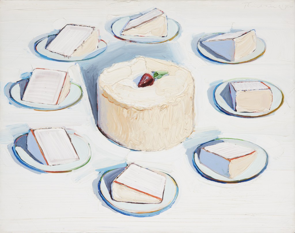
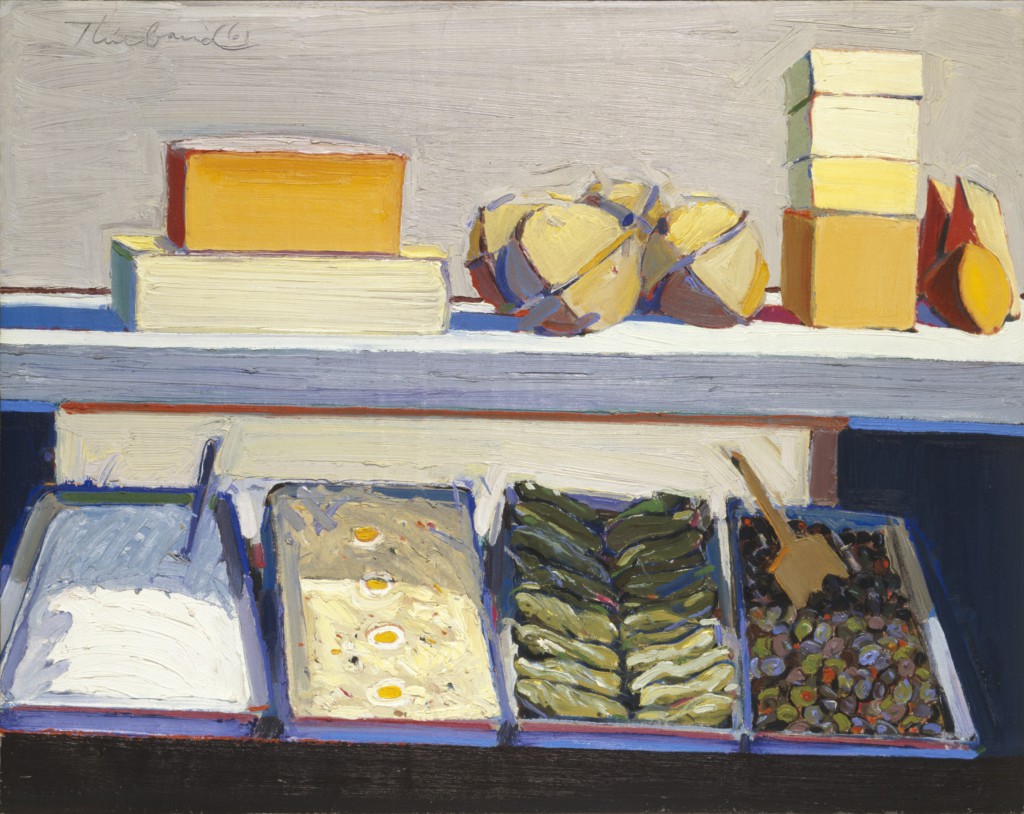
Lawrence Alloway, the New York curator and critic who welcomed the emergence of Pop Art in the 1960s and championed Thiebaud as the “laureate of lunch counters” and a modern-day Chardin, was confounded when he saw the artist’s first landscape paintings.2 “Burn these landscapes, burn your brushes, and eat the ashes, and never paint them again,” he urged the artist.3 What did Alloway (and others) find so disturbing about Thiebaud’s nascent swerve into the genre of landscape painting? To begin to answer that question we need to look briefly at the character of art criticism with which Alloway was familiar, twentieth-century attitudes toward landscape painting, and, with care, at Thiebaud’s works themselves, for the artist declined to burn his canvases, his brushes, or abandon his desire to pictorially investigate space, place, and land.
While Alloway’s injunction to Thiebaud to eradicate all trace of his landscapes seems harsh, it is not as remarkable as it seems when viewed in light of the heated rhetorics of criticism circulating with the midcentury paradigm shift as modernism lost traction. Understood and interpreted as the pinnacle achievement (and a singular American contribution) in the development of Western art, Abstract Expressionism stirred its apologists to savage attacks on the postmodernists and others who challenged their orthodoxy. Alloway himself, in characterizing Thiebaud as a modern-day Chardin, was vigorously slammed in the Partisan Review by Peter Selz (then curator at the Museum of Modern Art) for endorsing Thiebaud and others; Selz compared the newcomers to Nazi and Soviet artists and opined that their works were, in his opinion, “slick, effete, and chic,” evidence of “profound cowardice” “cater[ing] to infantile personalities,” vigorously denigrating Alloway’s Pop artists with incendiary political and sexual slurs.4 My point is not to excuse Alloway for his termagancy by suggesting that he necessarily gave as good as he got, but to underline the anger, fear, alarm, and disdain with which the return to representational art was met. For Selz, the challenge of Pop Art was unseemly, a regressive sign of objectionable political and sexual deviance. For Alloway, representational art of the sort being made by the Pop artists was exciting and commendable, but landscape was clearly one bridge too far.
Alloway’s “burn these landscapes” found its source in a post-1945 skittishness about landscape as a passé genre. It has recently been described as “the ‘dreamwork’ of imperialism,” as a genre that “has lost much of its claim to be an important preoccupation of progressive artists,” but that persists as a “defunct artistic tradition . . . [as the] ‘romanticizing’ and idealizing conceptions of landscape” that is “the daily fare of regional and [provincial] city galleries, newspapers, and art centers.”5 Alloway’s endorsement of Thiebaud’s representational art in still life, with its shallow depth of field and its less vexed relationship to ideology, imperialism, and “romanticizing” popular culture, did not extend to representation in landscape hobbled by these three serious cultural disabilities. Even Thiebaud’s New York dealer, Allan Stone, was not entirely welcoming of these works, responding when he first saw them, “My god! I’ve just gotten people used to your pies.”6
The most straightforward link between Thiebaud’s work in still life and landscape is paint handling—the management of his medium is as much Thiebaud’s signature as the subject: oil paint manipulated with a swirling flat brush or paint spatula that imitates the medium of the cake icing or egg salad that it represents (and underlines in relief the edges of the form described). These juicy impasto (or relief) passages draw attention to the handmade character of the work, allow us to empathetically feel the gesture of the artist’s hand, and draw attention to the character and the act of representational imitation. The rhyming of such very different artistic media in these works (for instance, paint and icing), and the attention that rhyming draws to the crafting of paintings, is also a feature of Thiebaud’s extraordinary, more enigmatic, less well-known landscape paintings, where gestural strokes rhyme, for instance, with the edge of a river’s flow.
The second link between Thiebaud’s food paintings and his landscapes is, as he put it, his long-term “pursuit of the kind of painting in which I am most interested—painting that is representational and abstract simultaneously.”7 This simultaneity takes the form in the food paintings of objects that we recognize as crafted foods but also as abstract, or platonic, perfect geometric forms: cream soup plates that are circles, gum balls that are spheres, cakes that are stubby cylinders, cheese bricks that are rectangles, ice cream treats that are conjoined cones and spheres, and pie servings that are volumetric triangles.8 These are complex foods that have been made into simple shapes; in fact, subjected to Euclidian geometry. Their “abstraction” is underlined by the precision of their forms and their repetition; their representationality is underlined by their recognizability and their chromatic variability. As we will see, the strategies Thiebaud mobilizes to give us simultaneous representation and abstraction in landscape are different (and bolder), but the goal is essentially the same.
With the jocund bakery pastries and orderly deli counters in the foreground of his production, his exhibitions, and his reputation in the 1960s, Thiebaud quietly initiated the very different and important investigation into the nature of land, place, and space that some critics found profoundly unsettling. In doing so he was venturing into vexed territory—a kind of terra inconnu that appeared, to some, to deviate too substantially from his recognized oeuvre, and that deliberately challenged key precepts of post-1945 painting theory and practice. Landscape painting (and commentary on this genre) by ambitious artists and critics in the second half of the twentieth century is remarkably slim, exhibiting a profound nervousness about potential association with down-market popular visual and sentimental culture where representational landscape art thrived.9 Here, in the work of artists such as Eric Sloane, nineteenth-century conventions, concepts of nature, and the sentimental tug with which some avant-garde modernists have feared association persisted.10 A characteristic insistence of this still-active worry about realism is evident in such recent comments about Thiebaud as “a realist to the core. . . . what rescues [Thiebaud’s paintings] . . . from sentimentality is the fact that he eliminates illusionistic, spatial perspectives.”11 That representation risks both illusion and sentimentality is at the core of an anxiety, surfacing here with a reassurance that the artist has “rescued” himself from these presumed pitfalls that the critic cannot help conjuring.
Modernism’s repudiation of representational space was not just a deliberate decoupling of the visible world from the work of art; it was a retreat from the entanglements of high-stakes politics.12 Equally important, it was a repudiation of the romantic notion of nature in ecological balance, a concept thought to be fundamental to Hudson River School painting and nineteenth-century landscape design with long-term “suffocating” impact on ecologists, environmentalists, and landscape designers (and by extension, all of us) into the twenty-first century.13
The eschewal of landscape painting by most serious artists in the second half of the twentieth century was, then, not a judgment on its unimportance, but rather a suppression or evasion of its well-known historic manifestations and, perhaps more important, its continuing vernacular power. A few devised bold strategies to incorporate (and comment on) landforms, ecologies, and human interventions in the natural world while embracing modernism’s theory of the canvas. Prominent among these is Thiebaud, whose strategy is to paint landscapes that call attention to the fact of the two-dimensional canvas while delivering recognizable forms and places, deploying what could be called an unsettling kinesthetic, even visceral, model of landscape viewership.14 He asks us to think about and respond to larger concerns of human habitation on the planet as well as to the canvas as an artwork.
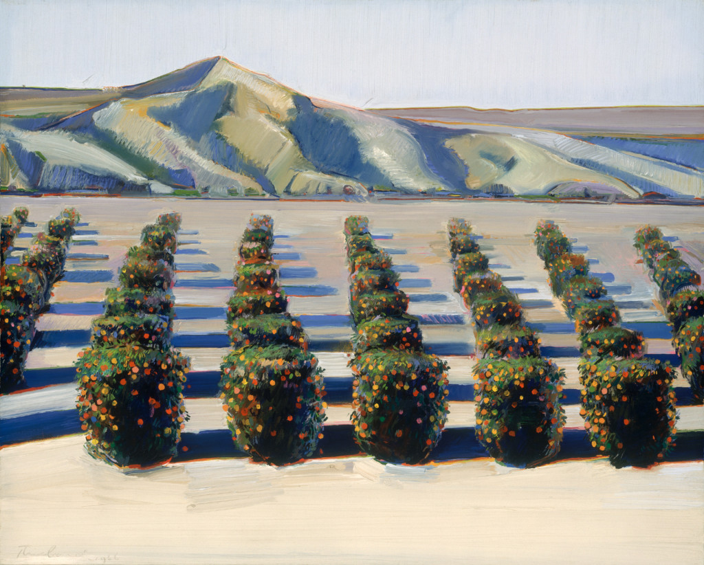
Despite Alloway’s biting critique, Thiebaud persisted in painting landscapes.15 In Hillside, 1963, and Orange Grove, 1966, two early landscapes (figs 3, 4), the cerulean blue shadows, vibrant edges, dramatic color juxtapositions, and rhyming forms familiar in his food paintings move outdoors to the complex geometry of geological forms and agricultural planting. Exemplary of his early forays and pregnant with what was to come, Hillside is a small canvas with luscious paint not quite describing, perhaps implying, a steep hillside with no clear beginning or end or footing for the viewer.16 It was painted quickly, in four or five hours, in response to a brilliant sunlit moment.17 We note immediately the unsettling denial of classic landscape conventions and organizational principles (bracketing trees, aerial perspective, linear perspective, stable low horizon line, a central zigzag path back into deep space, laboring staffage figures). Instead, the painting makes one bold, dramatic, enigmatic statement about a steeply diagonal slope and about the robustness and the diminutiveness of the earth’s crust.
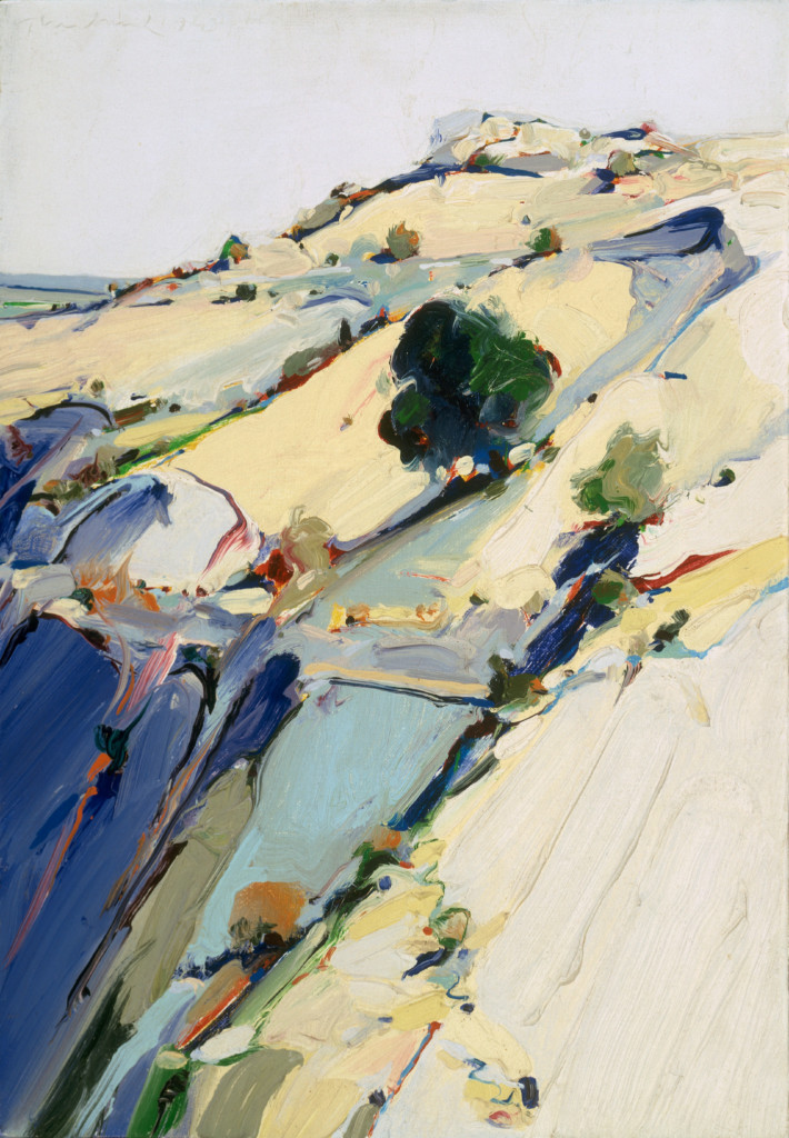
Thiebaud speaks of landscape painting as a process of “orchestrating” three kinds of overlapping visual truths.18 The finished works are simultaneously, in varying degrees, faithful records of his onsite observation of specific landscapes, conjurings of remembered landscapes, and fictions constructed as self-contained, self-explanatory elements organized around the inventions and logics of the two-dimensional canvas as much as the logics of vision. The role of direct observation (“actual confrontation with the world where you sit down and look at it”) is evident in the artist’s account of Road Through (fig. 5).19
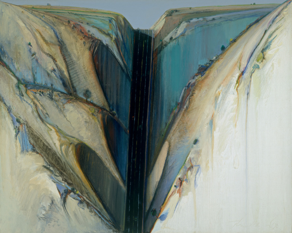
This work was prompted by Thiebaud’s drive through a dramatic road cut in southern California where Interstate 5 follows a ruler-straight path sliced through the Tehachapi mountains, the roadway descending in a six percent grade from the Tejon Pass to the village of Grapevine, flanked by escape sandpits for runaway eighteen-wheelers. He was struck by the scene as “a heroic human achievement against great odds,” the three-dimensional record of engineers and roadworkers “fighting against natural obstacles and blasting through,” leaving deeply shadowed sharply sliced cuts in the earth, chiseled records of heroic violence.20 Pausing in his journey, he drew the scene (“I carry a sketchbook all the time”) that would evolve into Road Through.21 The process begins with drawing not just as an aide memoire but as a discipline in looking: ‘’The biggest achievement and richest gift of drawing is not the drawing, but the new eyes that it gives you because it teaches you how to see in a way you can’t see otherwise.”22 The drawing resulting from that seeing is fundamental. “Drawing, to me, is a kind of inquiring research tool that painting rests upon. . . . I’ve drawn all my life,” reports the artist.23 Road Through—as other landscape paintings—began as a drawing. It records the visual and kinesthetic experience of a dramatic stretch of freeway where cliff-like slopes (daunting because seemingly steeper than the angle of repose for these rocks) flank a plunging Interstate roadway.
If drawing is a research tool, the studio is the site where memory collaborates with the drawing(s) to suggest scale and color, filtering the scene seen into dominant and recessive elements. Most important, and most difficult to understand (and teach) are the logics of art, the making of the thing seen and the thing remembered into a self-sufficient object that works visually in itself in a lengthy process of revision, the artist “orchestrating forms . . . so you have rhythm and serialization, . . . a process of composing.”24 Thiebaud speaks of this as working “to get it to come together,” reveling in the strenuous need “to paint and try to get the space [of the painting] to work.”25 He makes clear that for him, at a certain point, the painting begins to dictate terms: “The premise of the painting . . . is its own premise, and has to be. . . . It will tell you. And if you are not listening to that . . . the painting is equivocated.”26 Thiebaud’s own consciousness of the craft and process of painting certainly contributes to his interest in and empathy with the skilled crafting of cakes and orchards and roadways.
Orange Grove is a particularly clear example of the logics of art trumping the logics of vision. Here Thiebaud’s lines of well-pruned fruit trees do not converge as they would if we observed an actual orchard, but rather they splay out in regimental lines, gesturing toward the distant mountains, keeping the space of the painting open, and slowing the tempo of our visual careen into deep space. The painting, in other words, reproduces recognizable objects and places, but the artist eschews classic one- or two-point perspective systems that mimic binocular vision and our daily perception of reality. Thiebaud’s object is to create a painting that works on its own terms. However fresh and complete the finished product appears, the process is a substantial (and often long) quest, rife with complexities: “Painting itself is a kind of miracle, because what you’re doing is reducing a three-dimensional world of living, active, organized chaos into this little, . . . unmoving, quiet, flat thing, which has to . . . be able to speak.”27 The painter’s task, as Thiebaud sees it, is to turn a limitless, dynamic, unscripted tableau of visual events into a legible, bounded, rectangular arrangement of colors that rewards the viewer’s attention.
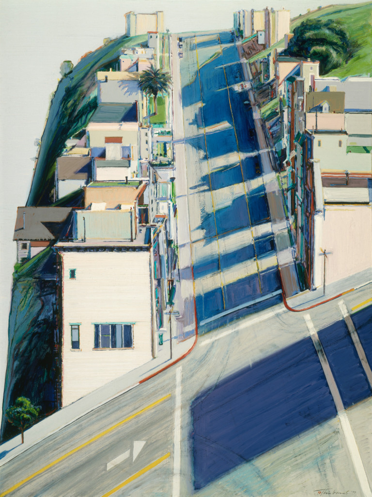
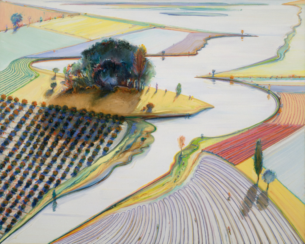
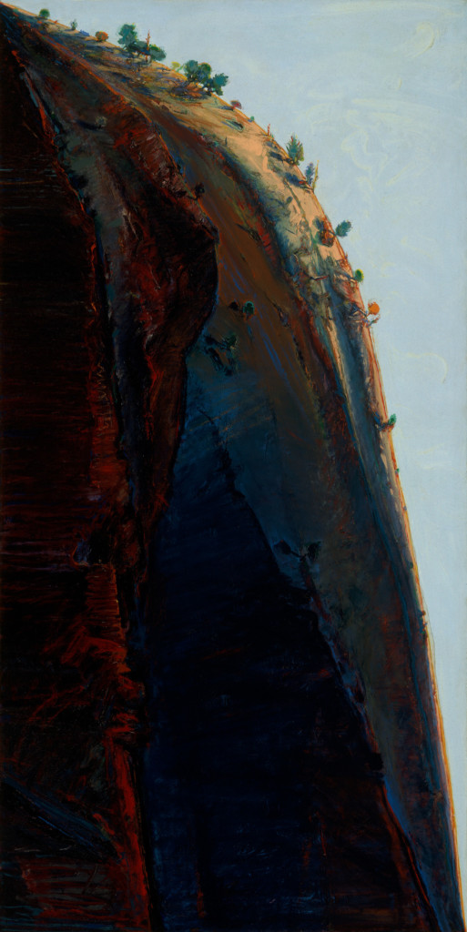
Since early experiments such as Hillside in the 1960s, Thiebaud’s landscapes have become more numerous and coalesce into three subject categories: San Francisco streetscapes such as Ripley Ridge, images of the Sacramento River Delta as we see in Waterland, and mountains, especially the Sierra Nevada range, characteristically Yosemite Ridge (figs. 6, 7, 8). In each set, he has produced a vivid and thought-provoking group of images of human-altered space and human habitation commenting on three important California ecologies: vertiginous urban San Francisco streets, rural Sacramento River Delta farmland, and the towering mountains of the West. Landscape painting flourished in the seventeenth, eighteenth, and nineteenth centuries as a way for artists to describe, and their audiences to understand (or question), the relation between humans and the natural world, between nations and their homelands. Unlike, for instance, Abstract Expressionist paintings that are centrally about the artist’s interior state or the evocative power of color relationships, historical landscape paintings describe, in varying degrees, elements that are familiar from the ambient world; they look as though they are about nature, but they are usually about human-made space, human activities, alliances, and ideologies. In Thiebaud’s terms, paintings are crafted objects that comment on crafted space; they “tattle on us and our preoccupations.” These three sets of landscapes tend to be not only “representational and abstract simultaneously”; they “tattle” on what Americans have done to the land to accommodate the needs and desires of successive generations, and they suggest attitudes of the artist (and of Americans writ large) toward human landscapes, habitation, and an unquiet planet.28
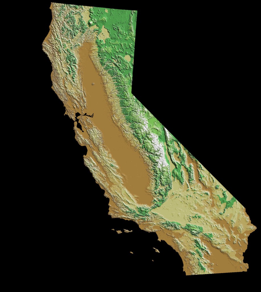
California’s three main geographic (and economic) zones are a temperate, hilly coastal region; a huge, flat Central Valley; and a ridge of high mountains, the Sierras, along the eastern edge (fig. 9). Most of its thirty-nine million inhabitants live near the coast, in the urban San Francisco Bay area in the north and the Los Angeles area in the south. If it were a country, California would have the sixth largest economy in the world, right behind the United Kingdom and ahead of France. Its capital is Sacramento, a seaport city located inland on the Sacramento River that was the main provisioning site for forty-niners en route to the gold fields in the Sierra foothills during the Gold Rush. It is a seaport, but it is in the Central Valley, a vast, flat, fecund agricultural basin that is the source of a large percentage of the fruits, nuts, and vegetables that feed the nation. Sacramento is not a town that has attracted a large community of artists. Thiebaud, however, has chosen to live in this capital city, and for many years he headlined in the Art Department at the University of California, Davis, nearby.
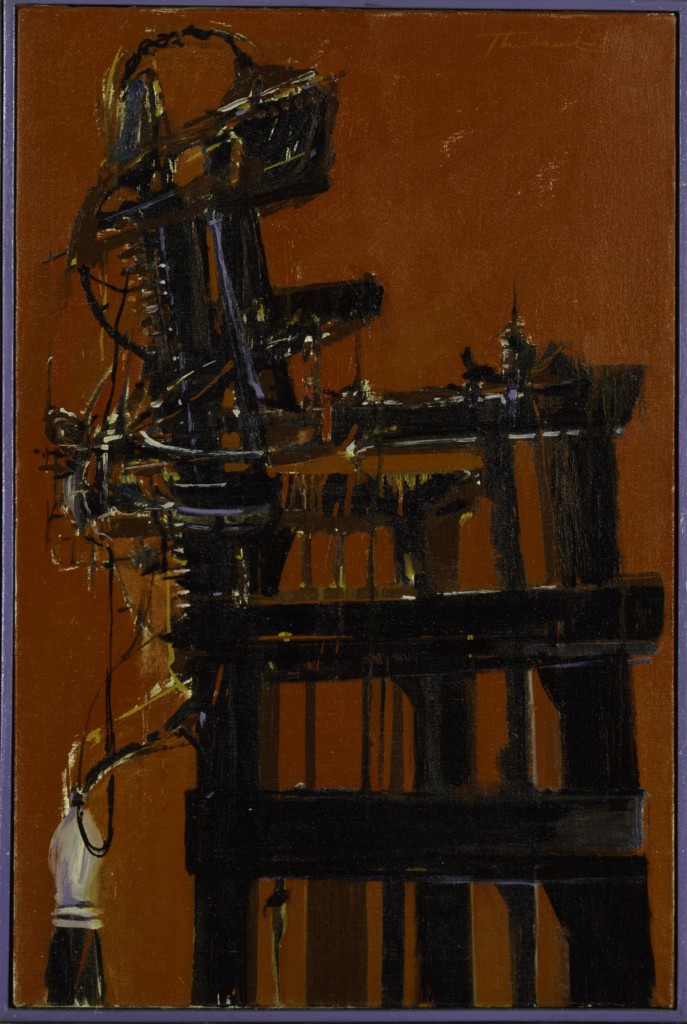
Sacramento is 2,827 miles from New York City, where the vast majority of American artists cluster hopefully and clamor for attention. Sacramento is where Thiebaud lives and California is what he paints. It was not always so. After training in trade school and working in commercial advertising and military cartooning in southern California, in 1956 to 1957, Thiebaud spent a year in New York City in contact with the most progressive artists of that decade. He speaks most consistently of the importance of Willem de Kooning during this important episode in his life.29 Already at this early date, when Thiebaud had yet to find his subject(s), he had developed the thick, gestural impasto brushstrokes and emotionally charged primary colors that were to characterize his later paintings, as we see in Electric Chair of 1957 (fig. 10).30 . . . de Kooning in terms of his premier coup bravura painting” (Thiebaud, “Wayne Thiebaud Interview,” Academy of Achievement, 8), and he credits the group around de Kooning with helping him manage the technical aspects of painting (Thiebaud, conversation with the author, July 2, 2013). Electric Chair is one of a series of works focusing on this subject inspired by protests concerning the execution of Caryl Chessman. See Paul LeBaron Thiebaud to Arthur J. Levin, letter of October 5, 1986, curatorial files, Smithsonian American Art Museum (SAAM).
There is also a second electric chair painting at SAAM (Composition, 1957, watercolor and gouache). Both were in a substantial bequest from Edith S. and Arthur J. Levin in 2005, which included works by Elaine de Kooning (Portrait of Jack Greenbaum,1959) and several northern California artists. See Mary Okin (University of California, Santa Barbara), forthcoming article concerning the Levin bequest and the relationship between Thiebaud and the deKoonings, focusing on the electric chair series. That Thiebaud’s paintings might be more political than is usually credited is suggested by John Yau in his linking of the artist’s Eight Lipsticks of 1964 with the Cuban missile crisis. See Yau in Baker, Weber, et al., Wayne Thiebaud, 30. A conjunction of militarism with cosmetics was an idea that Claes Oldenburg would capitalize on five years later in his Lipstick (Ascending) on Caterpillar Tracks (1969; Yale University).] This unusual subject (five years before Andy Warhol began his own electric chair series) likely grew out of his association with the de Koonings.31
Having mastered the deeply engaged impasto technique for which he is well known, and having developed enormous respect for the power of painting as a medium, in the early 1960s Thiebaud found the subjects that would elicit voluminous experimentation over the succeeding decades—food and landscape. The medium of painting itself—oil (or acrylic) on canvas stretched on wood supports affixed to a wall, centered about five feet off the floor—tells us we must attend to its message as we might to poetry. And it tells us that that looking may be rewarded. This rewarding, in American landscape painting, is often structured with the tales Americans tell themselves (and others) about themselves and their relationship to the hospitable continent they have occupied so completely. These images do not flicker, speak, flash, or move; they hang still and draw the viewer toward them, suggesting stories of precarious and often vexed geographic and geologic interventions. In Thiebaud’s case, they also elicit dramatic kinesthetic responses in the viewer.
San Francisco
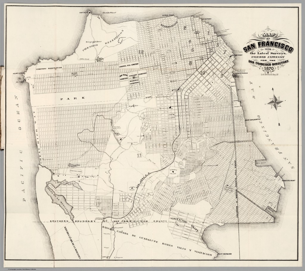
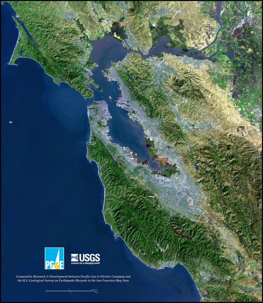
San Francisco occupies a peninsula at the edge of the continent, where the Pacific plate haltingly slides by and under the North American plate. The Pacific Ocean edges the city to its west, the Golden Gate to its North, and San Francisco Bay to its East (fig. 11). To the northeast is the Sacramento River Delta—gateway to the gold fields and the agricultural riches of the interior; to the Southeast that burgeoning zone, the Silicon Valley, clusters around Stanford University’s campus and the city of San Jose (fig. 12). Berkeley is directly across the Bay from the Golden Gate. The most startling aspect of San Francisco to visitors is the terrain of the city. Or to be more specific, what is startling is the way the city was platted with a system of neatly rectangular blocks, despite the mountainous terrain on which much of the city is built. A grid overlaid on a mountainscape results in a web of very steep streets, suggesting an uncompromising Cartesian attitude toward the environment, a reluctance to collaborate with nature. In the nineteenth century, these streets were too steep for horses to pull or brake loads, and so San Francisco’s celebrated cable cars were devised to carry passengers and goods where ordinary conveyances such as horse-drawn omnibuses, carts, gigs, or cabs were impossible. If these were ski slopes they would be Black Diamonds.
Thiebaud’s subject in San Francisco is the careening streetscapes of the city. In 1972, he purchased property on Potrero Hill in the city and began to study the urban environment closely.32 He worked both on site and from memory, synthesizing structures and perspectives to suggest the visual and kinesthetic impact of this unusually vertical city. Working en plein air, he might be expected to duplicate perspectivally correct vignettes of the observed streetscapes, but that was not his intent. He recounted to a friend with amusement that “once when he had set up his easel on a San Francisco street, a man stopped to watch and [opined] . . . ’You could spend just a short time in . . . [an art school] and get that perspective thing worked out.’”33
Among the few other artists who broached the vernacular urban environment as a sustained subject in the second half of the twentieth century was Thiebaud’s friend Richard Diebenkorn (1922–1993); their urban subjects can be read as a long-term conversation on the paintability of place. Diebenkorn, acknowledged in New York City as the “reigning chef d’école of the Bay Area figurative painting,” met approval for his 1950s Abstract Expressionist works “that evoked, without explicitly depicting . . . Northern California” places.34 Diebenkorn’s strategy of invoking what influential critic Hilton Kramer called “rather summary transcriptions of observed motifs” was acceptable until, in his early 1960s landscapes, “the pictorial reconstitution of the scene on the flat surface of the canvas is given priority over the painterly inflection of the surface itself,” at which point Kramer panned Diebenkorn’s landscapes as “astonishingly dull” in their “old-fashioned emulation of a received vision,” causing the critic to “shudder at such naked aesthetic atavism.”35 Given the harsh quality of this public reprimand, it is no wonder that the artist corrected course and his subsequent Ocean Park series retreats from what Kramer called the “impure” topographical visual rhetoric, returning to a new version of “pure-Diebenkorn abstraction,” carefully keeping his admiration for “the [old] masters . . . decently suppressed.”36 It is no wonder that the interest in landscape evident in his friend Thiebaud’s Hillside remained latent. But Thiebaud had seen something in Diebenkorn’s townscapes that provided the seed for his own exploration of the urban landscape. As he put it, “The street pictures which I later did of San Francisco—that came out of Dick [Diebenkorn]’s Berkeley series and his street scenes.”37 As Diebenkorn moved in the direction of large-scale abstraction, Thiebaud moved in the opposite direction, toward what one critic has called “pictorial tall tales.”38 Doing so, Thiebaud risked reprimands such as Alloway’s “burn them” and the disdain of professional critics and art historians into the twenty-first century. James Elkins, for instance, in Landscape Theory, opines that “Landscape representation, and references to it, might be like sugar: a sweet leftover from the romantic tradition . . . maybe landscape representation is like strychnine: even a little bit of it is poison.”39
In Ripley Ridge, one of many works in which Thiebaud explored this urban subject during the 1970s and 1980s, and into the 1990s, he uses the bright candy colors, including the primaries blue and yellow, familiar from his celebratory food images, to describe a dramatic and yet quotidian intersection where four roads converge and we face Ripley Street with its 31.5 percent grade.40 The street markings make clear that automobiles are expected here despite the grade. The street that occupies the center of the image and therefore the viewer’s attention is punctuated by vivid blue shadows of the buildings on the uphill side. These buildings have, in the language of the painting, projected their own representations—we see their facades, volumes, relative heights, and the profiles of their cornices not in the usual vertical plane, but in silhouettes they have cast on the horizontal surface of the deserted street. The façades are rendered in exquisite detail—each has been painstakingly described, yet each remains illegible to the viewer. The largest of the blue shadows we take to be that of an invisible, very tall structure that closes the street out of sight at the right. Its dominance of the foreground, its size, and its divorce from its structure are unsettling.
Our own point of view is precarious. We can imagine ourselves—having climbed with effort up steep sidewalks and steeper stairs—standing in a protruding bay window of a very tall (also invisible) building. The almost blank sides of the two structures that flank the opposite corner ascend and descend on abrupt diagonals, indicating the steepness of the street that crosses our view. Above the large structure on the left, a cheerful cubist array of white-yellow-buff rectangles describe the tops of the row of ordinary, everyday buildings ascending the steep street in front of us. After a few moments scanning the bright geometry of these many structures, it becomes clear that we are looking at a man-made environment imposed on a very inhospitable natural space: two thin ribbons of houses cling precariously to a flattish ridge between an unbuildably steep hillside rising to the right and a dark, cliff-like precipice that descends resolutely and threateningly to the left. The subject of this cityscape is gravity. Some might say it represents heroic achievement—humans transcending the constraints of the natural environment. Others would say it is a poignant comment on hubris and the irrationality of platting a grid on a mountain landscape. What makes the painting festive and positive is the bright sunlight with which the scene is bathed; what makes it unsettling, psychologically uncomfortable, even forbidding, is the dark descent of the cliff behind the lives lived in ordinary, tidy, middle-class structures arrayed so neatly and orthogonally, seemingly unconscious of the terrain and the punishing, inescapable effects of the force of gravity on mere humans.
Ripley Ridge, like many of Thiebaud’s San Francisco paintings, comments on the power of the idea of the grid as the seemingly ideal, rational urban street pattern for both rural and urban settlement. A diagrammatic visual residue of Enlightenment thought, the ideology of equality, clarity, and democracy embodied in the grid has been active and well in the United States in both urban (William Penn’s 1682 plan for Philadelphia) and rural (Thomas Jefferson’s 1784–87 Northwest Ordinance) settlement patterns.41 And yet the grid is sometimes irrational, as when it trumps topographic logic. With such works, Thiebaud points to not just the streetscape before us but, more important, to what we cannot see, to what he encourages us to feel, namely to the power of gravity to chasten us and remind us of the array of superhuman natural forces that underlie our buildings and our assumptions.
Sacramento Delta
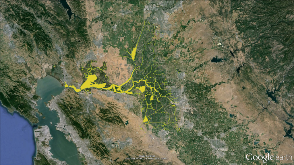
Inland from San Francisco lie a series of bays and the Delta where the Sacramento and San Joaquin Rivers spill the freshwater runoff from the Sierra snowpack into the tidal salt Bay (fig. 13). In the Delta, 738,000 acres of rich farmland (much of it below sea level), are protected by 101,000 miles of earth levees and are laced by dredged channels framing a maze of more than fifty below-sea-level islands.42 In other words, it is an entirely man-made landscape overlaying a natural landscape. Row crops, grain crops, and fruits are raised here on both small-scale and corporate farms.43
If San Francisco is dizzyingly vertical, the Delta—small islands framed by meandering channels—is pancake flat. Narrow roads run along the top of the levees that offer the only vertical relief in this landscape. In the 1990s, Thiebaud lived in the Delta for three years and took this landscape as his subject.44 He produced dozens of jewel-colored works describing the waterways and productive fields of this unusual, seldom-visited, but critically important region of California.45 Waterland is exemplary. The raking light of early morning provides shadows, and the water provides reflections, doubling the vertical elements in this very flat landscape. Thick impasto (relief) brushwork describes ripples on the water and plow lines on the land. As critics noted from the outset of his career, “a canvas by Thiebaud is a veritable palimpsest of manual gestures: strokes, brush marks and wrist movements.”46 As in Orange Grove, painted thirty years earlier, the rules of perspective are not invoked to describe space, and the horizon line—which in traditional landscape painting bisects the image—is pressed here to the very top of the canvas, compressing and flattening pictorial space. Waterland is a record of work, of human labor: the dredging of the slough (which constantly takes place to keep the waterways navigable), the constructing and repairing of the levees that we can imply from their sturdy forms, and the planning, plowing, and planting of each field, vividly evoked in paint strokes mimicking the action of the tractor. The fields are a patchwork of colors and crops; some, like the orchard in the lower left, are organized with industrial regularity. Other fields exhibit parallel plow lines, but they bend to accommodate the irregular boundaries of the fields and the meandering path of the river. The landscape is spare, quiet, but robust in its rich display of red, yellow, and blue hedging the white expanse of water. A grove of trees inhabits a small peninsula of land unsuitable for cultivation—a bit of wildness and randomness in a landscape that is otherwise the record of historical as well as recent human labor and care. If the San Francisco views are heroic in character, the Delta views are lyrical sonnets of gratitude. But they are nevertheless quietly unsettling in the uneasy high-stakes contests they depict between land and water, and between fresh river water flowing down from the mountains and problematic salt water encroaching upstream from the Pacific, constantly at work in the Delta.
Figures representing those who have crafted this landscape are usually absent, but they and their work are everywhere acknowledged in Thiebaud’s Sacramento Delta landscapes. Like the bakers whose craft we are invited to admire in his portraits of cakes and pies, and the roadmakers who have blasted freeways and macadamized seemingly-vertical urban hills, the farmers—equipped with purposeful, knowledgeable labor, shrewd acumen, and aesthetic sense—are the protagonists of the tales the artist tells in these vignettes of a buoyant Delta landscape. They have sculpted the surface of the islands with plowed furrows, planted fruit trees, and seasonal wafting grain crops. Their partner is the willful, sinuous river that bounds, nourishes, and threatens these pods of cultivation and the efforts of the humans who prosper here. John Barrell shrewdly suggests that landscape paintings deny (yet unbeknownst, disclose) social conflict, presenting rural life as “stable, unified, almost egalitarian” when it is not.47 But far more than in the eighteenth-century landscapes Barrell investigates, these paintings acknowledge, imitatively mimic, and celebrate the active labor and the land product that its crafters have presented to the painter’s view. This is not a faux-nature Capability Brown park pretending to extend itself before us, unaided by labor, for our aesthetic pleasure; it is a fecund farmed landscape crafted by successive generations to be of edible human use.
Ownership, management, and labor in the Delta have been diverse, shifting, and often vexed. Indigenous Native Americans, Spanish, Chinese (whose labor built the original levees in the 1860s and 1870s), Japanese (who owned or leased farms on which forty percent of California vegetables were raised on the eve of internment in 1942), Italians (specializing in truck farming and cherry orchards from the 1880s), Portuguese (who invented the clamshell dredger to maintain waterways and build up levees), Filipinos (from the 1920s), Punjabi Sikhs, and Mexicans have contributed to the shaping of the land and the production of the ample crops pulled from this fertile, well-irrigated, long-season patchwork of irregular islands.48
In the buoyant, celebratory tone of these Delta paintings an answer to an art historical conundrum can be found. Thiebaud is often casually associated with the Pop Art movement of the early 1960s. His entry into the New York art world with cakes and pies coincided with the early work of Claes Oldenberg, Roy Lichtenstein, and Andy Warhol, whose deadpan renderings of commonplace American objects threatened the ascendency of Abstract Expressionism and set the scene for a return to figuration and representation in art. But Thiebaud is quick to disassociate himself from that “school.”49 new visual species occur. . . . It doesn’t come out of Andy Warhol. That comes out of, clearly, applied art in all of its limitation.”] In technique and subject, but even more important in tone, his practice diverged considerably from these contemporaries. The deliberately super-mechanical commercial silkscreen process Warhol adopted and the faux-Benday dots that became Lichtenstein’s trademark, for instance, are dramatically different from Thiebaud’s absorption in the plasticity of paint and the craft of painting. And while all of these artists depicted easily-recognized, characteristically American objects, Thiebaud’s are not the laboratory-perfected, mass-produced foodstuffs of capitalism’s national food industries (such as Campbell’s soup and their hyperpredictable cans) but instead are the work of neighborhood professional bakers, local dairies, and main-street eateries familiar in shopfront mom-and-pop venues.
The works of Warhol, Lichtenstein, and Oldenberg were immediately recognized (and lionized) for the parodic tone they aimed at the banal commodities they offered up ironically as art. Insofar as the strategy of Pop Art was to feed a highbrow disdain for lowbrow culture, to mark sophistication by critiquing vacuous and superficial dimensions of American commercial capitalism, their work is antithetical to that of Thiebaud. As the artist put it in the late 1960s, “Pop art became a stimulus for [art writers] to express what they felt about what was happening in the world. They wrote that the pop artist is concerned with social alienation, with a society amidst mass produced goods—cheap, ordinary and banal objects. They began to see that Pop art expressed what they feel. . . . [I, on the other hand] celebrate Coca-Cola signs as beautiful objects.”50
Thiebaud’s tone toward the objects of his attention is neither ironic disdain nor naive celebration, but it is clear from both his comments and his paintings that his is an affectionate eye. He respects the icers of cakes, scoopers of ice cream, and the plowers of fields (even the designers of logos) as, in their parallel mediums, fellow artists. They have an idea, often a geometrically precise idea, of what the finished product should look like, a platonic ideal, for instance, of the perfect slice of pie. Bakery goods “are glorious,” the artist said; “Why must pie always be cut so precisely? Why not just scoop a helping out with a spoon? They have to be cut clean and they have to continue to stand up and maintain their shapes after being cut.”51 To achieve that perfect, triangular piece of pie cut with straight vertical sides, the baker must be an engineer, fluent in his or her materials so that the color, shape, and integrity of the food offering (as well as the taste) meet expectations. The baker, like the road engineer and workmen who blasted the Tehachapi mountains to achieve a freeway route with stable flanking walls, must know the materials, the optimum geometry of the finished form, and must be a master of all the many steps in the process of achieving that final product. Thiebaud—the former restaurant worker and grandson of a farmer—clearly is curious about the paradigmatic shapes achieved in human-made products created with natural materials, and he understands their makers to be fellow craftspeople. As with his other landscapes, the process of their invention involved direct observation, memory, and studio work: he describes “going out on the delta on those levees and looking, making direct paintings, some drawings; and like with the city pictures, then coming back and trying to combine ’em to see what [could be made of it].”52
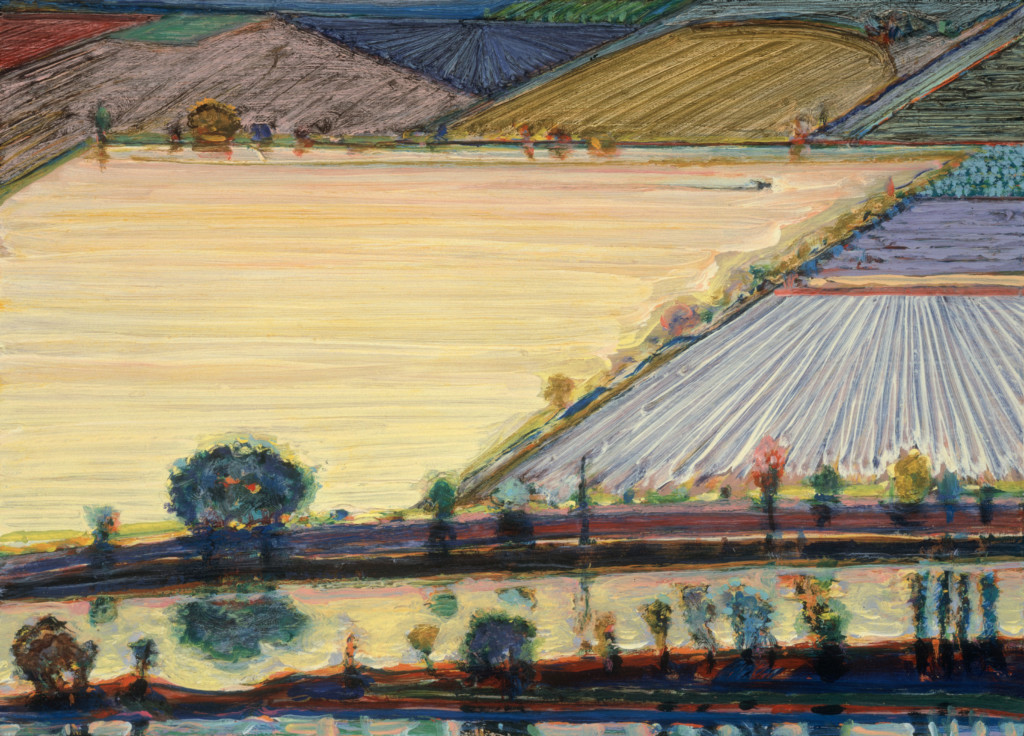
The Sacramento Delta fields, like cakes or pies, are offered not as evidence of alienation, but rather as paeans to overlooked, carefully crafted land works, each field in the “harlequinade of water meadow, plow[land], orchard, pasture [and] lines of poplars” demonstrating the maker’s idea of an optimum geometry.53 Thiebaud invites the viewer to admire and perhaps virtually, kinesthetically experience the fabrication of this landscape of patchwork. Channel Farms (fig. 14), another painting of the Delta series, vibrates with vivid yellow and its opposite, a purply blue. In the distance, a tractor plows a straight furrow across the largest field. We can imagine the tractor and its harrow making their way with geometrically regular sweeps back and forth across the entire golden expanse, the traverses recorded with parallel brushstrokes—the medium of paint describing parallel furrows of soil. In the foreground the water shimmers and reflects. It is, as he has said, “a very beautiful world,” but like most Delta paintings, it is horizonless, no governing perspective system clarifies the visual field, and no foothold positions the observer steadily on the edge of the pictured world.54 Channel Farms, like all Thiebaud landscape paintings, provides a familiar kind of subject spatially disrupted and deliberately defamiliarized. As he put it, ”I wanted to eliminate the horizon line, to see if I could get a landscape image that didn’t use a horizontal fixation . . . to try and get some sense of the loss of the convenience or comfort of standing and looking at things, to throw people off a bit.”55 This “sense of . . . loss” strategy gives even his most Edenic paintings an edginess.
A second source of disquiet is evident in the foreground. Along the narrow watercourse that transects the bottom of the image, a pair of dark levees mark its edges, punctuated by trees and shrubs that help to hold the soil on these important structures. This levee system is the Achilles heel of this orderly agricultural system. Originally constructed over a century ago, these earthen dykes keep the river at bay and keep the fields (that are vulnerably below sea level) safe. But age, earthquakes, and the forces of spring freshets threaten breaches, floods that are catastrophic for the crops and economy of this region. Even worse, sustained drought reduces river outflow and draws the Pacific saltwater inland, threatening the drinking water, the agricultural irrigation, and the economy of the whole state, as fifty percent of California’s water comes from the Delta.56 This is an agricultural landscape of jewel-like beauty, a landscape seemingly in balance, but the forces of erosion, floodwaters, saltwater intrusion, and shifting tectonic plates dwarf the human efforts described so brightly scratching the surface of the plowed islands. This note of discord or loss of “comfort” becomes louder as Thiebaud shifts his attention to the mountains.
Mountains
The third California ecology Thiebaud has painted, and the one he has made the focus of his efforts in recent years, are the mountains, most often the Sierra Nevadas, which run down the eastern border of California like a formidable spine. He has also painted other Western and imaginary mountain landscapes familiar from earlier chapters in his life, but the Sierras predominate. For pioneers trekking across the continent from Missouri in wagons (including the ill-fated Donner party) this mountain range was the last great—and often deadly—obstacle to achieving their goal. For gold seekers, the rugged Sierra foothills spurred their dreams (usually dashed) of easy riches. These are extraordinary mountains, up to 14,500 feet in height. The peaks are forbidding places, and the passes are high and inhospitable. Thiebaud’s son Paul, who died prematurely in his prime in 2010, had a house in the Sierras, and an anxious elegiac tone can be sensed in many of the mountain paintings.
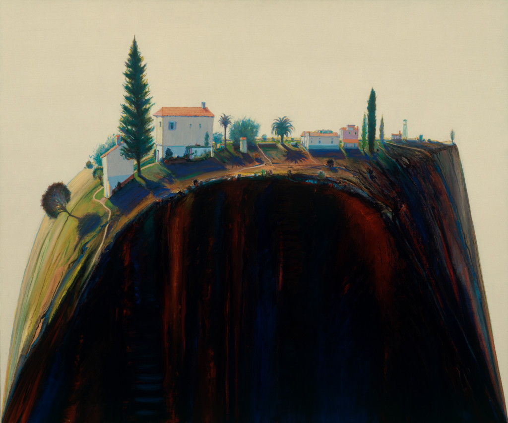
The Sierras offer magnificent aesthetic features; best known are Lake Tahoe—a huge, high lake surrounded by snow-capped peaks—and Yosemite Valley, a narrow, glacier-carved valley flanked by mile-high, almost vertical granite walls, a natural wonder that became the nation’s first set-aside rural park (now a National Park). Yosemite Ridge, painted in 1975, is an early and characteristic example of Thiebaud’s mountain paintings. Unlike predecessor mountain painters, Thiebaud generally does not root his mountains in the landscape—they seem to float without base, context, or resolution. He is interested in their tops and their steep rock flanks, but not in the talus piles that extend in diagonal rubble debris beneath steep slopes, or in the horizontal expanse of water or meadow that sets their soaring elevations in context for Albert Bierstadt and other nineteenth-century landscape artists. Thiebaud’s mountains are fragmentary vertical monoliths, their scale suggested by the size of these canvases (among his largest) and the scale of tiny trees that cling to their summits, here in Yosemite Ridge catching the last rays of a setting sun. Almost all his mountain paintings have raw cuts as we see in Yosemite Ridge and Estate (fig. 15), as though a voracious glacier, the dynamite of a road crew, or the massive, destructive jets of hydraulic mining had just sheared off their faces, revealing a dark red-blue molten rock interior. If we approach such an image with a sense of physical empathy, we grow quickly timid at the sight of that catastrophic gash, and fearful imagining ourselves clinging to the normalcy of life among those trees on that thin crust of hospitable earth, resting on that very inhospitable mountain of dark, vertical rock. Here that note of disquiet, of anxiety about the power of gravity that we saw in the San Francisco images, becomes the major theme of the painting.
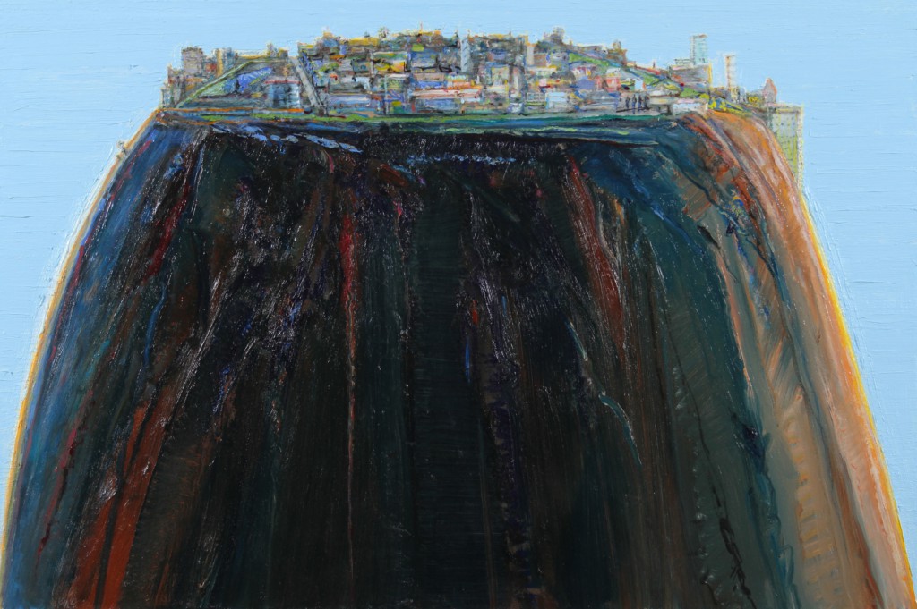
In Estate—which is based on geology and settlement patterns familiar in the California Coastal Range, where roadways snake along canyons and creeks, but ranch houses and outbuildings of large landholdings perch on plateaus above steep pastures and oak savannahs—and Laguna Rise (fig. 16), which is based on a non-California Western site, Thiebaud is dramatizing the fact of human habitation in outsized, awesome landscapes. His are imaginary or composite places, but they do evoke real places. Remembering his birth in Arizona and a teaching stint at the University of New Mexico, Thiebaud includes memories of the distinctive mesa dwellings of the Southwest, where Native Americans built cities on mountaintops, in Laguna Rise.57 In the painting, he reminds viewers of both the rockbound town of Laguna and the remarkable city of Acoma, perched defensively and dramatically for at least seven centuries on a rock-faced 365-foot mesa in what is now New Mexico. Secure here from most hostile incursions (although eventually conquered and savagely subdued by the Spanish in the sixteenth century), the inhabitants of such fortress sites are, nevertheless, continually subject to that most unremitting and frequently hostile force of nature: gravity.
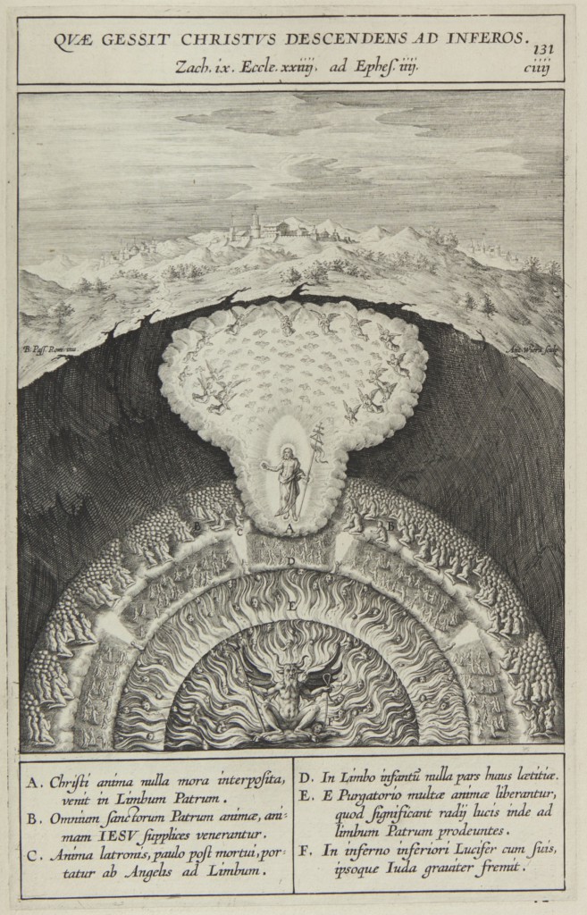
The pull of gravity is not the only issue in Thiebaud’s insistently vertical mountains. There is a long history of the association of the inner earth, situated beneath a thin, vulnerable crust, with Hell and the punishment of lost souls in the kingdom of Lucifer (fig. 17). More modern but no less mythic and apocalyptic, there is a Wagnerian quality to Thiebaud’s mountains—suggestions of the subterranean rocky dwellings of the Nibelungen. These works picture the tenuousness of human affairs and suggest the scale of the forces we ignore in daily life. Understanding the earth’s crust as a fragile, paper-thin hospitable space for flora, fauna, and human habitation, a precarious Eden sandwiched between the transparent dome of air and fathomless, chartless, incomprehensible rock substrate, is one of the things that makes Thiebaud’s mountain landscapes bizarrely original and eerily unsettling.
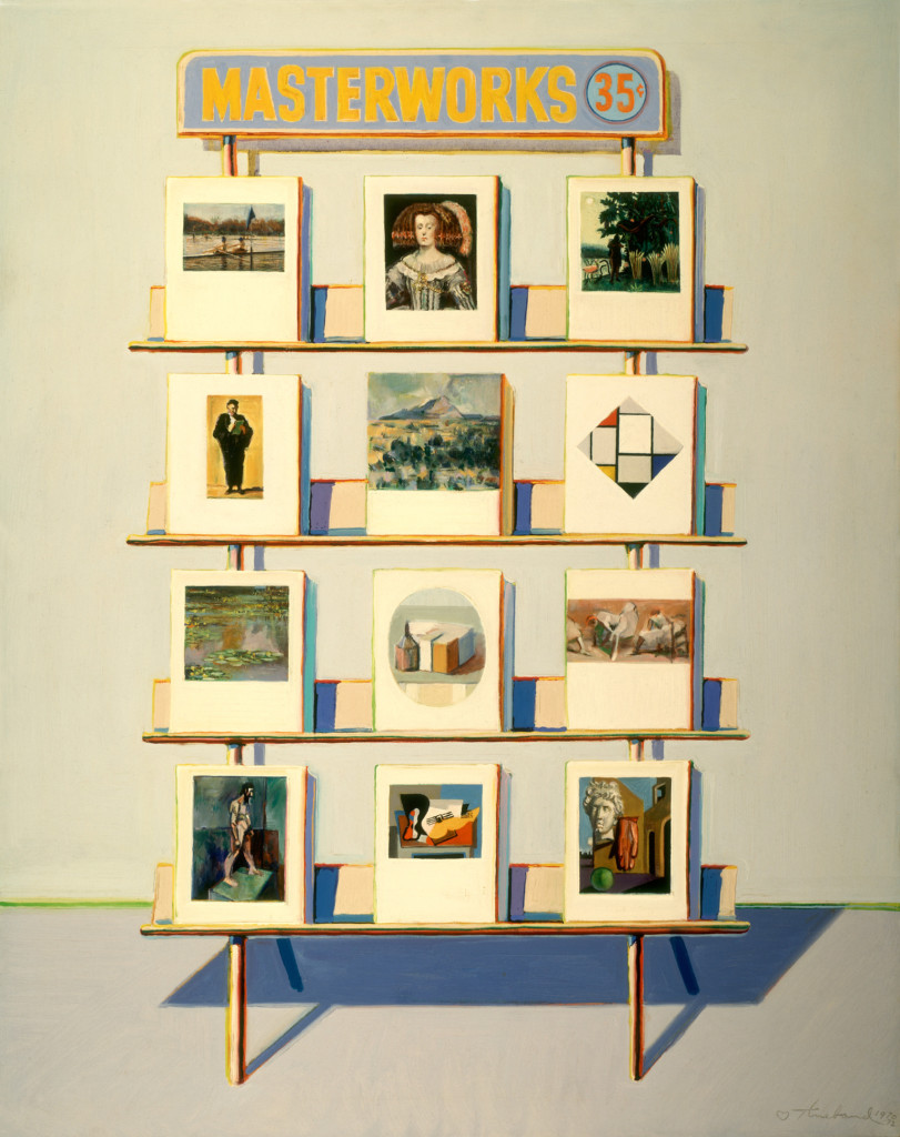
As original as these mountain paintings are, they are the result of a long process of conception and execution that involves, beyond work on site and in the studio, work in the museum; that is, research into the history of art. Thiebaud’s background is unusual for an artist; as he puts it, “I didn’t go to art school. . . . I came up through the ranks of cartooning and illustration and graphic design,” where he learned by apprenticeship “the great traditions of design and typography and decorative arts, the ideas [and practices] of design and drawing.”58 His immersion in art history came later, when, in conjunction with an early faculty appointment, he was asked to teach the discipline, and when he found himself among more established artists who venerated the fine arts tradition they all aspired to. The group around de Kooning, during Thiebaud’s year in that circle, for instance, was “serious . . . about the history of painting . . . interested as much in Rembrandt as in . . . Picasso”; they also urged him to “do something that you know about, that you’re infatuated with.” As a result of this two-pronged counsel, Thiebaud reports, “I changed my whole program.”59 ‘It’s very important to understand art history, it’s . . . not so important to be interested in what’s happening today.’ That made a big impression on me,” as quoted in the Larsen, Archives of American Art Oral History Interview. Thiebaud speaks eloquently of being asked to teach the history of art at his first teaching job at Sacramento City College, keeping just ahead of the students, and learning to love the material of the discipline, as reported in a conversation with the author, July 2, 2013.The bridge between Thiebaud’s work in commercial design in southern California and his camaraderie in the New York art world was fellow designer Robert Mallary. Son of a Berkeley history professor, Mallary mentored Thiebaud and introduced him to Elaine de Kooning and Allan Stone; for more on this see Larsen, Oral History Interview, Archives of American Art.] A confessed eclectic historian of art, he is an eager museum visitor, repeatedly mentioning his pleasure and awe in studying the work of his predecessors in museums, institutions he thinks of as “a kind of bureau of standards setting criteria of excellence” and “a kind of exotic, endangered species preserve, where you get all the . . . best examples of whatever we’ve done.”60 But even without his comments we can learn from his paintings that he has observed with care both the finished works and the artistic process of other artists. Masterworks 35 Cents (fig. 18), for instance, is both a tongue-in-cheek comment on aesthetic value and an homage to a select assembly of predecessors in the European and American painting traditions.61 While a jocular comment on the postcard-and-poster availability of masterpieces, this work also expresses lifelong admiration. As he has put it, “the wonderful thing about being a painter is having the privilege of coming into some sort of intimate contact with a great tradition.”62 In the works by these master predecessors offered wittily on a display rack by Thiebaud, we can point to some lessons he has learned from these masters: Mondrian’s focus on primary colors and the geometries of the canvas, Monet’s suppression of the horizon line, Eakins’s management of deeply saturated ultramarine blue, and, most important in this discussion, Cézanne’s long-term engagement with the mountain.
Some of Thiebaud’s paintings were executed quickly in a single day, such as Hillside, and he clearly admires the sense that Cézanne’s “paintings start with an almost totally complete idea” that results in a single credible sense in the viewer that “you’re taking a trip through space with Cézanne.”63 However, many of Thiebaud’s paintings—and especially the mountain landscapes—carry eccentrically long production dates. Laguna Rise, for instance, is published as a product of “2003–12.” When asked about these long gestational periods, he responds that they represent both intermittent long-term engagement with the canvas and, in some cases, a return to the painting for modification long after it was initially felt to be finished.64 Speaking of the process of creating a set of six landscape paintings, one observer wryly noted, “I watched as horizons asserted themselves one week only to disappear the next, as geometry was replaced with lyricism only to go back on itself later.”65 This long-term revisionary practice—what Thiebaud calls “learning by mistakes, modifying, reconstituting, reorganizing, over and over again”—is enabled by the fact that Thiebaud keeps many of his own paintings rather than offering them for sale, with the expectation that they will remain in his family and a newly established foundation.66 What it suggests to those interested in his work is his deep engagement with his subjects—not only as series but also as individual canvases which he returns to, working “to get it to come together,” in that last step of his creative process.
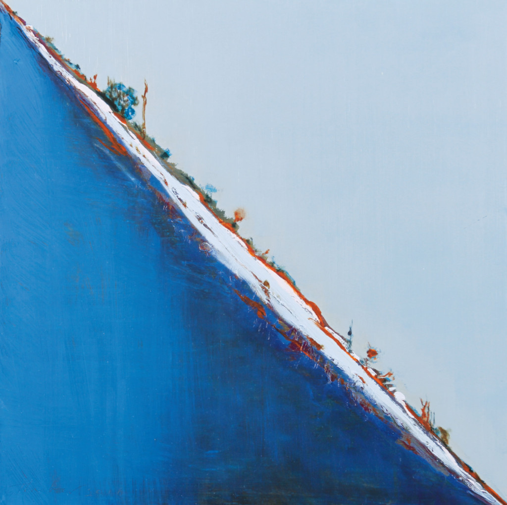
A rather different variant on these mountainscapes are the diagonal paintings such as Winter Ridge of 2010 (fig.19). Square in format, this painting from a distance could read as a field of two blues, as abstract as a marine signal flag. Precisely bisected at the two diagonal corners, the steep straight slope that, on closer inspection, we read as a cross section of mountain populated by valiantly upright trees and shrubs, touches the canvas’s corners en route from somewhere to nowhere in particular. Here, with the title “Winter” and the irregular impasto white line that divides the blues, we read snow on a plunging landscape punctuated by dead and deciduous vegetation suggested by brown-orange (burnt umber) passages. Empathetically projecting ourselves into the scene—as the artist encourages us to do—we feel, as in the San Francisco streetscapes, the disquieting strong pull of gravity and the disequilibrium of a horizonless scene.
That it represents a slope allows us to respond kinesthetically, emotionally, not just to the mysterious conjoined fields of blue but also to the relentless pull of the earth. Here we see and feel the paradox of fiction as we respond with real emotions to an imagined situation in the uncomfortably tilted field of the painting.67 By triggering “mirroring, identification, empathy, sympathy, antipathy,” Thiebuad asks us to focus on the facts of being a human being hyperalert to the earth’s forms and its invisible forces.68 With such fictions he pulls us out of our quotidian neglect of the substrate on which our lives are built, and calls attention to the false fictions of constancy, fixity, balance that guide our very real daily lives.
Viewing Winter Ridge as a square board on the wall, we are drawn by the equally powerful pull of Thiebaud’s use of blue. Neither the lighter blue of the equilateral triangle we read as sky or the lower triangle we read as gash are flat fields of color, but rather they are ombré expanses shading imperceptibly from upper left to slightly deepening hues in the lower right. This is not, in other words, a neo-Joseph Albers experiment in flat color juxtapositions but a more painterly, more pictorial, play with two- and three-dimensional special effects. But in fact, Winter Ridge could be read as a color theory painting nevertheless. The “halation” effect of Thiebaud’s edges has often been remarked upon.69 That this particular array of ultramarine/cobalt blue is often at work in achieving that effect has been less remarked. Similar in quality and effect to the blue with which John Singer Sargent punctuated his watercolors, this range of blues is deployed with magical effect by Thiebaud. Often used to describe shadows (as in Orange Grove), blue is frequently used by Thiebaud in conjunction with its opposite—a range of oranges—to electrify the edges of objects, a process first theorized by chemist Michel Eugène Chevreul in his efforts to improve the vibrancy of pictorial textiles for the Goblins tapestry works in the 1830s.70 In Winter Ridge, the expanse of deep blue on the lower half of the image is set off from the more neutral light blue of the upper side and set vibrating by the powerful brown-orange (burnt umber) traces across the center, an effect described by Chevreul as “simultaneous contrast” in which color opposites intensify each other. The whole and its constituent parts work to create both equilibrium (suggested by the square format and equal parts) and its opposite, vibrating active disequilibrium, suggested by the diagonal slope, the calibration of the blues, and the conjunction of color opposites.
Thiebaud often has spoken about the need “to bring the painting alive” and to use color “to heighten the edge effect . . . to give more energy to the image. I would like the painting to create its own light, to create its own energizing forces . . . to express metaphorically with the use of color the same sort of light energy that reflects off natural objects.”71 The color mechanism by which he does this is often the juxtaposition of opposites (a primary with its opposing secondary): yellow/violet, blue/orange, or, less often, red/green, and myriad variations on these vibrant chords. Looking back over the Thiebaud paintings considered here, one can note the frequency with which he uses color opposites, especially at edges (see, for instance, the yellow-violet juxtapositions in Waterland) to arrest our attention. He reports that his use of “vibrant chromatic outlining . . . showed up accidentally at first as a way of drawing. . . . When I began to paint, some of that would be left, and it looked good . . . [I realized outlining in a contrasting color was useful] in order to get the painting to be richer, or to have more vibrancy,” and blue is a major player in achieving this “vibrancy.”72
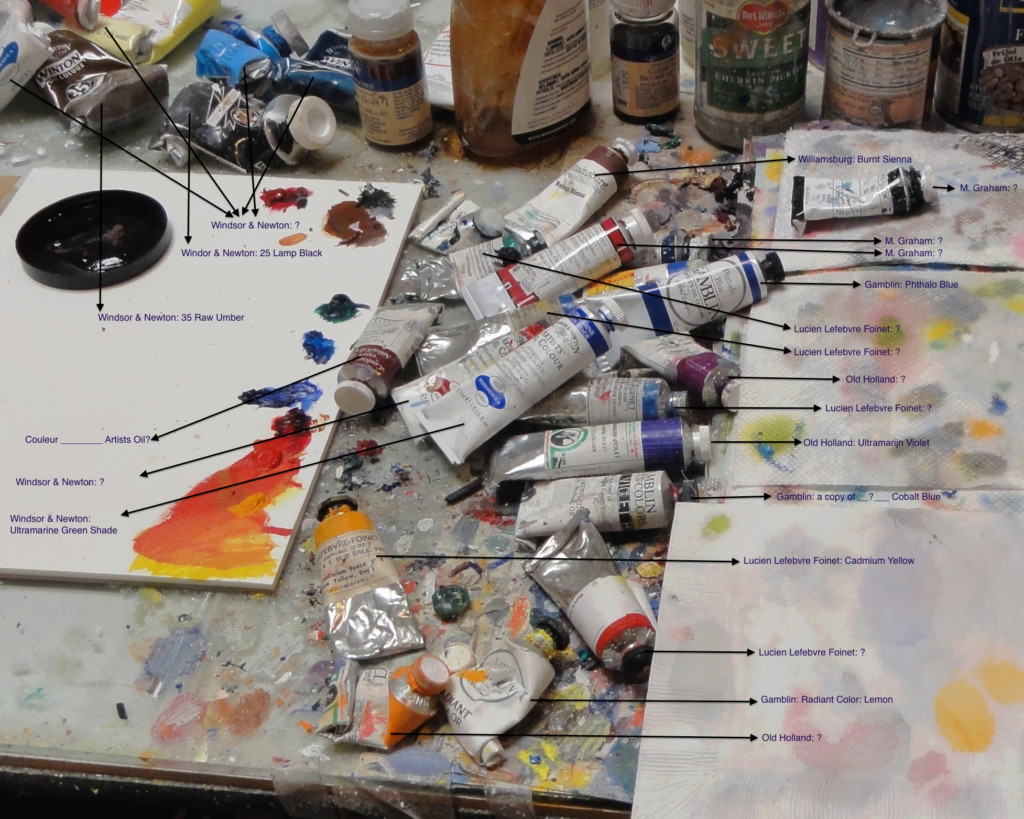
Thiebaud’s blues—the primary agents of “vibrancy” in his landscapes—are unusual. The blue shadows of trees, of buildings, of riverbanks, and the molten blue of mountain interiors, far from reading as recessive negatives of objects, create forms, edges, and surfaces that are as pictorially active as the objects they shadow. A glance at his studio workbench reveals that the artist uses prepared blue pigments by at least four and probably five different firms—Lucien Lefebvre Fionet, Winsor & Newton, Old Holland, Williamsburg, and M. Graham—orchestrating them with adroit originality (fig. 20).73 This eclecticism in materials suggests a long-term process of creative experimentation. One firm whose products he favors—Lucien Lefebrve Fionet—no longer makes commercial pigments and, while they continued to service the requirements of a few artists into the 1990s on special order, these tubes are no longer available.74 That he stocked up for future decades suggests his sensitivity to experience with successful pigment. That on his table, tubes are roughly grouped by color (rather than arrayed by firm) suggests a broad-based, task-oriented creative search for color and pigment mixes. And it is no surprise that the blue-violet tubes are at the heart of his workbench array.
Falling
Thiebaud protests that his outlook and his art are not angst ridden; indeed that his personal experience, outlook, and paintings have been almost uniformly positive and upbeat. He is convincing when he reports that “for me, working is a joy” and “my own little Eden,” although it is also “the most difficult thing I’ve ever done, the hardest work.”75 He rebuts those who interpret his work as “basically heavy-spirited” as quickly as he bats aside commentary on his food paintings that recasts them as critical of “the mass consumerism of American food, [as] . . . major American social criticism made visual.”76 But the tone and character of his landscape paintings is a more complicated matter. The artist himself speaks of “ominous” mountains, “cityscapes [about] . . . yearning,” and “precipitousness . . . you . . . feel in the pit of your stomach.”77 He cites pictorial strategies that “throw people off a bit,” and that convey a “very precarious state of tension,” introduced because “if [the painting] . . . is a little too stable it can die on you.”78 More important, his paintings, to use his term, “tattle” on a dissonant undercurrent in that buoyant narrative of joyful life and work. Or more to the point, like our cultural landscapes, they “tell things about us, [they are] tattletale evidence of what we are, or what we would like to be, or might be, or should be, or shouldn’t be.”79 The products of Thiebaud’s decades-long engagement with landscape speak obliquely, in the vernacular, to major concerns about human habitation of the planet.
While vibrant color and luscious brushwork certainly seduce our eyes, there is nevertheless a sense of uncomfortable vertigo in Thiebaud’s San Francisco images, and an undertone of threat in the dark, water-soaked dykes of the Delta images; those foreboding notes grow loud in the mountain scenes where habitation clings to precipitous edges of gigantic rocks, and road cuts point equally to mastery of the natural world and the meagerness of human efforts. Taken together, these paintings speak of an America in which titanic forces—such as gravity and colliding tectonic plates—threateningly underlie and potentially undermine everyday life. The earth’s crust is just that, a thin, precious zone where humans labor to make the land habitable and productive. Thiebaud’s landscapes describe a fragile world, beautiful and exuberant but fundamentally beyond human control. His landscapes suggest the dignity of labor in the face of titanic extrahuman forces and counsel an attitude of both stewardship and humility. His works are as much about paint as a medium as they are about the golden state. They teach us about the value of looking, the covert danger within the quotidian, and the value of art as a medium through which an artist might comment on human occupation of the planet. His paintings are both sonnets of gratitude and cautionary tales. We need not worry too much about whether he is modern, postmodern, or anti-modern. He is, as everyone who meets him notes, remarkably unpretentious, and, as one astute critic put it, a “detached and highly focused independent, working in a school of one,” teaching us about things we know but do not feel as viscerally present until he underlines for us the fragility of Eden.80
Cite this article: Margaretta M. Lovell, “City, River, Mountain: Wayne Thiebaud’s California,” Panorama: Journal of the Association of Historians of American Art 3, no. 2 (Fall 2017), https://doi.org/10.24926/24716839.1602.
PDF: Lovell, Wayne Thiebaud’s California
Notes
- For Thiebaud’s food images, see, for instance, John Yau, “Wayne Thiebaud’s Incongruities” in Kenneth Baker, Nicholas Fox Weber, et al., Wayne Thiebaud (New York: Rizzoli, 2015), 26–33; John Rabe and Marc Haefele, “Pop-art Icon Wayne Thiebaud,” http://scpr.org/programs/offramp/2014/03/05/36332/pop-art (accessed June 9, 2015); Andrew Russeth, “Welcome to the Good Life: Learning from Wayne Thiebaud,” Art News 113, no. 10, posted 10/07/14, http://www.artnews.com/2014/10/07
welcome-to-the-good-life (accessed June 8, 2015); Alexandra Wolfe, “Wayne Thiebaud and the Art of Longevity” The Wall Street Journal, October 2, 2014, http://www.wsj.com/articles/wayne-thiebauds-art-of-longevity (accessed June 9, 2015); Karen Rosenberg, “Slices and Scoops of Life: Wayne Thiebaud Retrospective at Acquavella Galleries,” New York Times, November 9, 2012, C26; Rachael Blackburn, “Interview” in Wayne Thiebaud: Fifty Years of Painting (Kansas City, MO: Kemper Museum of Contemporary Art, 2003), 4. One of the best essays on Thiebaud’s work and his 1962 debut exhibition in New York City is by Max Kozloff in which he describes the artist as “the poet laureate of the coffee break.” See “Art,” The Nation 194, no. 18 (May 5, 1962): 406. ↵ - Lawrence Alloway, “Introduction,” in Six More, a 1963 exhibition organized by the Los Angeles County Museum of Art, as quoted in Nigel Whiteley, Art and Pluralism: Lawrence Alloway’s Cultural Criticism (Liverpool, England: Liverpool University Press, 2012), 182–83. ↵
- Thiebaud in conversation with the author, August 11, 2016. He reports that the remark was made in person, at a party. ↵
- Peter Selz, “Pop Goes the Artist,” in Partisan Review 30, no. 2 (Summer 1963): 315. Others have compared Thiebaud to Jean-Baptiste-Siméon Chardin, most eloquently in a 1985 review of the San Francisco Museum of Modern Art exhibition, Wayne Thiebaud, by Bill Berkson, “Thiebaud’s Vanities,” in The Sweet Singer of Modernism and Other Art Writings, 1985–2003 (Jamestown, R.I.: Qua Books, 2003), 8, 15. ↵
- W. T. J. Mitchell, as quoted by James Elkins in Rachael Ziady DeLue and James Elkins, eds., Landscape Theory (New York: Routledge, 2008), 100; Denis Cosgrove, Social Formation and Symbolic Landscape (1984; repr. Madison Wis.: University of Wisconsin Press, 1998, 20; Michael Gaudio and James Elkins in “The Art Seminar,” in DeLue and Elkins, Landscape Theory, 119, 120. ↵
- Thiebaud in conversation with the author, August 11, 2016. ↵
- As quoted in Andrée Maréchal-Workman, “Wayne Thiebaud: Beyond the Cityscapes,” in Smithsonian Studies in American Art 1, no. 2 (Autumn 1987): 41. ↵
- In this practice he is following age-old advice, “Make your entrance {to painting}. . . with plain geometrical figures, such as are the circle, square, oval, cone, triangle, cylinder,” C. K, Art’s Masterpiece, 5th ed. (London, 1710), 8. ↵
- For instance, unlike the nineteenth-century Hudson River School, landscape painting during the past sixty years has rarely been treated as a movement or as a notable unified genre (although it is analyzed within studies of individual artists such as David Hockney and Richard Diebenkorn). Exceptions include John I. H. Baur, Nature in Abstraction: The Relation of Abstract Painting and Sculpture to Nature in Twentieth-Century American Art, exh. cat. (New York: Whitney Museum of American Art, 1958); Alan Gussow, A Sense of Place: The Artist and the American Land (San Francisco and New York: Friends of the Earth, 1971); Painting as Landscape: Views of American Modernism, 1920–1984, exh. cat. (Southampton, N.Y.: Parrish Art Museum, 1985); and Amy Scott, “Twenty-First-Century Sublime: Nature and Culture Entangled,” Boom: The Journal of California 4, no. 3 (Fall 2014): 28–35. For an influential discussion of the evolution of landscape within the context of European social and economic life, see Dennis E. Cosgrove, Social Formation and Symbolic Landscape (Madison, Wis.: University of Wisconsin Press, 1984). ↵
- See “Eric Sloane Museum & Kent Iron Furnace,” http://www.ct.gov/cct/cwp/view.asp?a=2127&q=302262 (accessed August 30, 2017). ↵
- David M. Roth, “Wayne Thiebaud @ The Crocker Art Museum” in Northern California Art, at squarecylinder.com, posted October 23, 2010 (accessed August 3, 2016) http://www.squarecylinder.com/2010/10/wayne-thiebaud-the-crocker-art-museum/; for a summary of the “death of nature” discourse, see Leo Marx, “The Idea of Nature in America,” Daedalus 137, no. 2 (Spring 2008): 17–19. ↵
- See for instance, Lauren Kroiz, Cultivating Citizens: The Regional Work of Art in the New Deal Era (Berkeley: University of California Press, 2018), who describes the accusatory strategies of midcentury German émigré art historians—who were themselves deeply invested in European modernism—discrediting American Regionalist painters and their artworks by labeling representational art, especially landscapes, “fascist,” 74-90. ↵
- Aaron M. Ellison, “The Suffocating Embrace of Landscape and the Picturesque Conditioning of Ecology,” Landscape Journal: Design, Planning, and Management of the Land 32, no. 1 (2013): 79–94. ↵
- For an investigation of the triggering of heightened emotional response by works of art in both historical painting and in such modernist works as those by Mark Rothko, see James Elkins, Pictures and Tears: A History of People Who Have Cried in Front of Paintings (New York: Routledge: 2001). ↵
- This essay focuses on Thiebaud’s landscape paintings, but it should be noted that he also has executed what could broadly be termed public art (art in the public sphere) over the course of his career, much of it employing landscape elements. Examples include a jaunty California license plate, posters for the 1984 Democratic National Convention (see http://collections.museumca.org/?q=collection-item/20105419339, accessed July 7, 2015) and the Embarcadero Freeway demolition party (see Marc Sandalow, “Wistful End to an Unparalleled Vista/Demolition to Begin on Embarcadero Freeway Wednesday,” San Francisco Chronicle, February 25, 1991, A2, accessed July 13, 2015, http://infoweb.newsbank.com/resources/doc/nb/news/0EB4F323542D4477?p=AWNB), and a 1959 mosaic mural for the façade of the Sacramento Municipal Utility District (see Carol Roland, National Register nomination for the building and the mural http://www.nps.gov/nr//feature/weekly_features/2010/SMUDHeadquarters.pdf, accessed July 7, 2015—note the mural was 1959, not the nomination—and Lesley Stein, “SMUD Headquarters: International Style Architecture in Sacramento, CA,” December 6, 2011, http://www.artjabber.com/?p=978, accessed July 7, 2015). ↵
- For a discussion of Thiebaud’s 1960s landscapes, see Margaretta M. Lovell, “Wayne Thiebaud’s Early Landscapes,” in Rachel Teagle, ed., Wayne Thiebaud: 1958–1968, exh. cat. (Davis, Calif.: Manetti Shrem Museum of Art and University of California Press, 2018). ↵
- Thiebaud to the author, July 2, 2013. This was not Thiebaud’s first landscape; he submitted a “landscape” to the 1958 San Francisco Art Association Annual Painting and Sculpture Exhibition that the judge, Thomas Hess of ARTnews, rejected (San Francisco Museum of Modern Art archives). ↵
- Wayne Thiebaud, conversation with the author, July 2, 2013. He speaks of “the happy side of taking on actual confrontation with the world, where you sit down and look at it . . . and draw a lot” but then in the studio, the artist is “orchestrating forms.” ↵
- Ibid. ↵
- Ibid. ↵
- Ibid. ↵
- As quoted in Wolfe, “Art of Longevity.” ↵
- As quoted in Stephen G. McGough, “An Interview with Wayne Thiebaud,” in Thiebaud Selects Thiebaud: A Forty-Year Survey from Private Collections, exh. cat. (Sacramento, Calif.: Crocker Art Museum, 1996), 8. ↵
- Thiebaud, conversation with the author, July 2, 2013. ↵
- As quoted in Ian Parker, “The Artistic Life: Oldies But Goodies: Wayne Thiebaud’s Sweet Tooth,” The New Yorker, November 10, 2014, http://www.newyorker.com/magazine/2014/11/10/oldies-goodies (accessed June 9, 2015); quoted in Vonn Sumner, “American Gumbo: Wayne Thiebaud,” Artillery Magazine, http://artillerymag.com/america-gumbo-wayne-thiebaud/ (accessed June 9, 2015). ↵
- Thiebaud, conversation with the author, July 2, 2013. ↵
- Thiebaud, as quoted in “Wayne Thiebaud Interview: Painter and Teacher, Celebrating the Joy of Living,” Academy of Achievement, Sacramento, May 27, 2011. http://www.achievement.org/autodoc/page/thi0int-4 (accessed June 18, 2015). ↵
- Ibid. ↵
- Thiebaud’s warm comments about the importance of de Kooning during his year in New York City are quoted in Parker, “Oldies But Goodies”; Sumner, “American Gumbo: Wayne Thiebaud”; Michael Kimmelman, “Wayne Thiebaud,” in Portraits: Talking with Artists at the Met, The Modern, The Louvre and Elsewhere (New York: Random House, 1998), 167; Susan Larsen, Oral History Interview with Wayne Thiebaud, May 17–18, 2001, Archives of American Art, Smithsonian Institution; and Richard Wollenheim, “On Thiebaud and Diebenkorn: Richard Wollenheim Talks to Wayne Thiebaud,” in Modern Painters 4, no. 3 (Autumn 1991): 66. ↵
- Thiebaud speaks of the “great lessons [of ↵
- Elaine de Kooning was an outspoken opponent of the death penalty, chairing the “Justice for Chessman” Committee and assembling a seventy-nine-page scrapbook concerning the death row years and eventual execution of Caryl Chessman at San Quentin Prison in 1960. See Theodore Hamm, Rebel and a Cause: Caryl Chessman and the Politics of the Death Penalty in Postwar California, 1948–1974 (Berkeley: University of California Press, 2001); http://www.aaa.si.edu/collections/images/detail/elaine-de-kooning-scrapbook-relating-to-caryl-chessman-6203 (accessed July 9, 2015). Thiebaud reported on their association: “Elaine {de Kooning} and I became quite good friends, and my wife did a video of her painting a portrait” (Thiebaud, conversation with the author, July 2, 2013). ↵
- Susan Stowens, “Wayne Thiebaud: Beyond Pop Art,” 46–51, 102–4, American Artist 44, no. 458 (September 1980): 102; John Wilmerding, Wayne Thiebaud, exh. cat. (New York: Rizzoli, 2012), 26. ↵
- As quoted in Kathan Brown, Know That You Are Lucky (San Francisco: Crown Point Press, 2012), 48. ↵
- Hilton Kramer, “New York Exhibitions: Pure and Impure Diebenkorn,” Arts Magazine 38, no. 3, (December 1963): 46. ↵
- Ibid., 48, 51. ↵
- Ibid., 49, 51. ↵
- As quoted in Wollenheim, “On Thiebaud and Diebenkorn,” 66. ↵
- Kenneth Baker, “Thiebaud’s Dreamy Vision of the Urban Landscape,” The San Francisco Chronicle, December 11, 1993, E1, http://infoweb.newsbank.com/resources/doc/print?p=AWNB&d. (accessed July 7, 2015) ↵
- Elkins, “The Art Seminar,” 126. ↵
- Stephen von Worley, “The Steeps of San Francisco,” November 10, 2009, http://www.datapointed.net/2009/11/the-steeps-of-san-francisco/ (accessed June 12, 2015); he reports that Ripley Street is the fourth steepest street in San Francisco. According to one reviewer this painting was done “on the spot,” and indeed the effect of verticality is true to the site, but the painting also integrates buildings from elsewhere in the city. See Victoria Dalkey, “Thiebaud Selects Thiebaud for Retrospective Scripps-McClatchy Western Service,” Access World News, April 21, 1996, http://infoweb.newsbank.com/resources/doc/nb/news/OEB7B190DE65CE4A?p=AWNB, (accessed July 2, 2015). ↵
- For a discussion of the grid plan in the American context, see “Part II: Metropolitan Improvements,” in Dell Upton, Another City: Urban Life and Urban Spaces in the New American Republic (New Haven: Yale University Press, 2008), especially 123–25. ↵
- S. E. Ingebritsen and Marti E. Ikhara, “Sacramento-San Joaquin Delta: The Sinking Heart of the State,” http://pubs.usgs.gov/circ/circ1182/pdf/11Delta.pdf (accessed January 12, 2016). ↵
- For overviews of the Delta as inhabited agricultural space and contested environmental territory, see Terry L. Prichard, “Agriculture in the Sacramento-San Joaquin Delta,” in California Agriculture 33 (November/December 1979): 4–5; and Philip Garone, The Fall and Rise of the Wetlands of California’s Great Central Valley (Berkeley: University of California Press, 2011). ↵
- Thiebaud, conversation with the author, July 2, 2013; the Delta paintings were introduced to the public in a 1997 exhibition at the Campbell-Thiebaud Gallery in San Francisco to “mixed reviews.” See Steven A. Nash, “Unbalancing Acts: Wayne Thiebaud Reconsidered” in Steven A. Nash with Adam Gopnik, eds., Wayne Thiebaud: A Paintings Retrospective (San Francisco: Fine Arts Museums of San Francisco, 2000), 31. ↵
- Jay Lund, Ellen Hanak, et al., Envisioning Futures for Sacramento-San Joaquin Delta (2007), www.ppic.org (accessed August 10, 2016); Ellen Hanak, Alvar Escriva-Bou, et al., California’s Future: Water (Public Policy Institute of California, January 2016), http://www.ppic.org/content/pubs/report/R_116EHR.pdf (accessed August 10, 2016). ↵
- Kozloff, “Art,” 407. ↵
- John Barrell, The Dark Side of the Landscape: The Rural Poor in English Painting 1730–1840 (Cambridge, U.K.: Cambridge University Press, 1980), 5. ↵
- Jennifer Helzer and Delta Protection Commission, “Delta Narratives, Building Communities—Economics & Ethnicity,” http://www.delta.ca.gov/Delta_Narratives.htm (accessed August 10, 2016); “Jap Ban to Force Farm Adjustments,” The San Francisco News, March 4, 1942, http://www.sfmuseum.org/hist8/land3.html (accessed August 4, 2016). The Swampland Act of 1850 enabled states to acquire and sell wetlands provided that such lands be reclaimed for productive agricultural use; by the 1920s virtually the entire Delta had been reclaimed and planted. See Prichard, “Agriculture in the Sacramento-San Joaquin Delta,” 4–5. ↵
- Thiebaud’s comments disassociating himself from Pop Art include remarks made in conversation with John Coplans, Wayne Thiebaud, (Pasadena, Calif.: Pasadena Art Museum, 1968), 28 (“I have always exhibited in Pop Art shows, but I don’t see myself as being in any way central to that category”); Wolfe, “Art of Longevity” (“I don’t care for pop art at all”); and in conversation with the author, July 2, 2013: “The tradition that comes out of a great formalist academic tradition is, you could say, almost endless. . . . [out of that tradition ↵
- As quoted in LeGrace G. Benson, David H. R. Shearer, and Wayne Thiebaud, “An Interview with Wayne Thiebaud,” Leonardo 2, no. 1 (January 1969): 70. ↵
- As quoted in Coplans, Wayne Thiebaud, 26. ↵
- As quoted in Larsen, “Oral History Interview with Wayne Thiebaud,” AAA. ↵
- Richard Wollheim, “Wayne Thiebaud: Green River Lands, “Art Forum International 38, no. 2 (October 1999): 135. ↵
- As quoted in Larsen, “Oral History Interview with Wayne Thiebaud,” AAA. ↵
- As quoted in G. Gordon, “Thiebaud Puts a Visual Feast on Canvas,” California Aggie (Davis, Calif.: University of California, Davis, 1983), 2. ↵
- S. E. Ingebritsen and Marti E. Ikehara, “Sacramento-San Joaquin Delta,” pubs.usgs.gov/circ1182/pdf/11Delta.pdf (accessed January 12, 2016). ↵
- Hollis Walker, “Santa Fe Art Institute’s director Kerry Benson can’t help it; she’s driven by passion,” Santa Fe New Mexican, April 25, 1999, E-1 http://www.lexisnexis.com/hottopics/lnacademic/?shr=t&sfi=AC00NBGenSrch&csi=147872 (accessed November 3, 2017). ↵
- As quoted in John Seed, “Wayne Thiebaud: Memory Mountains,” Huffington Post, November 14, 2013, http://www.huffingtonpost.com/john-seed/wayne-thiebaud-me (accessed June 8, 2015). ↵
- Parker, “Oldies But Goodies”; elsewhere Thiebaud commented: “[de Kooning said ↵
- Blackburn, “Interview,” 2; Kenneth Baker, “A Conversation with Wayne Thiebaud—An American Painter,” San Francisco Chronicle, January 15, 1995, 25, http:infoweb.newsbank.com/resources/doc/print?p=AWNB&d (accessed July 2, 2015). That he finds these sojourns humbling is indicated by such comments as “How audacious of me to pick up a brush when Velázquez did what he did!” As quoted in Wolfe, “Art of Longevity.” ↵
- This assemblage includes visual quotations of works by Thomas Eakins, Diego Velázquez, Henri Rousseau, Edouard Manet, Paul Cézanne, Piet Mondrian, Claude Monet, Giorgio Morandi, Edgar Degas, Henri Matisse, Pablo Picasso, and Giorgio de Chirico. ↵
- As quoted in Baker, “A Conversation with Wayne Thiebaud—An American Painter,” 25. ↵
- Thiebaud, conversation with the author, July 2, 2013. ↵
- Ibid.; see also Cathleen McGuigan, “Wayne Thiebaud Is Not a Pop Artist,” Smithsonian Magazine, February 2011, http://www.smithsoniannmag.com/arts-culture/wayne-thiebaud (accessed July 13, 2015). ↵
- Paul LeBaron Thiebaud, Wayne Thiebaud, Riverscapes, exh. cat. (San Francisco: Paul Thiebaud Gallery, 2002). ↵
- Thiebaud, “Wayne Thiebaud Interview,” Academy of Achievement, 2; Richard Wollheim reports that Diebenkorn also “likes to have paintings around a long time,” working on them and that “he doesn’t cover his tracks: . . . not just pentimenti, but the scrubbing, the erasing, the smearing, collaging over, tearing it apart, cropping, lots of cancelling out and starting over.” See Wollheim, “On Thiebaud and Diebenkorn,” 67. ↵
- Jerrold Levinson, “Emotion in Response to Art,” in Contemplating Art: Essays in Aesthetics (Oxford Scholarship Online, January 2007), 4, 11; http://www.oxfordscholarship.com/view/10.1093/acprof:oso/9780199206179.001.0001/acprof-9780199206179-chapter-4 (accessed July 15, 2106). ↵
- Levinson, “Emotion in Response to Art,” 14. ↵
- Exemplary halation comments are found in Wollheim, “On Thiebaud and Diebenkorn,” 65; Wilmerding, Wayne Thiebaud, 29; Wayne Thiebaud Survey: 1947–1976, exh. cat. (Phoenix: Phoenix Art Museum 1976), 13; and Thiebaud, as quoted in Benson, Shearer, and Thiebaud, “An Interview with Wayne Thiebaud,” 70. ↵
- Michel Eugène Chevreul, De la loi du contraste simultané des couleurs (Paris: Pitois-Levrault 1839), trans. 1854, The Principles of Harmony and Contrast of Colors and their Application to the Arts (West Chester, Penn., Schiffer Publishing, 1987). ↵
- Thiebaud, conversation with the author, July 2, 2013; as quoted in Coplans, Wayne Thiebaud, 32. ↵
- As quoted in Nash, “Unbalancing,” 36n19; more recently he remarked “I want that building on the right to have a glow on the right, so there’s a kind of orange-blue line along the side which makes a little vibration.” Thiebaud, conversation with the author, July 2, 2013. ↵
- Lucien Lefebvre Fionet was established in the 1880s in Paris; Winsor & Newton was established 1832 in London; Old Holland was established 1905, in the Netherlands; Williamsburg was established 1980, in New York City; and M. Graham was established 1993 in Oregon. ↵
- Jean Bond Raffety, “In Paris, a Colorful Collection Comes to Auction,” Visual Arts, November 30, 2009, http:www.blouinartinfo.com/news/story/275726/in-paris-a-col (accessed July 2, 2015; The Lucian Lefebvre-Foinet firm had a long history serving the needs of American artists; its pigments, for instance, were advertised in the Catalogue of the International Exhibition of Modern Art (known as the Armory Show) (New York: Association of American Sculptors and Painters, 1913), and the publication American Art News was available for sale at its establishment in Paris from at least 1916 (American Art News 14, no. 33 {May 20, 1916}: 4). In 1980, Thiebaud reported that when doing the San Francisco paintings, “I go out with my French paint box. . .” As quoted in Stowens, “Wayne Thiebaud: Beyond Pop Art,” 51. ↵
- As quoted in Baker, “A Conversation with Wayne Thiebaud—An American Painter,” 25; Hilarie M. Sheets, “You Become Better with Age,” ARTnews 112, no. 5 (May 20, 2013), http://www.artnews.com/2013/05/20/making-art-after-8 (accessed June 8, 2015). ↵
- Sumner, “American Gumbo: Wayne Thiebaud”; Dalkey, “Thiebaud Selects Thiebaud.” ↵
- As quoted in Seed, “Memory Mountains”; Baker, “A Conversation with Wayne Thiebaud—An American Painter”; and Adam Gopnik, “An American Painter,” in Nash and Gopnik, Wayne Thiebaud, 58. ↵
- As quoted in Gordon, “Thiebaud Puts a Visual Feast on Canvas,” 2, as cited in Karen Tsujimoto, “Landscapes,” in Wayne Thiebaud, exh. cat. (Seattle: University of Washington Press for San Francisco Museum of Modern Art), 123; See also Stowens, “Wayne Thiebaud: Beyond Pop Art,” 102; and Thiebaud, “Wayne Thiebaud Interview,” Academy of Achievement, 3. ↵
- Wayne Thiebaud, speaking about specific material culture elements of the American environment shared generally—supermarkets and store windows, as quoted in Thomas Albright, “Wayne Thiebaud: Scrambling Around with Ordinary Problems,” 82–86, ARTnews 77, no. 2 (February 1978): 86. ↵
- Justin Spring, “Wayne Thiebaud,” Artforum 39, no. 10 (Summer 2001): 61. ↵
About the Author(s): Margaretta M. Lovell is the Jay D. McEvoy Jr. Professor of American Art at the University of California, Berkeley.

