

Paul Reed: A Retrospective





PDF: TK
Curated by: David Gariff, National Gallery of Art, Washington, DC
Exhibition schedule: Oklahoma City Museum of Art, November 22, 2025–April 12, 2026; Mary M. Torggler Fine Arts Center, Christopher Newport University, Newport News, VA, June 6–October 4, 2026.
Exhibition catalogue: David Gariff, ed., Paul Reed: A Retrospective. Marquand Books in association with Oklahoma City Museum of Art, 2026. 160pp. 110 color illus. Paperback: $50.00 (ISBN-13: 9781646570461)
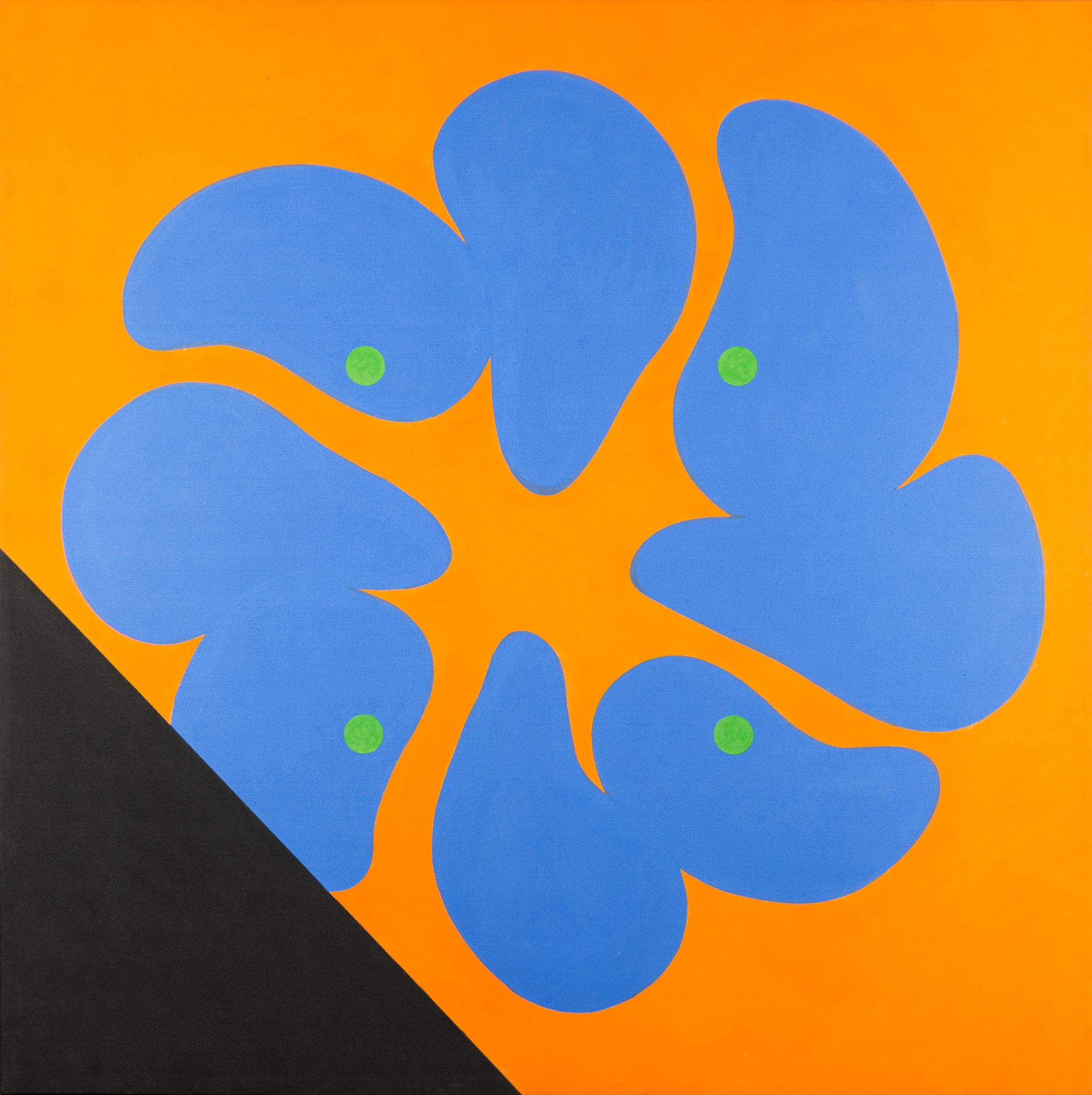
The Oklahoma City Museum of Art’s Paul Reed retrospective opened with the arresting, blazingly colored No. 17 from 1964 (fig. 1). In the large square painting, eight pear-like blobs of a deep cornflower blue form a circle, not unlike the petals of a flower, on an electric orange ground. Four bright green dots anchor the corners of a virtual square at center, and a black triangle “cuts” off the lower-left corner of the composition like a shade abruptly pulled across a window. Like works by other members of the so-called Washington Color School, No. 17 celebrates the brilliance of color, rigorous technical precision, and the elevation of surface forms over tactility, gesture, or any indication of pictorial depth. Hanging at the entrance to the show, the painting appears like a missive from another, quite distant art world: one where color, surface, and abstract form are taken as the essential ingredients not only of cutting-edge painting but also of a whole conception of art’s history and future. The most substantive retrospective ever devoted to Reed, the show asks us to look anew at this art world and its dogmas. How does the work appear today, six decades after its heyday? Does the critical language of the mid-twentieth century, which did so much to define Color Field painting—and, in many ways, to lift it out of its particular moment and milieu—still offer any purchase on abstraction and its possibilities?
Paul Reed (1919–2015) was born in Washington, DC, and attended McKinley High School along with Gene Davis, his close friend and future peer in the Washington Color School. Reed worked as a graphic designer in the 1940s and ’50s, and the effects of this training were visible throughout the exhibition: His art is marked by a deft sense of design, a virtuosic level of technical control, and, in later years, a direct engagement with photographic manipulation and montage. In 1965, Reed was one of six artists included in curator Gerald Nordland’s The Washington Color Painters, a movement-defining exhibition that opened at the Washington Gallery of Modern Art (WGMA) in Washington, DC, and traveled to four other sites around the country.1 Within the critical establishment, Reed remained a secondary figure, outside the trio of Morris Louis, Kenneth Noland, and Jules Olitski anointed by critics Clement Greenberg and Michael Fried as heirs to, and re-evaluators of, the modernist tradition. Yet within Washington, and within a more expansive postwar abstract-painting world, Reed remained a central figure. He was an influential teacher at the Corcoran School of Art, and his shows—local ones in Washington but also national ones in New York, Arizona, Florida, and elsewhere—earned frequent reviews in the press.
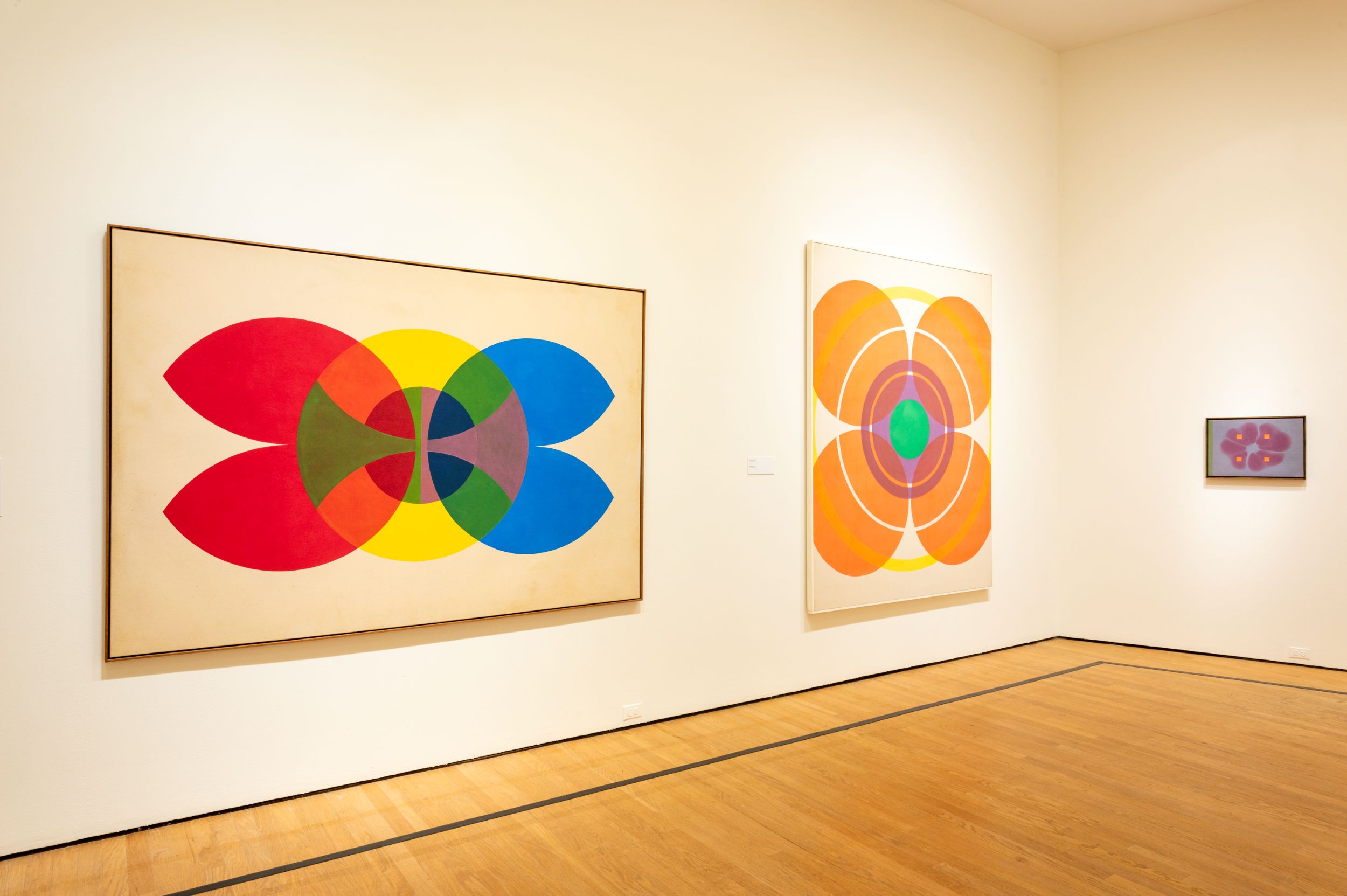
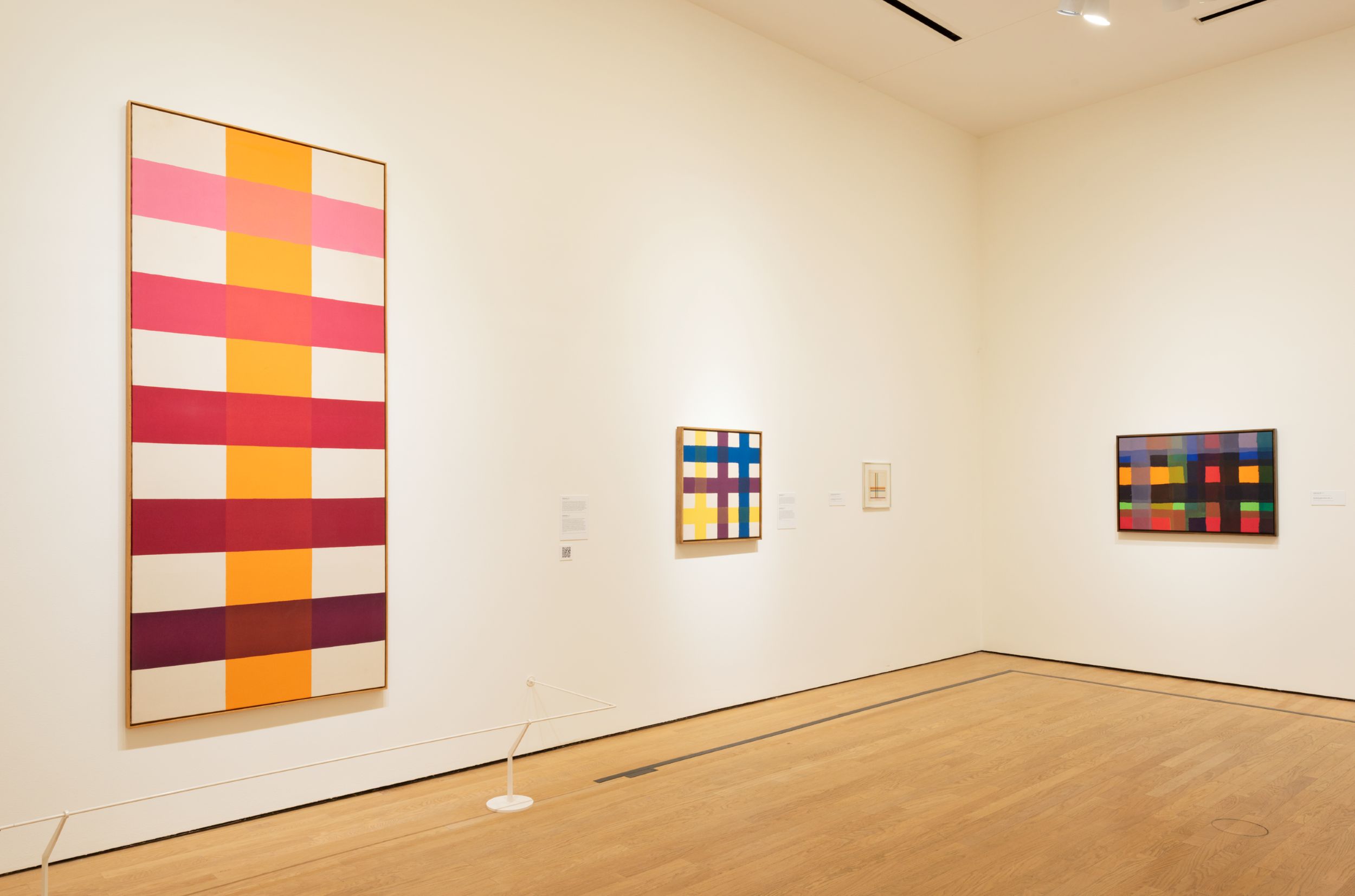
The exhibition, ably curated by David Gariff, proceeds both chronologically and by series, moving from Reed’s early work—responses to Paul Cézanne, Cubism, and, especially, Abstract Expressionism—to the diaphanous color-soaked and hard-edged geometries that the artist began to explore in the early 1960s, and which set the terms of much of his subsequent work. Because Reed’s coordinates are often basic geometries and rules (the golden ratio, symmetry, color complements), some works have an inevitable, almost preordained quality to them. No. 2B (1965), an iconic Reed painting included in the 1965 Color Painters show, presents a trio of precisely rendered disks in red, yellow, and blue, the central one a perfect circle and the outer two opening into curved, tulip-like points (fig. 2). Where they intersect, the disks create new, if expected, mixes of colors (green, orange, purple) and new, if equally precise, forms (oval, fan-shaped stem, cross). The satisfaction of viewing the work comes from the way it generates unusual and yet entirely predictable results from its basic premises. Similarly, works such as Coherence (1966) offer both script and result: A wide orange bar runs straight down the center of the vertical canvas, crossed by five horizontal bars of equal width, each one ascending in color from wine-dark burgundy at the bottom to red to pink at the top (fig. 3).
Yet one thing the exhibition revealed was just how much of Reed’s oeuvre moves away from the straight recitation of fundamental formal properties and color effects. In plenty of canvases, the “rules” generate forms that are strange and particular rather than elegant and ideal. In No. 17 (see fig. 1), for example, the blue-on-orange painting that opened the show, the negative space at center creates a wobbly, uneven Greek cross, its four arms alternately cradling the bulbous heads of the blue petals and snaking off into long rivulets, like the dendrites of a nerve cell. In another series from the early 1960s, Reed fills the canvas with an allover pattern of small, biomorphic shapes somewhat reminiscent of jigsaw-puzzle pieces, each one appearing slightly different from its neighbor—suggesting now a dove, now a flower, now a horned crescent—but locked snugly together into a regulated variety. What we get with Reed, then, is not so much a return to a past art world and its dogmas of formalism but a painterly intelligence that is playful, experimental, and surprising. Reed does not “solve” a formal problem or “exhaust” a series but instead finds himself led down new routes. Puzzle pieces become amorphous blobs; targets become satellites; diagonal and centrifugal compositions become diamond-shaped canvases.
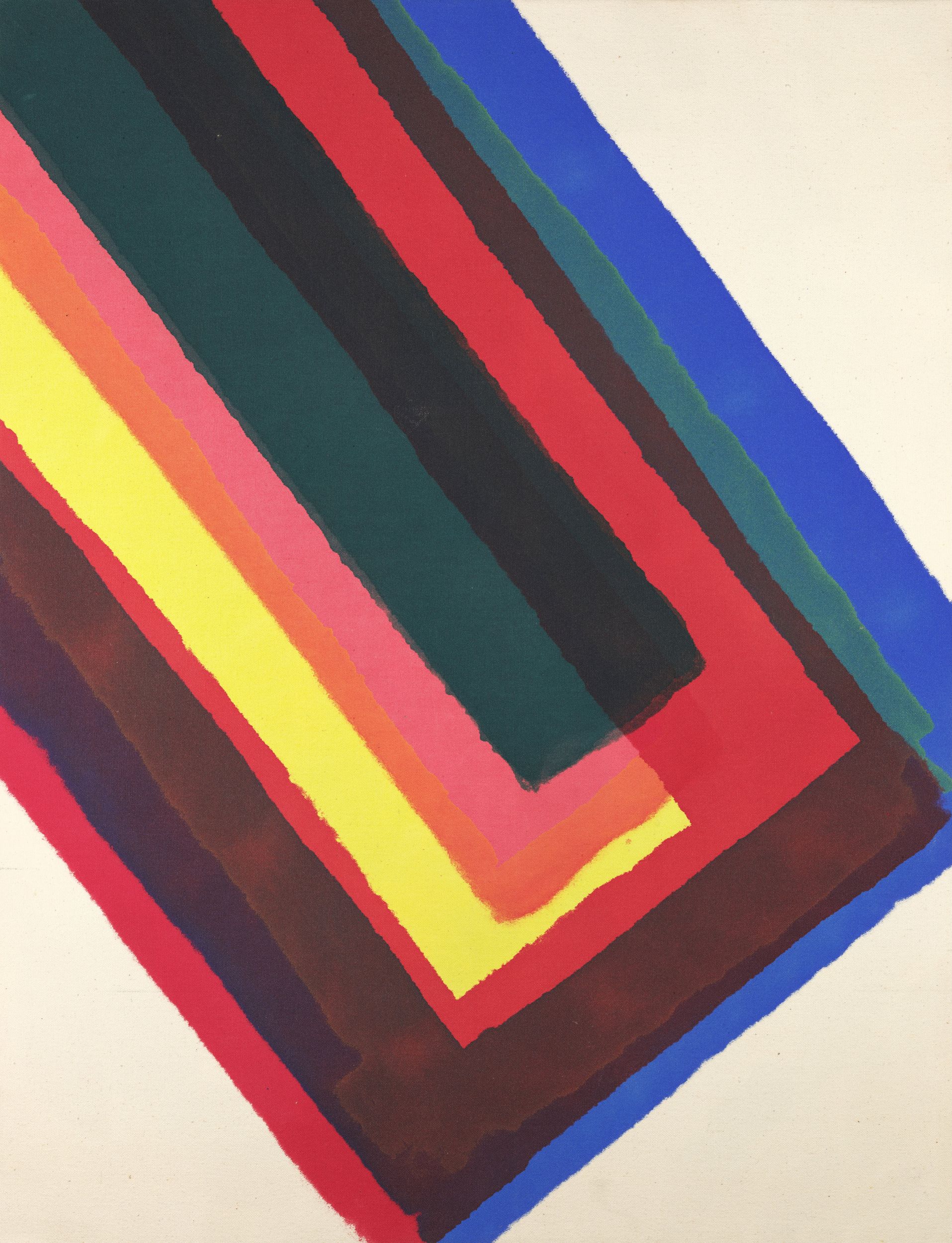
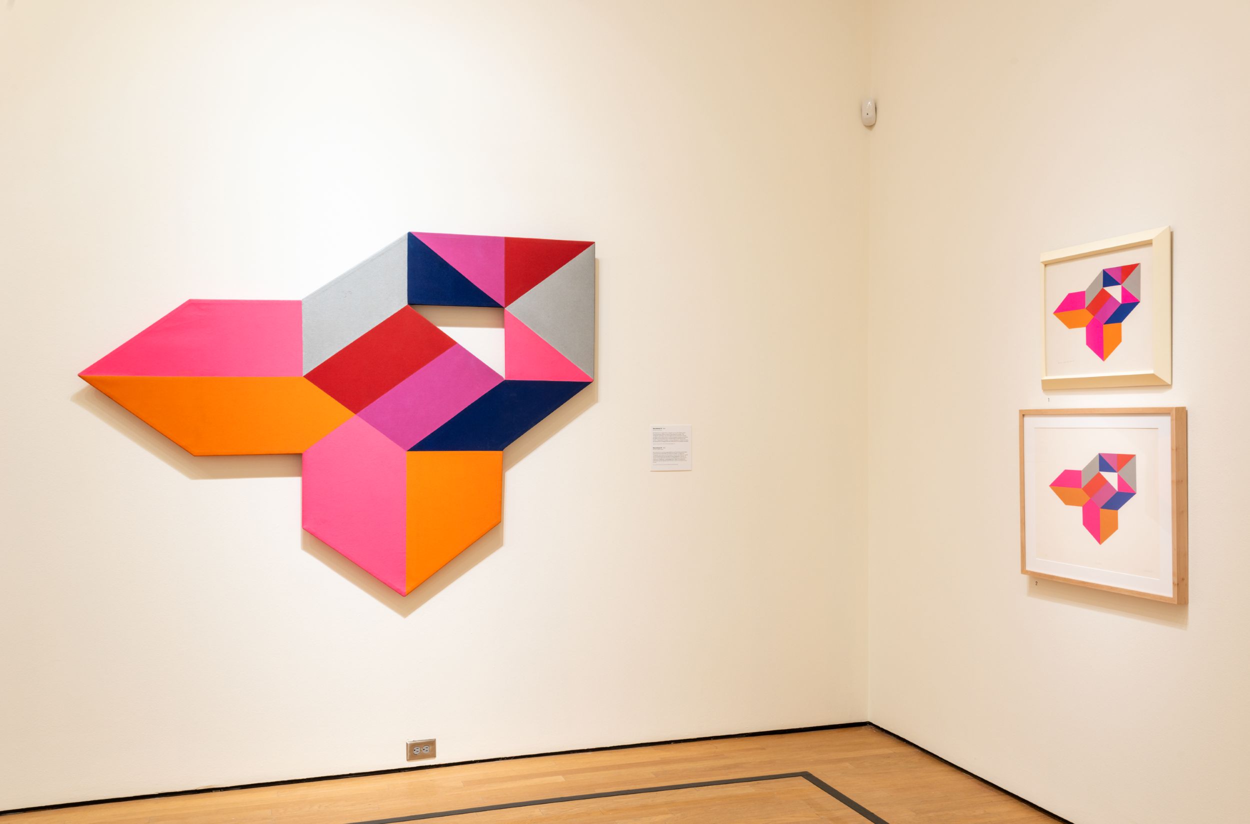
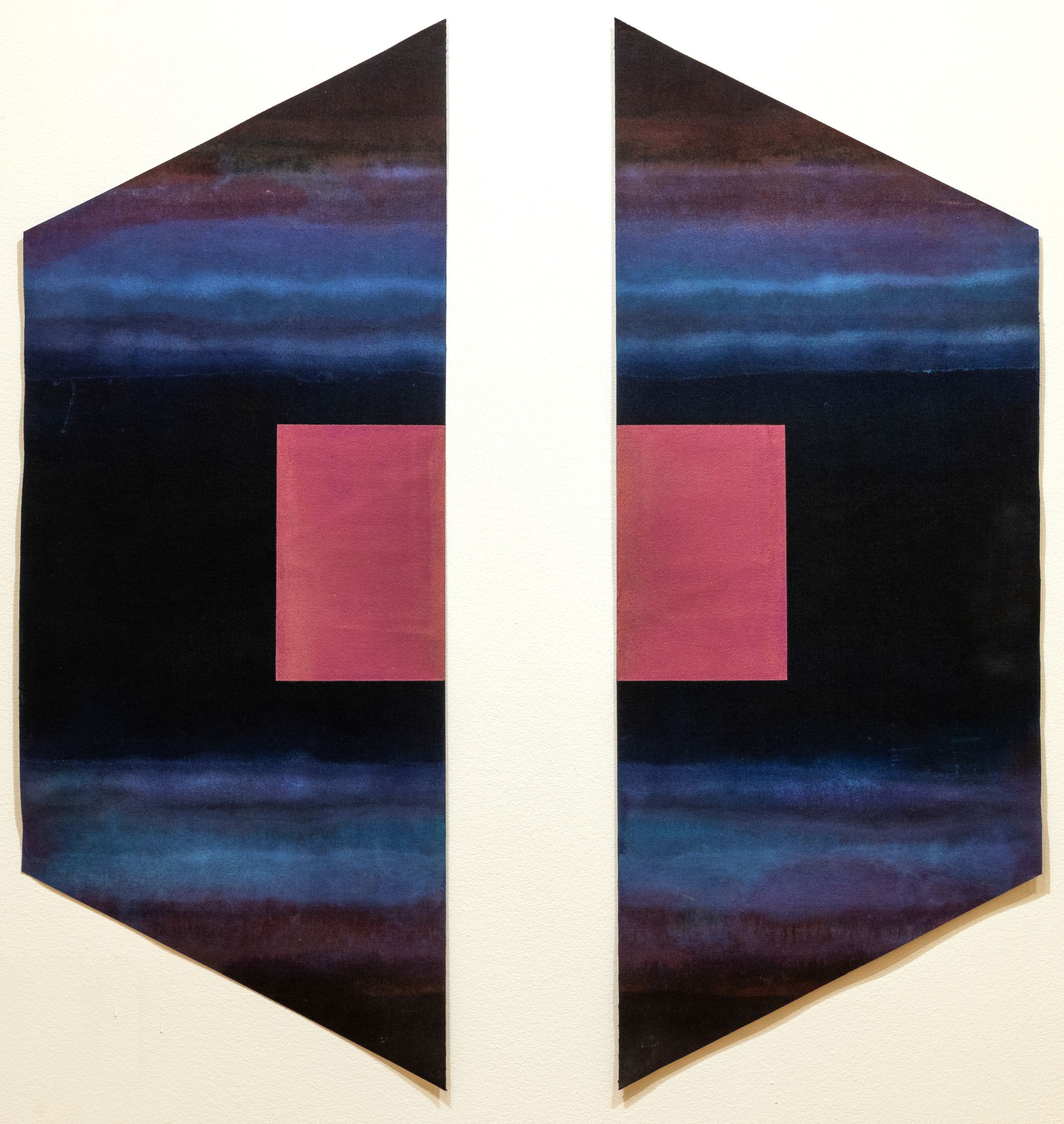
Reed’s various experiments take place almost entirely on the surface. At times, this is a soaked surface—a canvas absorbing fluid stains of paint, as in the Upstart and Interchange series from the mid-1960s, marvelous works that balance stacked geometric forms with a wet, wobbly application (at times, done with a paint roller; fig. 4). More often, though, Reed’s surface is hard as a tack, consisting of flat, unmodulated colors that coat the canvas evenly. Reed literalizes this hardening of the surface in his shaped canvases, polygons of four, seven, and more sides that have an object-like impenetrability. A group of these paintings, created over a decade from 1962 to 1972, made up the heart of the Oklahoma exhibition. In Barcelona IV (1969), the hard edges of the rocket-like shape are echoed by the painted hard edges of the internal forms, and by the interior triangular “window” cut into the work (fig. 5). In many of the shaped canvases, subtle color contrasts—lemon yellow next to mustard yellow, for example, or a spectrum of values next to one another—give the illusion of angled or receding planes. If these are exacting, precise works, they are also fun, playing humorously with the tension between real and illusory edges and angles. This play reaches a highpoint in the Gilport series: split paintings on sheets of paired, unstretched canvas, in which the suggestion of an illusory portal or entrance is in tension with the ordinary flatness of the canvas, tacked directly to the wall (fig. 6).
In focusing so intently on the surface, Reed, like others of his generation, abandoned a “depth” model of both self and painting. The stakes of this were made clear in the exhibition by the inclusion of Reed’s works from the mid- to late 1950s: vigorous, splashy oils reminiscent of Franz Kline and Hans Hofmann. With his embrace of geometric form and water-based acrylic paint around 1960, Reed’s surfaces contract and harden. Pictorial incident now takes place on a razor-thin surface with nothing below it—no layers of paint or traces of a making self. This reduction to surface has often been treated as a distillation—painting boiled down to its core essence, often described in poetic, almost transcendental terms. (Claudine Humblet’s two-volume The New American Abstraction, 1950–1970, including a chapter on Reed, exemplifies this treatment.) Alternately, the reduction to surface has been treated as a contraction of meaning, a drying up of affect and interest as everything is converted into formal facts. (The exhibition’s wall text often followed this strategy, dutifully reciting, say, the number of colors and edges in a canvas or describing the precise geometric relationships within a given composition—important but at times tedious.) Reed’s work, though, suggests something different, an approach that slides over the surface not because this is the mystical endpoint of painting or because painting has no “meaning” but because the surface has become the right place to experiment, to tinker.
Oklahoma may feel far away, geographically and culturally, from the center of the Washington Color School, but it has been involved in the movement’s legacy from early on. The chronically underfunded WGMA was folded into the Corcoran in 1968, only seven years after opening and only three years after Nordland’s Washington Color Painters established the movement on a national footing. One condition of the merger was that the WGMA be debt-free, and it sold its collection of 154 works to the Oklahoma Art Center, the precursor to the Oklahoma City Museum of Art—a sale presided over by J. Robert Porter, an Oklahoma-born, DC-based satellite scientist who served on the WGMA’s board of trustees.2 The purchase significantly expanded the Oklahoma Art Center’s permanent collection and established its credentials in contemporary art. It also installed a nucleus of Color Field work by Reed, Gene Davis, Sam Gilliam, Howard Mehring, and others in Oklahoma City, one which the museum has continued to develop in the decades since. A 2017 gift from the Paul and Esther Reed Trust included 125 new works, with the result that the Oklahoma City Museum of Art is now home to a significant collection of Reed works, from every phase of the artist’s career and in a range of media, from painting to sculpture to collage to screenprints. The retrospective gave viewers the chance to see not only the color paintings of the 1960s and ’70s but also Reed’s later developments: photomontages, with doubled and mirrored views of roadside buildings; collages of photographs and oil pastel; and late abstractions that marry geometry and texture with striations scraped through the thick acrylic.
Perhaps the retrospective will generate new scholarship on Reed and his peers. Reed deserves investigation that is sensitive to the formal problems at play but also cognizant of what those formal problems might mean. The hermeticism of so much Color Field painting—what Christa Noel Robbins, in a slightly different context, called the “reticence” of Noland’s target paintings—does not have to condemn writers to the dry recitation of formal facts.3 Indeed, this hermeticism might be color painting’s richest and most fascinating dimension. Why do these paintings say so little—or, say so much, but only on their own, often recursive terms? Why does the color-coated surface become such an inviting site for painterly experimentation in the 1960s and beyond? What do these works tell us about the kind of making—and the kind of self—that was available to painters, and viewers, in this postwar moment? And, what do we make of the embeddedness of these paintings in their moment (nothing looks so dated to a particular moment in time as certain 1960s–’70s color abstractions) and yet their insistently oblique relationship to that moment? This kind of scholarship has, of course, already begun, largely for the established Color Field figures.4 Perhaps future versions will make room for Reed, and his particular form of playful experimentation, within the narrative.
Cite this article: Emily Warner, review of Paul Reed: A Retrospective, Oklahoma City Museum of Art, Panorama: Journal of the Association of Historians of American Art 12, no. 2 (Fall 2026), https://doi.org/10.24926/24716839.21587.
Notes
- The five other artists were Gene Davis, Thomas Downing, Morris Louis, Howard Mehring, and Kenneth Noland. The show traveled to the University of Texas Art Gallery in Austin, the Art Gallery of the University of California at Santa Barbara, the Walker Art Center in Minneapolis, and the Rose Art Museum at Brandeis University in Waltham, MA. ↵
- The Corcoran inherited the WGMA’s DuPont Circle gallery, membership rolls, and some of its staff, most notably Walter Hopps. Much of this story is recounted in Erich Keel’s contribution to the exhibition catalogue, “The Washington Gallery of Modern Art: A Brief History.” ↵
- Christa Robbins, Artist as Author: Action and Intent in Late Modernist Painting (University of Chicago Press, 2021), 96. ↵
- See, for example, Alex J. Taylor, “Gift, 1961–2 by Kenneth Noland,” Tate Research Publication, 2017, https://www.tate.org.uk/research/in-focus/gift-kenneth-noland; Robbins, Artist as Author; John J. Curley, “‘Banner of an Atomic Regiment’: Morris Louis, Greenberg’s Modernism, and Science, c. 1962,” Art History 44, no. 1 (2021): 130–62; and the contributions by Miriam Grotte-Jacobs, Jonathan Frederick Walz, and Miguel de Baca in “What’s in a Name? The Washington Color School,” American Art 38, no. 2 (2024): 2–27. ↵
About the Author(s): Emily Warner is Assistant Professor of art history at the University of Oklahoma.