In the Tower: Anne Truitt
Curated by: James Meyer
Exhibition schedule: National Gallery of Art, Washington, DC, November 19, 2017–July 8, 2018
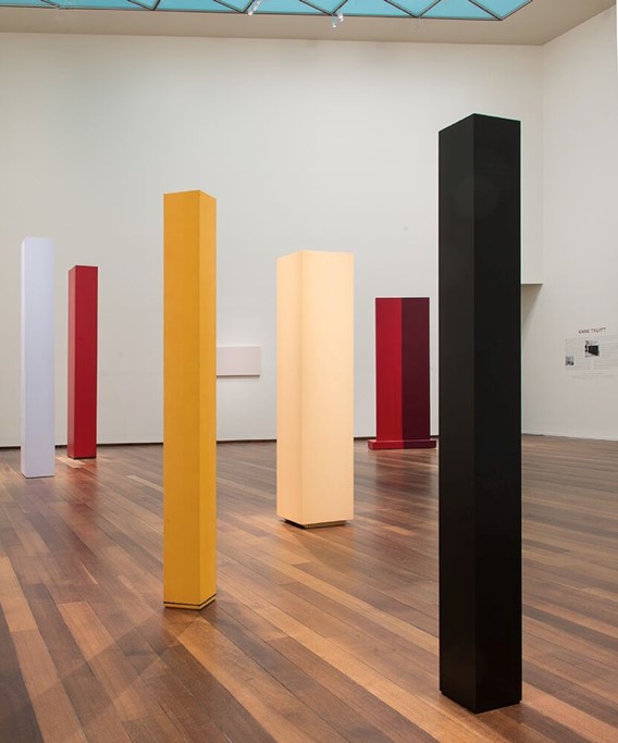
Imagine fusing the paintings of Barnett Newman and Ad Reinhardt and transfiguring them into three-dimensional space in varying shapes and heights. The resulting human-size figures—boldly colored, intricately designed, intense—convey something of Anne Truitt’s (1921–2004) art to a first approximation. The invocation of Newman and Reinhardt is hardly accidental, since Truitt was inspired by their work in the early 1960s. This tells us something about her style of Minimalism, which held onto supposedly “outdated” ideas about the aims of art that Minimalism is often said to have left behind. This modestly sized but excellent exhibition brings these complexities to light. It conveys Truitt’s uneasy relationship with Minimalism, challenges overly simplistic readings of the movement, and cements Truitt’s reputation as a leading American sculptor.
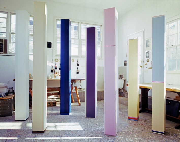
The exhibition is the third in the Tower Project series at the National Gallery of Art (NGA) devoted to contemporary art in the East Building Tower 3, previously featuring artists Theaster Gates and Barbara Kruger in 2016 and 2017. It includes twenty-three works of sculpture, canvas, and paper presented across two galleries. Over half the works are from the holdings of the NGA, although as of this writing none are on view. Six works come from Truitt’s estate, represented by the Matthew Marks Gallery in New York City, and a handful of works are from private collections. As visitors ascend the winding steps and enter the airy, skylit main gallery, eight of the nine sculptures—the focal points of the exhibition—appear as in a forest clearing (fig. 1). The sculptures, along with other works and a short documentary, offer first-rate insights into Truitt’s fascination with color, her distinctive art-making methods, and her unique vocabulary to articulate her aesthetic vision.
The curator, James Meyer, is a specialist in both Minimalism and Truitt’s art. In addition to offering a representative look at Truitt’s sculptural work from the 1960s and ’70s (as well as two sculptures from 1981 and 2002), Meyer achieves three additional goals. He underlines Truitt’s versatility as an artist by displaying two works on canvas (including one from the Arundel series of 1974–75) alongside the sculptures and by presenting a set of lively works on paper and paperboard in the second gallery. By integrating maps and photographs of Truitt’s studios around Washington, DC, Meyer indexes Truitt’s art making in space and time, a helpful contrast to the abstract qualities of most of the works. And by including Jem Cohen’s revelatory thirteen-minute documentary of Truitt speaking amid art supplies and unfinished works in her studio, Meyer gives us a glimpse of the material conditions of Truitt’s craft and an intriguing set of tropes to approach her art. An extended brochure accompanies the exhibition.1 It contains fascinating excerpts from conversations between Truitt and Meyer on the early evolution of Truitt’s approach to art, her complex relationship with leading art critic Clement Greenberg, the practicalities of the art business, the influences of her upbringing on her work, and the realities of being a female artist in a male-dominated profession.
§
Born in Baltimore in 1921, Truitt took a circuitous path to art. After studying psychology as well as art at Bryn Mawr College,2 she turned down a place at Yale in the psychology PhD program in 1943, sensing she preferred engagement with people over theoretical inquiry.3 Joining her sisters in Boston, their mother’s birthplace, Truitt worked as a researcher and nurse’s aide at Massachusetts General Hospital. Intense care for patients yielded a set of emotionally rich experiences that “open[ed] up the ducts through which [her] life would flow into art.”4 In 1946, Truitt abruptly decided against a career in medicine. She felt that her ability to help others depended too much on others’ willingness to accept her help.5 “I had simply seen that I must unite with pain,”6 as Truitt put it in her published journals. Art, we are left to surmise, gave her that opening. After marrying James Truitt in 1947, and following him to Washington, DC,7 Truitt enrolled at the Institute of Contemporary Art to study sculpture in 1948.8 Washington became her near-permanent home, and Truitt often spoke of a special kinship to the geography of her childhood, including in exchanges with James Meyer in the exhibition brochure.9
Early on Truitt experimented with materials such as chicken wire, plastic, and cloth, as well as clay casts.10 But she is best known for constructing elegant, colorful wooden sculpture in diverse sizes and shapes starting around 1961, when Truitt says her work “suddenly took an autonomous turn.”11 She meticulously applied, sanded, and reapplied coats of acrylic paint, sometimes twenty layers thick, to produce beautiful crosshatched patterns. Her repertoire of colors features bright yellow, scarlet, lavender, light blue, black, and white. Her relationship to color is quite different from the ways Washington DC-based artist Gene Davis—or Donald Judd, Sol Lewitt, Frank Stella, Alexander Calder—deployed reds, yellows, blacks, and blues. For Truitt, the organic and living are paramount, despite a lack of representational content. She seeks an atmosphere of “aliveness,” so colors “won’t settle.”12
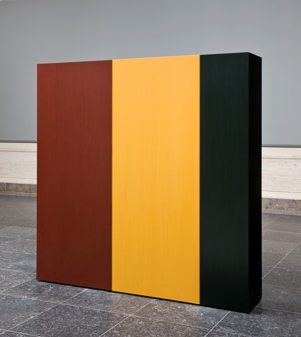
This sense of vitality, quite distinctive among Minimalists, comes through by circling around the works and catching the light reflecting from multiple angles. In Knight’s Heritage (fig. 2)—an imposing sculpture divided into two vertical brown and yellow sections and a smaller black section—faint streaks of white appear in uneven brushstrokes. The white has a luminous effect that softens and complicates the dominant hues as one glances from various directions. A similar pattern recurs elsewhere. The diaphanous colors of Spume (1972; NGA), which rises ten feet, combine faint blues, lavenders, and whites in delicate crosshatched shapes. Summer Remembered (1981; NGA), a slender sculpture of around seven feet, boasts an unruly color scheme. Blood-orange dots accentuate diverse intensities of yellow; each side has lighter and darker halves along the vertical axis. Various “irregularities”—uneven brushstrokes, asymmetric color fields, shading of varying strengths—reinforce Truitt’s fidelity to the organic.13
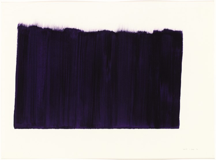
Truitt evinces the same mastery on canvas and paper. While she worked comparatively little in those media, she intriguingly translated some of her sculptural conceits into two-dimensional space. In Sand Morning (1973; NGA), the textured ridges of the canvas recall grains of sand and set off geometric forms in duller and brighter pinks that produce a richly meditative effect, echoing palettes from Picasso’s Rose Period. The work 1 June 1976 (fig. 3) showcases a rectangle skewed slightly to the right. In this fevered work, deep purples, verging on blacks, are interwoven with lighter shades that fade into white, reminiscent of the streaks in Knight’s Heritage, but more pronounced and erratic. Instead of demarcating the top of the geometric shape with a straight line, Truitt uses brushstrokes that let up gently, blending delicate purple bristle marks into the paperboard. Finally, the remarkably vibrant orange that suffuses 24 Oct ’71 (1971; Mary H. Davidson Swift Collection) and surrounds two columns of yellow almost leaps off the paper. In both her sculpture and works on paper, Truitt’s whites, yellows, and other tones give depth to the foreground colors, much as melodic and harmonic elements play off each other in musical works.
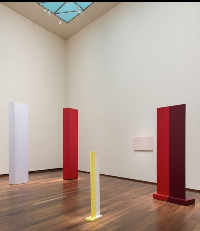
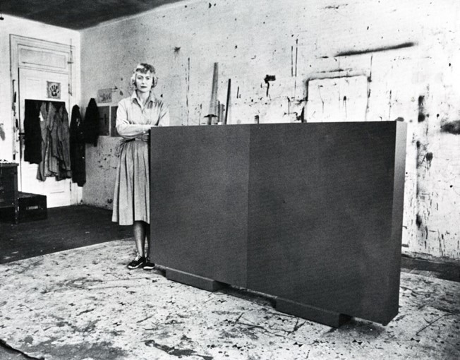
The works on display highlight Truitt’s ambivalent relationship to trends in Minimalism while emphasizing the movement’s heterogeneity. When it comes to spareness of form, reduction of art to its essentials (shape, color, line), and the turn away from representation, Truitt’s work falls squarely within Minimalism’s ambit (fig. 4). Yet in other ways, her art accentuates fault lines in the movement. In overall effect, choice of materials, and compositional approach, her art aligns with Carl Andre’s sensibilities far more than Donald Judd’s penchant for sleek monochromatic finishes or Dan Flavin’s inclination toward playful industrial chic. Both Andre and Truitt accentuate uneven textures. But whereas the rich variability in Andre’s wooden sculpture is usually pronounced—as in Last Ladder (1959; Tate Gallery)—in Truitt’s works, ineffable complexities are expressed through variations in layering and shading on a micro scale.
The exhibition also points to the limits of Anna Chave’s influential critique of Minimalism as masculine and domineering by virtue of its form, materials, manufacturing techniques, and presentational modes.14 Truitt’s approach contrasts sharply with the outsourced production methods that symbolize an emptying out of individuality, emotion, and referentiality. Given the meticulousness with which she chiseled and sanded wood and then mixed, applied, layered, removed, and reapplied colors, she likely saw such aims as antithetical to her craft. She seemed intent on preserving an ineliminable imprint of individuality and personality despite opting for universalizing aesthetic language. This aspiration, which goes against the grain of dominant Minimalist theorizing, may help explain Truitt’s aversion to the “Minimalist” label.
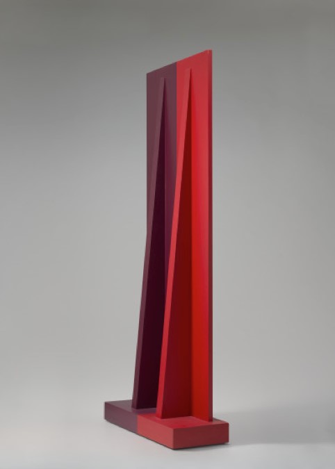
Whereas Donald Judd’s Untitled (1966/68; Milwaukee Art Museum) and Dan Flavin’s “monument” I (for V. Tatlin) (1964; Museum of Modern Art) celebrate machine-like repetition, Truitt distances herself from it in subtle ways.15 What looks like symmetry is often, on closer inspection, a sui generis or custom feature. Consider Insurrection (fig. 5), an eight foot sculpture with two elegant triangular supporting structures that to my mind recall abstracted angels’ wings reminiscent of the Wilton Dyptich. The work consists of two sides, dark purple and bright red. After a while, one realizes that the colors are not evenly distributed: the purple area is somewhat bigger. A similar imbalance characterizes Mary’s Light (1962; Angleton/Khalsa Family Collection), with its sheer white and light yellow. It is as if Truitt sets herself apart from—or perhaps even subverts—the industrial replication techniques favored by some of her contemporaries by integrating inconspicuous asymmetries visible only with attentive study.
§
Truitt is preoccupied with how color and form interact to create a dynamic lifting effect. To achieve it, Truitt often uses narrow bands of contrasting colors that wrap around a figure near its top or bottom (fig. 6). In architectural terms, these bands of color are ornaments rather than dispensable decorations,16 playing an integral role to Truitt’s method. Mid Day (1972; NGA) offers the best example. At its base, two adjoining bands of black and light brown give the bright red sculpture an electric charge so that the red hue, evoking the intensity of the noon sun, bolts toward the sky to a height of ten feet. A related effect in different tonalities characterizes Summer Remembered. A zigzagging dark blue band encircles the thin yellowish sculpture, vaulting it upward. The most elusive ornament appears in Twining Court II (2002; John and Mary Pappajohn Collection), a slender, austere black sculpture. A quarter-inch from the top, a thin black protrusion encircles the work. It is visible only at close range, and its meaning and function are difficult to divine.
Truitt’s fascination with vertical movement comes through clearly in Jem Cohen’s documentary in the second gallery (fig. 7). Filmed in 1999 at Yaddo, the artists’ community in upstate New York where Truitt had a long association, it shows Truitt amid jars of paint, brushes, and half-finished sculptures in her studio. Truitt’s sensibilities and idiosyncratic turns of phrase—like “sickish color” and feeling “springy on our feet”—offer clues to reading her works. She describes her art-making process and narrates her ways of selecting and blending hues so that color “zooms into being” to enliven a sculpture. “As you walk around it the whole thing vibrates. It sings. It moves. It moves as the light moves.”17 This sense of dynamism and vitality expressed in sculptural form and made vivid up close sets Truitt’s work apart from that of other Minimalists.
Fig. 7. Jem Cohen, dir., Anne Truitt, Working (2009), an interview and 16mm footage made in and around her studio at the Yaddo artist colony and from her home studio in Washington, DC, screened at a public symposium held at the National Gallery on January 19, 2018
§
Together the sculptures take on architectural dimensions owing to incisive placement by the exhibition team. Instead of a predictable linear arrangement or categorization by color, juxtapositions predominate. Sculptures in smaller groupings are put in dialogue among themselves—Spume and Mid Day, Mary’s Light and Insurrection, Summer Remembered and Flower (1969; NGA). Their placement at irregular angles and intervals creates an effect that is more than the sum of its parts. As one looks from different vantage points, the sculptures regroup in kaleidoscopic fashion. Some, like Mid Day and Insurrection, tower over us; others, like Mary’s Light and Parva XII (1977; NGA), are more diminutive.
Meandering among these human-scale forms is both intriguing and unsettling. They have an intensity that can make a visitor somewhat uncomfortable—not in a repellent sense but in a way that sparks interest in encountering them more closely. Here again Truitt’s art belies Chave’s depiction of Minimalism as domineering and invasive. Consider how Tony Smith’s Smoke (1967; Los Angeles County Museum of Art) or Ronald Bladen’s Cathedral Evening (1969; Loretta Howard Gallery) impinge on spectators by colonizing space to varying degrees. Truitt’s works, in Meyer’s spatial arrangement, do not impose in this way. Instead, they demand attention. At its best, her sculpture strives to do what good architecture can accomplish—help us come to terms with our place in the world by relating to it in new ways.
Truitt’s deceptively plain sculptures invite us to do the hard work of really seeing, a much-needed skill in today’s distraction-prone culture. In her art we confront alien, magnetic, self-sustaining objects (fig. 8). While they are refined aesthetic works, they refer us back to elemental processes in nature via the interplay of movement, light, and emotional vibrancy. The exhibition makes a case against reductive narratives of Minimalism and convincingly demonstrates how the organic and the individual can be preserved, improbably and subtly, in Minimalist garb.18
Cite this article: Mark L. Hanin, review of In the Tower: Anne Truitt, Panorama: Journal of the Association of Historians of American Art 4, no. 2 (Fall 2018), https://doi.org/10.24926/24716839.1680.
PDF: Hanin, review of In the Tower
- James Meyer, In the Tower: Anne Truitt. Exhibition brochure. Washington, DC: National Gallery of Art, 2017, https://www.nga.gov/content/dam/ngaweb/press/exh/4952/annetruitt-brochure.pdf. ↵
- Anne Truitt, Daybook: The Journal of an Artist (New York: Simon and Schuster, 2003), 73. ↵
- Truitt, Daybook, 59. ↵
- Truitt, Daybook, 61. ↵
- Truitt, Daybook, 56. ↵
- Truitt, Daybook, 57. ↵
- Truitt, Daybook, 61. ↵
- Truitt, Daybook, 34, 79. ↵
- Truitt, Daybook, 28. ↵
- Meyer, In the Tower, n.p. ↵
- Truitt, Daybook, 39. ↵
- Anne Truitt, Working. Directed by Jem Cohen. Gravity Hill Films, 2009. ↵
- But also see Truitt, Daybook, 35 (observing “how inorganic, how unnatural, my work is”). ↵
- See Anna C. Chave, “Minimalism and the Rhetoric of Power,” Arts Magazine 64, no. 5 (January 1990), 44–63. ↵
- One exception is Green: Five (1962; Matthew Marks Gallery), with five identical green vertical planks. ↵
- For this distinction see Karsten Harries, The Ethical Function of Architecture (Cambridge, MA: MIT Press, 1998). ↵
- Cohen, Anne Truitt, Working. ↵
- I am grateful to Monica Bravo, as well as two editors of Panorama, for their helpful comments. ↵
About the Author(s): Mark L. Hanin is an Art Writer and Law Clerk on the Court of Appeals for the District of Columbia Circuit, Washington, DC

