
Drive By or Fly Over: Alexander Calder in the Age of Aerial Art
PDF: Bewley, Drive By or Fly Over
Introduction
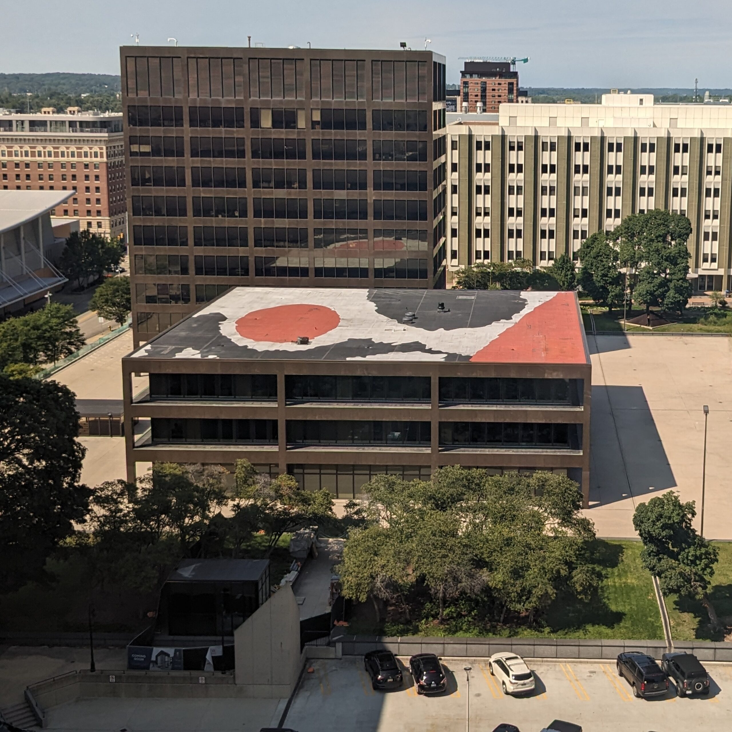
The Space Race at the close of the 1960s is well known to have proliferated a new fascination with celestial bodies, but the rise of skyscrapers, air travel, and satellite imagery also generated renewed attention to the surface of the Earth. In 1974, the city of Grand Rapids, Michigan, responded to the increasingly aerial view of the planet’s surface by commissioning a bold red, black, and white mural by Alexander Calder (1898–1976) for the rooftop of a government office building, popularly known as the Calder-on-the-Roof (fig. 1). Despite the monumental painting’s geographic closeness to the artist’s popular modernist sculpture in the plaza, La Grande vitesse (1969), the mural remains little discussed in Calder scholarship.
This essay places Calder’s commissions within the context of a transformation of vision in postwar America. As downtown interstates, high-rise offices, and jetliner travel became routine in the 1960s and 1970s, the surface of the Earth and the public art on it became literally framed by the windshields of cars, the plate glass of skyscrapers, and the oval windows of planes. In three interrelated public commissions, including his painted fuselages for Braniff International Airways, Calder inserted the “flyover” city of Grand Rapids into national discourse about expanding fields for public art amid new frameworks of vision shaped by automobile travel, skyscraper views, and passenger aviation in the United States.
From the Automobile
In front of the fourteen-story Grand Rapids City Hall, La Grande vitesse sits at a favorable location to be viewed from a car driving down the street. Five years after the sculpture’s red steel legitimized modernist abstract art for public spaces, funded by public money, the Calder-on-the-Roof transformed a county office building into an exploration of new visual vocabularies shaped by skyscrapers and air travel.
Both Calder’s sculpture and his mural came to be in Grand Rapids through the efforts of Nancy Mulnix Tweddale (1939–2025), a local arts volunteer whose meticulously maintained archive attests to the civic labor required to bring modernist abstraction to a Midwestern city.1 Mulnix Tweddale was charged with organizing the Women’s Committee annual exhibition at the Grand Rapids Art Museum.2 Critical to the growth of small regional museums from the 1950s to the 1980s, Women’s Committees and similar volunteer groups operated gift shops and arranged special events at museums. In many cases, as in Grand Rapids, the women independently organized their own exhibitions in museum galleries, supervised annual arts competitions, and administered gift shops for fundraising.
For the 1967 annual exhibition, the Women’s Committee planned the exhibition 20th Century American Painting, based on a monumental survey organized two years prior by curator Henry Geldzahler at the Metropolitan Museum of Art, New York. The women volunteers took Geldzahler’s catalogue, American Painting in the Twentieth Century, “as a bible” and sought to build a checklist that demonstrated the modernist impulses of Michigan’s regional artists.3
When the day came for Geldzahler’s keynote lecture in Grand Rapids, Mulnix Tweddale picked the curator up from the airport and drove him through the recently redeveloped downtown, a product of a 1960s urban renewal plan that razed more than 120 buildings.4 The urban renewal of Grand Rapids was one of many nationwide plans that destroyed historic neighborhoods to make way for cities organized around interstates, car parks, and centralized offices. The government services center in Grand Rapids, called Vandenberg Plaza, featured International Style offices arranged around a six-acre plaza. Underneath a grid of light brown pavers, a hidden underground parking deck supports the city’s economic realignment away from its nineteenth-century furniture industry to the orbit of automobile manufacturers headquartered in Detroit. While looking at the plaza through the windshield of the car, a mode of vision rapidly naturalized through urban sprawl, Geldzahler made an offhand suggestion that the plaza should have a sculpture. Mulnix Tweddale jumped at the suggestion—in her recollections, she shouted, “YES, and how do we get one?”5
Geldzahler was soon to be named the first chair of the Visual Art Committee of the National Endowment for the Arts (NEA), and the support of Vice President Gerald Ford (a native of Grand Rapids) ensured that the nascent Art in Public Places program of the NEA would support the endeavor. Calder, who had been Mulnix Tweddale’s favorite artist since girlhood, was approved for the commission by an NEA panel even before the details of the program were finalized; in most of Mulnix Tweddale’s correspondence, she can only refer to the as-yet-named grant as a “special program.”6 Mulnix Tweddale then began a massive campaign for local foundations, citizens, and businesses to match the money offered by the NEA.

When the Calder was installed in Vandenberg Plaza, detractors of the work were swallowed by the crowd of supporters who visited the plaza over its dedication weekend. La Grande vitesse’s dancing red curves interrupt the stolid regularity of the plaza, introducing a moment of exuberance. Furthermore, as the first sculpture funded by the Art in Public Places program of the NEA, La Grande vitesse legitimized modernist and nonfigurative art for public commissions. Since it was erected without any cost to the Grand Rapids government, even those who disliked the striking forty-two-ton red form grew to appreciate it. Ford, who as a senator was initially against the formation of the NEA, later said of La Grande vitesse, “I didn’t care for it at first, but now I wouldn’t be without it.”7 To this day, a graphic rendition of the sculpture by local artist Joseph Kinnebrew (b. 1942, Tacoma, Washington) officially signifies the city government on letterhead, street signs, and city fleet vehicles (fig. 2). Grand Rapids’ ready embrace of the red monument signaled a critical acceptance of modern art for public and civic identity, an acceptance primed by the framework of the car windshield as the sculpture became part of downtown’s daily visual field.
From the Skyscraper
While La Grande vitesse was calibrated for viewers at street level, the Calder-on-the-Roof addressed the newly emergent visual framework of high-rise office towers. Calder’s largest painting features black and red ovals floating in a white background, framed on one side by a diagonal red border. A wavy black line curves around the red sphere, bouncing like the blades of La Grande vitesse. The forms’ outlines are jagged, spilling off the roof and bringing vibrant red curves to the linear geometry of the plaza. Seen from the upper floors of the surrounding towers, the mural flattens Calder’s adjacent biomorphic sculpture into a graphic field calibrated for viewing at a distance (see fig. 1).
The design originated from a painting that Calder completed over a black-and-white photograph of the plaza taken from the windows of the University Club, a restaurant that occupies the fifth floor of an office building in Vandenberg Plaza. Given Calder’s advanced age and struggles with Parkinson’s, it is likely that another person used trigonometry to translate Calder’s original sketch onto a grid system for mapping the shapes on the actual roof.8
It is unclear from the archives who proposed that the roof of the Kent County building be painted, but Mulnix Tweddale was still in close communication with Calder by the fifth anniversary of La Grande vitesse. Some employees in the City Hall tower complained that the tar roof of the Kent Building distracted from the view of La Grande vitesse.9 Irregularly dotted with mechanical pipes, the lower roof dominates the view from the nearby slab towers.
Previously, urban renewal efforts in Chicago confronted similar challenges from the bald, flat rooftops filling the field of view of high-rise towers. Architect Ludwig Mies van der Rohe’s (1886–1969) design for the Chicago Federal Center in 1960 addressed the vista of employees in Kluczynski Tower by aligning the rooftop tiles of the low post office pavilion with the mullions of the slab building.10 In a further step, the General Services Administration commissioned Calder to add a pop of color to the plaza. His arced Flamingo, the same size and color as La Grande vitesse, was unveiled in 1974.
For many rural and suburban Americans in the 1970s, vision of the landscape from an aerial viewpoint played an increasingly critical role in shaping their identity. In Barnstorming the Prairies: How Aerial Vision Shaped the Midwest, art historian Jason D. Weems argues that federal oversight of agricultural efficiency in the first half of the twentieth century homogenized the rural farmland of the United States’ interior. Aerial photographs produced to survey the gridding of the prairie landscape into homogeneous fields reflected the collapsing of middle America into a superregional identity, one united by the indifferent geometry of megafarms and interstate highways.11 The destruction of Grand Rapids’ historic downtown, its replacement with a modernist grid, and the movement of businesses to elevated, detached upper floors similarly forced urban life into compliance and modularity.
When Calder learned of the complaints that building occupants had about their view of the unsightly roof, he offered his design free of charge to the Kent County Building rooftop: “I think of you people very often because I am still trying to produce a few objects which will be as successful as yours (GR) is (apparently).”12 Mulnix Tweddale acted quickly to secure funding for what promised to be the biggest painting ever completed by Calder. She successfully canvassed the banks and businesses occupying the upper stories of the slab buildings around the plaza to fund the cost of specialty paint for the roof. Once again, with no local taxpayer monies being spent, naysayers had little grounds for complaint about the mural’s intervention into the concrete landscape.13
The painting of the Calder-on-the-Roof celebrated the fifth anniversary of La Grande vitesse, which was programmed in conjunction with the city’s annual Festival of Arts. Largely a civic program of the past, municipal festivals of the arts constituted major annual events from the 1960s to 1980s in regional cities like Grand Rapids and Birmingham, Alabama. These weeks-long affairs, with music, theater, cuisine, visual arts, and even opera, were massive undertakings, entailing programming contributions from virtually all arts organizations in a city.
In 1974 the central nexus of the Grand Rapids Festival of Arts was the Vandenberg Plaza. The mural was painted over the course of the 1974 festival, and City Hall reserved two elevators to run express to its ninth floor for the public to watch the emergence of the work.14 More than one hundred thousand people attended during its apex event days. The roof was first coated with neoprene to prevent the tar from leeching through to the paint, and then an emulsion latex paint produced by a local industrial chemical company was applied.15
Over the next decades, the local commitment to the maintenance and repair of the sculpture and mural reveals the community’s embrace of abstract public art.16 In the mid-1980s, the material integrity of both works came under threat due to city budget reductions. In 1983 the city cut the annual forty-nine-gallon coat of Calder red for La Grande vitesse until the local Polish Heritage Society volunteered $1,200 to cover the cost. A further six businesses and organizations offered to fund the project.17 Four years later, the asphalt roof of the Kent County Administrative Building needed replacement, and businesses in offices from which the design could be seen provided the money to repaint the mural.18 In 2016 the county building’s asphalt roof needed to be replaced with a synthetic rubber membrane system, so the mural required total repainting. Local roofing company Great Lakes Systems took aerial photographs of the existing painting and digitally rendered the design.19
Each painting of the rooftop mural shifts the outlines of the forms slightly.20 From Calder’s initial sketches to a grid, then to the roof, and later to a digital rendering, these iterations shift the contours of the forms but mark the contributions of the Grand Rapids community members who have repeatedly brought the mural into being. Considered within the new era of vertical vision shaped by skyscraper floors and commercial air travel, the Calder-on-the-Roof erupts as a dazzling gem out of the concrete of downtown, marking the city as a unique space for both creativity and production.
From the Airplane
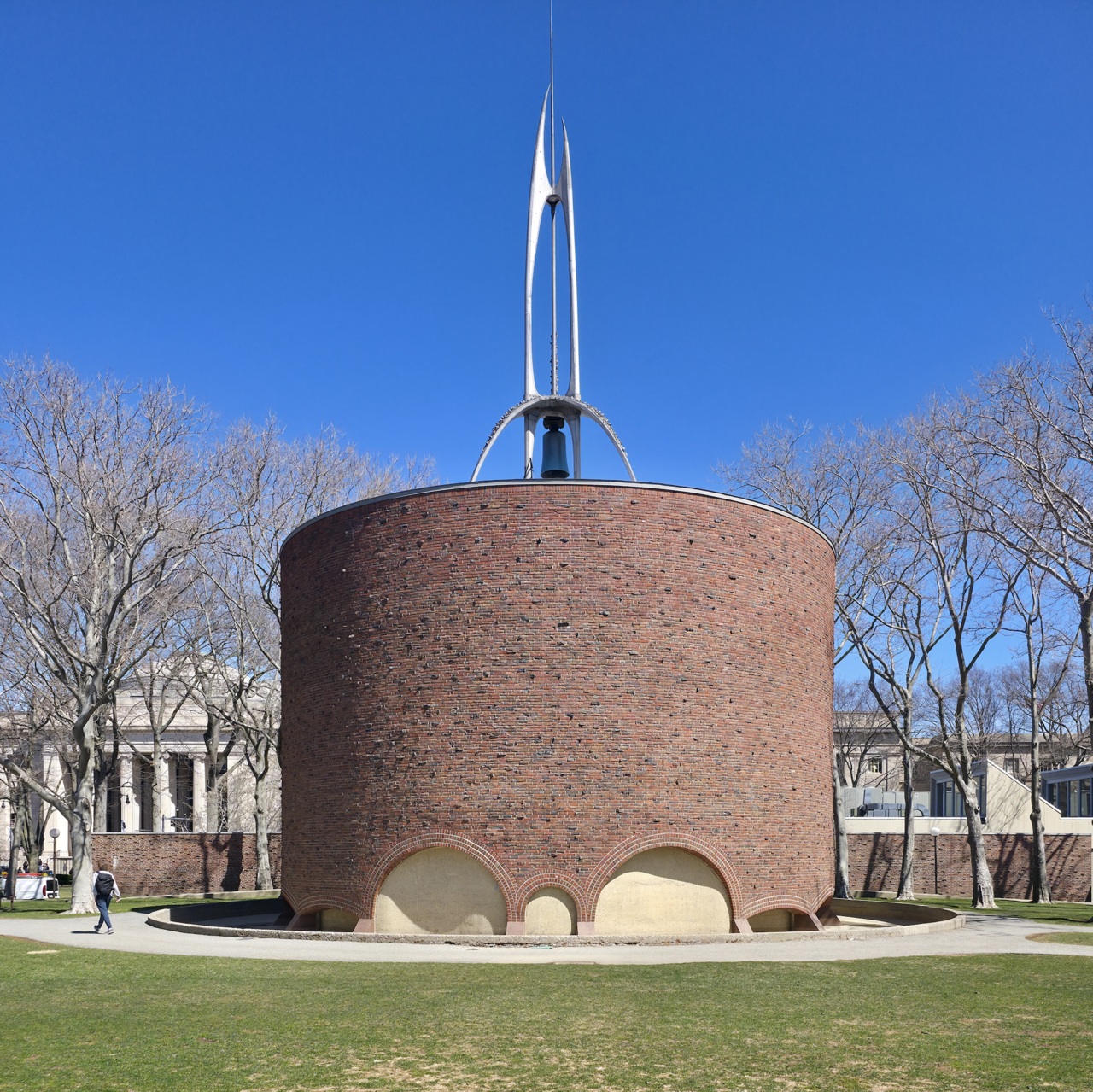
Excited locals would make the bold claim that such an unusual work, viewable from the sky, had never been attempted “in the entire history of art,” but precedent had been set in 1955, in Cambridge, Massachusetts.21 Sculptor Theodore Roszak (1907–1981) created a steel belltower for the rooftop of the MIT Chapel, designed by Eero Saarinen (1910–1961). Sitting on the nonsectarian chapel roof, Roszak’s arched quadruped soars above the circular brick building (fig. 3). Friezes of cast biomorphic forms span the planes of the tower’s legs. Hidden by the chapel’s parapet, the forms appear to be little more than an undulating texture. They cannot be seen from ground, nor from adjacent buildings or passing planes. The spire is, in the artist’s own words, for “God.”22 During World War II, Roszak worked as an aviation welder and instructor for Brewster Aircraft Corporation, a defense contractor focusing on naval aircraft. The tedious process of welding would have given him ample time to contemplate what an aerial, godlike view of the earth might be.23 Ten years after Roszak imagined a viewer beyond human sight, Calder addressed the aerial vision as a new condition of American life.
Calder’s engagement with aerial vision diverged from another important experiment with an aerial spectator of sculpture in the late 1960s. Robert Smithson (1938–1973) began to experiment with monumental art inside the dead landscape between airport terminal tarmacs. He was commissioned to be an “artist-consultant” to the architectural firm Tippetts-Abbett-McCarthy-Stratton (TAMS), which was developing a bid for a modular terminal design for the new Dallas-Fort Worth International Airport in Texas.24 A transportation hub for the future, the massive project had to accommodate the expected jumbo jets of the 1970s as well as new attitudes toward emergent public–private spaces. The hiring of Smithson to be an “artist-consultant” indicates an early response from the architectural firm to the growing passage of percent-for-the-arts ordinances, or laws that require new construction projects to earmark funds for public art. In 1963 the federal-level Art in Architecture program of the General Services Administration included international airports. The architecture firm perhaps hoped that their patronage of Smithson would enhance their bid and prepare the design team to meet federal requirements.
Between flights to Dallas, Smithson frequently organized road trips from Manhattan to mines, quarries, and abandoned air strips in New Jersey and Connecticut.25 Travelogues and recollections about day trips with Smithson and his wife, Nancy Holt, became a corpus in their own right.26 In Smithson’s first mainstream essay, “The Crystal Land,” published in Harper’s Bazaar, he describes the view of a cigarette-stuffed dashboard passing through the New Jersey Turnpike as he, Holt, Donald Judd, and Julie Finch traveled to hunt for minerals in quarries. This text precedes Tony Smith’s better-known description of nighttime on the unfinished New Jersey Turnpike, in which he recounts speeding down the unadorned asphalt, feeling in the monotonous experience “a reality there which had not had any expression in art,” momentum-bound beyond the dialectics of painting, architecture, and sculpture.27 These reflections on experience and viewing, framed by the edges of the highway pavement, prepared Smithson for a condition of spectatorship structured by the runway rather than the windshield.
Near the end of his contract with the architectural firm, Smithson requested that Robert Morris (1931–2018), Carl Andre (1935–2024), and Sol LeWitt (1928–2007) submit handwritten proposals for “plans for landmarks” that would accompany his own on the grounds of the redesigned airport. The artists all responded with handwritten proposals, none illustrated by drawing.28 Morris envisioned a monumental earthen ring, while Andre proposed a crater produced by the deployment of a one-ton bomb or a field of bluebonnets, the state flower of Texas.29 LeWitt, by contrast, refused to create a spectacle and instead wanted to place an unknown object in a six-inch wooden cube, encase it within another eighteen-inch block of cement, and then bury this block unmarked in the clear-zone grass.30 The work would deny any aesthetic distraction for bored travelers.
In his essay on the project, Smithson focused on the new field of vision enabled by passenger air travel. He argued that, within the fuselage of a plane, viewing is repositioned from the Renaissance tradition of human-height verticality to the downward view of the aerial. Yet, the scale of aerial vision is profoundly different from the flatbed picture plane of tabletop-like neo-pop combines or Cubist café scenes, and it insists on a reorientation of the spectator’s body in relationship to the ground.31 Smithson emphasized the dislocating effects of this shift, but Calder would respond by activating the downward gaze through bright color and form as skyscrapers and air travel increased in the 1970s.
Around the same time, the now-defunct Braniff International Airways responded to this new frame of vision by commissioning Calder to paint the exterior of two new two-hundred-passenger planes.32 The airline company was expanding its routes from the United States into South America with these Douglas-DC 8-62 wide-body jetliners. The planes would continue Braniff’s branding campaign, “The End of the Plain Plane,” which featured a fleet painted not only in orange, blue, and beige but also ocher, lemon, and turquoise, with seven matching interior designs.33
For the first commission in 1973, Calder painted eight designs on 1:25-scale models of the planes, which were translated to the fuselage using a grid method. The chosen design, titled Flying Colors of South America, featured swirls and waves of red, yellow, and blue (fig. 4). A slogan approved by marketing—“We’ll get you there with Flying Colors!”—accompanied photographs of the Calder plane in newspapers and postcards. The Braniff aircraft translated Calder’s biomorphic vocabulary to the curve of the fuselage, wrapping the surface in waves of primary color. Taxiing or airborne, the white negative space on the wings and engines reinforces the sense that color itself is hurtling forward in space. If the Calder-on-the-Roof invites a downward gaze from a controlled architectural height, then the Braniff plane offers a transient spectacle, a flash of color moving as quickly as the passenger-viewer.
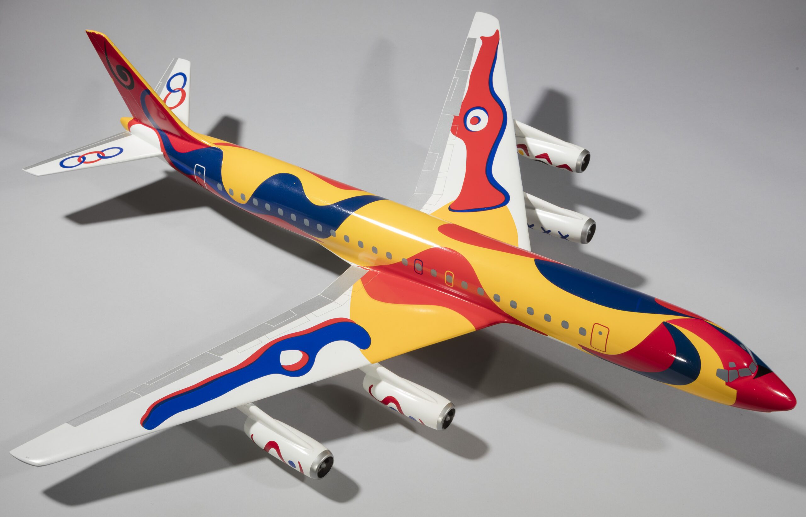
As in Grand Rapids, Braniff’s selection of Calder turned out to be especially welcome on two fronts: His colorful designs were popular and recognizable, and he was known to be easy to work with as an artist. The popularity of the first plane prompted Braniff to commission a second plane from Calder for the country’s bicentennial anniversary. Flying Colors of the United States wrapped a second Douglas plane in patriotic red and blue streaks, rolling like a flag in the wind. Evidencing his popularity with corporate and public patronage, Calder readily painted over line-drawn creature motifs on two wing turbine pod covers when Braniff disliked their red eyes and smoking jaws.34 Braniff’s publicity materials emphasized that the final design lacked its own corporate branding, but Calder did paint fourteen-foot signatures in bold contrast above both planes’ primary boarding doors.
Of the Calder plane, Braniff Board Chairman Harding Lawrence claimed, “More people will see this particular work of art in its original form than any other in the history of man.”35 He forecasted that millions of people would see the planes. By the mid-1970s, many Americans were experienced commercial passengers, industry employees, or lived under contrail-marked skies. The painted aircraft would be glimpsed through the glass curtain walls of terminal waiting areas or through the oval port window of a fuselage. Sometimes, visits from the Flying Colors planes made front page news at smaller towns with international airports.36
In promotional postcards sold at airports, Flying Colors jumps out as a colorful bolt against an undifferentiated field of farmland or monochromatic sky. Seen on the tarmac, in flight, or in reproduction, Calder’s planes redirected the newly elevated gaze back to the surface of the earth. Across monuments, murals, and painted aircraft, his work brought vibrant identity to the increasingly regulated and transitionary landscape of postwar America, meeting audiences who gaze out of the upper floors of skyscrapers, through the windows of jetliners, or, perhaps in the future, the ports of spaceships.
Cite this article: Shannon Bewley, “Drive By or Fly Over: Alexander Calder in the Age of Aerial Art,” Panorama: Journal of the Association of Historians of American Art 12, no. 1 (Spring 2026), https://doi.org/10.24926/24716839.21085.
Notes
- She donated her archive to the Grand Rapids History Center in 1982. See Bernice Mancewicz, “Nancy Mulnix Gives Calder Collection to City,” Grand Rapids Press, May 23, 1982, C37. ↵
- When the Women’s Committee in Grand Rapids was founded in 1957, a robust team of thirty to forty college-educated women joined the three-person staff, transforming the programming capabilities of the institution. Commitment and Community: The History of Volunteerism at Grand Rapids Art Museum, ed. Katy Leedy and Carol K. Cordes (Grand Rapids Art Museum, 2017). ↵
- Nancy Mulnix Tweddale, interviewed by B. Margaret Voss, August 17, 1994, transcript, 7–8, Grand Rapids History Center, Greater Grand Rapids Women’s History Council Oral History Collection. ↵
- The first thing Geldzahler wanted to do in Grand Rapids was visit the local Salvation Army. He was convinced that he would find Art Nouveau treasures in the Midwest, although all he found were “some naked baby dolls and some old toilets.” Mulnix Tweddale, interviewed by Voss, 7. ↵
- Mulnix Tweddale, interviewed by Voss, 8. ↵
- The selection panel, organized by NEA chair Roger L. Stevens, consisted of a mix of nationally known experts and prominent local citizens: Robert Blaich, industrial designer; Adolph Gottlieb, painter; Hideo Sasaki, landscape architect; Gordon Smith, director of the Albright-Knox Gallery in Buffalo, New York; Walter McBride, director of the Grand Rapids Art Museum; William E. Hartmann, president of Skidmore, Owings & Merril, the architecture firm that designed Grand Rapids City Hall and the Kent County Administrative Building; and J. Paul Jones, city planner. Although Calder was unanimously chosen, there were also discussions about works by George Rickey, David Smith, and Tony Smith. Chronology, April 18, 1969, annotated by Mulnix Tweddale, Nancy Mulnix Tweddale papers, Grand Rapids History Center. ↵
- Ford quoted in Nancy Hanks, “Art to the People,” Saturday Evening Post, April 1974, 80–81. To read more about Ford’s shift in attitude toward public art funding due to La Grande vitesse, see his speech in the Congressional Record, House 119, part 15, June 14, 1973, 19690. During his presidency, he nearly doubled the NEA budget from $60,775,000 to $114,451,507 and would honor Calder with the Presidential Medal of Freedom in 1977. See the 1974 and 1977 National Endowment for the Arts and National Council on the Arts Annual Reports, https://www.arts.gov/about/annual-reports. ↵
- Jed Perl, Calder: The Conquest of Space; The Later Years, 1940–1976 (Alfred A. Knopf, 2020), 474. ↵
- Albert Elsen (1974) quoted in John Wetenhall, “The Ascendency of Modern Public Sculpture in America” (PhD diss., Stanford University, 1988), 412n113. ↵
- Daniel Bluestone and Daniel M. Abramson, “Civic Business: Mies’s Chicago Federal Center in Context,” Journal of the Society of Architectural Historians 85, no. 1 (2026): 91. ↵
- Jason D. Weems, Barnstorming the Prairies: How Aerial Vision Shaped the Midwest (University of Minnesota Press, 2015). ↵
- Calder to Nancy and Lee Mulnix, August 2, 1973, Nancy Mulnix Tweddale papers, Grand Rapids History Center. ↵
- The Kent County Board of Commissioners did grumble about their exclusion from the planning of the project, with one of the commissioners even proposing that City Hall be painted with a bull’s eye, but all commissioners unanimously voted to accept the Calder. Maury de Jonge, “Kent Accepts Calder, but City’s Chided,” Grand Rapids Press, March 7, 1974, IE. ↵
- Roy Howard Beck, “Festival ’74 Outshines a Dismal Forecast,” Grand Rapids Press, June 8, 1974, 1. ↵
- Brian Malone, “Rooftop Canvas Primed for the Sake of Art,” Grand Rapids Press, May 21, 1974, 1. ↵
- Dave Wallace with illustrations by Charles Albright, “Doodler on the Roof,” Grand Rapids Press, March 24, 1974. ↵
- Vanessa Waters, “Calder Paint Job Axed in Budget Cut,” Grand Rapids Press, May 11, 1983, 2A; and “Calder to Get Fresh Coat of Paint for Festival,” Grand Rapids Press, May 15, 1983, 4. ↵
- Tracy L. Sypert, “Fund-Raising Drive to Replace Calder Art,” Grand Rapids Press, April 21, 1987, B1. ↵
- Louisa Hart, “A Michigan Contractor Is Challenged to Recreate a Roof’s 40-Year-Old Mural.” Roofing, November 21, 2016, https://roofingmagazine.com/michigan-contractor-challenged-recreate-roofs-40-year-old-mural. ↵
- While the contractors transcribed the shapes to the best of their ability, the Calder Foundation considers the original work to have been destroyed in 2009, as it was repainted “without a clear understanding of Calder’s original vision.” Beryl Gilothwest, Calder Foundation, email communication with author, April 30, 2026. ↵
- Tom Limmer, “Calder Takes Peek at His Rooftop Art,” Grand Rapids Press, October 27, 1971, 1. ↵
- Howard Griffin, “Totems in Steel,” Art News 55, no. 6 (1956): 34–35. A reproduction of a complete study for a panel can be seen in H. H. Arnason, Theodore Roszak (Walker Art Center, 1956), 16, fig. 19. ↵
- Arnason, Theodore Roszak, 14. ↵
- Prokosch, an alumnus of Yale University, attended Smithson’s lecture and then convinced his firm to hire Smithson. Brian O’Doherty invited Smithson to join John Hightower and Paul Weis on a panel titled “Shaping the Environment: The Artist and the City” for a Yale University School of Art and Architecture symposium. The event was sponsored by the Yale Arts Association (The Alumni and Friends of the School of Art and Architecture, Yale University), and it was held on June 17, 1966. See T, Miscellaneous, 1966–1967, series 5, box 2, folder 29, Archives of American Art, Smithsonian Institution, Washington, DC (hereafter AAA). For the employment contract, see series 2.2, box 2, folder 2, Smithson and Holt papers, AAA. The contract between TAMS and Smithson was signed July 20, 1966. ↵
- Oral history interview with Robert Smithson by Paul Cummings, July 14–19, 1972, 9, AAA. Neither Carl Andre nor Dan Flavin could drive. ↵
- The writers include Carl Andre, Ted Castle, Virginia Dwan, Dan Graham, Joan Jonas, Donald and Julie Finch Judd, Howard Junker, Allan Kaprow, Sol LeWitt, Richard Long, Dale McConathy, Claes and Patti Oldenburg, Mary Peacock, Charles Simonds, and Lucy Lippard. Alan Moore, “Chronology,” in Smithson: Drawings, eds. Susan Ginsberg and Mario Amaya (New York Cultural Center, 1974), 235. See recollections like Calvin Tomkins, “Onward and Upward with the Arts: Maybe a Quantum Leap,” New Yorker 47, no. 51 (February 5, 1972): 42–67; John Perreault, “Field Note for to a Dark Vision,” Village Voice, May 9, 1974, 38; and Lawrence Alloway, “Site Inspection,” Artforum 15, no. 2 (1976): 49–55. ↵
- Samuel J. Wagstaff Jr., “Talking with Tony Smith,” Artforum 5, no. 4 (1966): 15–19. Smithson nods back to Smith in his essay “Towards a Development of the Air Terminal Site,” a description of a proposed group exhibition in the clear zones, or safety margins for the runways, surrounding the Dallas-Fort Worth airport. Robert Smithson, “Towards the Development of the Air Terminal Site,” Artforum 5, no. 10 (1967): 36–40. ↵
- See the original correspondence at “Aerial Art,” series 5, box 4, folder 2, Smithson and Holt papers, AAA. ↵
- Robert Smithson “Towards the Development of the Air Terminal Site,” Artforum 5, no. 10 (1967): 36–40; Robert Smithson, “Aerial Art,” Studio International 177, no. 910 (1969): 50–52. The former discusses his personal proposals for TAMS, while the ladder focuses on a possible group exhibition with the other artists. Andre first proposed a twelve-foot-crater before sending Smithson a second plan, which I believe Andre updated on learning that Smithson planned to publish on the project. ↵
- On July 1, 1968, LeWitt realized Buried Cube Containing an Object of Importance But Little Value (also called Box in Hole) at the Visser family home in Bergeyk, Holland. ↵
- Smithson, “Towards the Development of the Air Terminal Site,” 36–40. ↵
- The advertising agency working with Braniff emphasized that “Calder’s colorful creations best reflect the product image of South America,” but, in fact, the firm first offered the commissions to Pablo Picasso and Joan Miró, both of whom declined for health reasons and age. At midcentury, artists with signature, energetic painterly styles, like Picasso, Henri Matisse, Salvador Dali, and Calder, frequently accepted corporate collaboration commissions. Thomas E. Mowry Jr., “‘Flying Colors’ Braniff Soars into Flight with Their Biggest Promotion Ever,” Wharton Account 13, no. 2 (1974): 19–21. ↵
- “The End of the Plain Plane,” 1965, posted May 1, 2024, by Braniff Airways Foundation, YouTube, 21:09, https://youtu.be/-WOqtScRf5E?si=Wmm9eb0hwG1fUses. Also see Mary Wells Lawrence, A Big Life in Advertising (Alfred A. Knopf, 2022), 200. ↵
- UPI News, “Artist’s Flying Dragon Has Braniff Up in Air,” Houston Post, November 16, 1975, 15. ↵
- Mowry, “‘Flying Colors’ Braniff Soars into Flight,” 21. ↵
- “‘Flying Colors’ Plane Visits,” Brownsville Herald (Texas), December 15, 1975, 1. ↵
About the Author(s): Shannon Bewley is an art historian of twentieth-century sculpture. She earned her PhD in the history of art and architecture from Boston University in 2026.